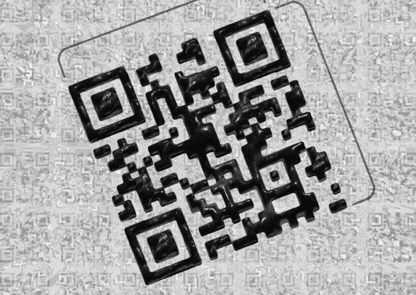
This is a set of posters I made for my girlfriend in my free time, to surprise her for one of our Monthsaries which encompasses five different designs, and four different styles. Each style has it’s own theme and each theme has a sentence that goes hand in hand with the design.
Here are the final results first:
Behind the scenes
I made this entirely in Illustrator, Photoshop and to top it off I used InDesign to assemble the entire PDF together and put them in the correct order and made them available to print.
The first thing I did is think about what I wanted to do, my resolve for the surprise was to make her a few posters, at this point I still did not have in mind about what they were gonna be about nor what the sizing, colors, etc. After I took some inspiration on Dribbble, I came across a few Posters, with quite different and contrasting themes, namely;
- Special Love by Ferdie Balderas
- Love by Patrick McLaughlin
- Love! by Nour Oumousse
Which sparked an idea in my mind and made me think, “It would be boring if all posters look the exact same, and all had the same colors/layout/theme, right?” and that’s when I thought, I will make multiple posters, specifically 5 (technically 4). I do not count the first page; the one with the QR code as a page, since it is more like a cover, like shown in the flip book above.
