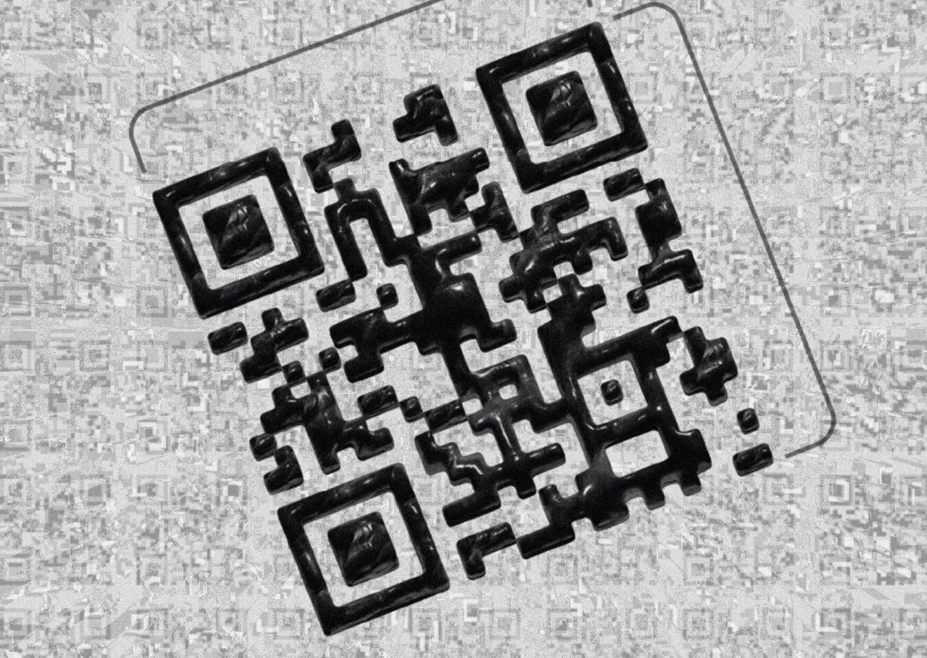
The first two (ignoring the QR code) are clearly digital. First one is a hyper-futuristic style poster that I made based on something I used to do years ago which is basically a form of title sequence or intro for YouTube channels that used to be popular around 2014-2016. It featured large texts, quite often accompanied by a lot of effects, and distortions applied to the name to display some sort of “power”?
Here is the Illustrator and Photoshop BTS of the first poster:

In Illustrator I used a few tools, but keeping it minimalist:
- Text Tool
- Pucker & Bloat (For the background decorations)
- Pathfinder
- 3D and Materials

In Photoshop I just applied a Gradient Map layer with a custom gradient to achieve the colors that I wished to portray, mainly Teal & Orange because they are my favorite colors.
Invert because the gradient would apply the color orange where the blue now is, and I think orange for shadows and blue for highlights is not exactly easy on the eyes.
Color Lookup with a Photoshop default LUT to change the overall vibrancy of the image and adjust the colors even further, to achieve what I had in mind.
Curves layer to add the finishing touches.
Second one is a simple, stylish and cute design of a isometric 3D stylistic heart that I made, heavily inspired by Valve’s Aperture Lab entire aesthetic. It was by far the simplest and easiest to do, but it is also the sweetest in my opinion since the tagline,
Even if I had a hundred hearts,
you would fill them all
Takes the initial design based off of Valve’s replicating isometric work cubicle and gives the idea a twist, making a heartwarming quote that indicates, no matter who I am or how much I change, I would still fall in love for you.
Here is the Illustrator and Photoshop BTS of the second poster:

This time in Illustrator I used even less tools:
- Pen Tool
- Text Tool
- Swatches (For the repeating pattern)

In Photoshop I added the background since I exported in Illustrator just the assets,
Followed by a Color Lookup with a Photoshop default LUT to change the coloring and style.
That’s it, simple huh?

