The third and fourth poster have a totally different and contrasting theme, and here is went for different eras too, this third poster is inspired by SGI, and those early eerie but atmospheric looking 3D graphics commonly used in the late 1990s that show a very early moment in the history of 3D graphics, I also watched a documentary at the time about one of those computers and how it worked, so I felt inspired by it. I wanted to imitate the art style, but done with modern tools, of course.
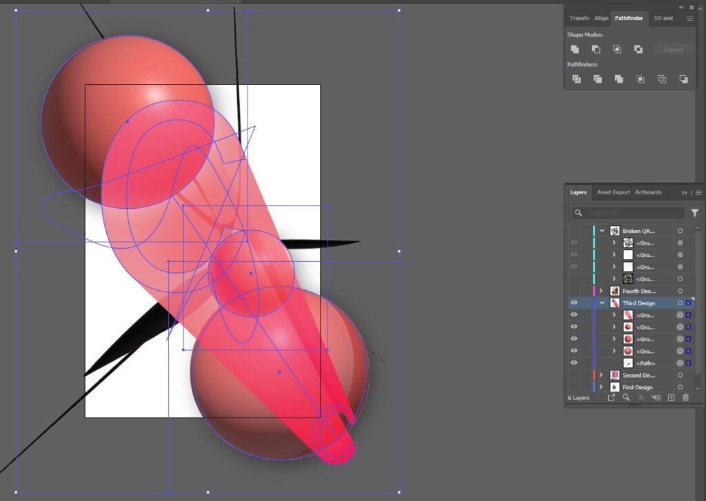
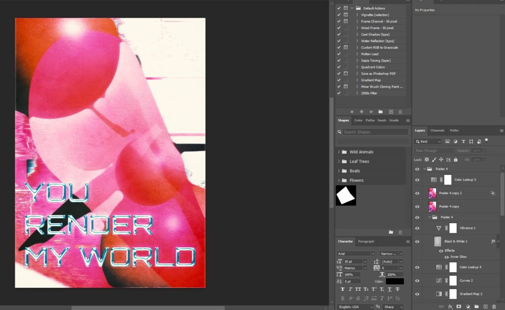
Here is the Illustrator and Photoshop BTS of the third poster:

The tools used in Illustrator:
- Pen Tool
- Text Tool
- 3D and Materials
- Mesh tool

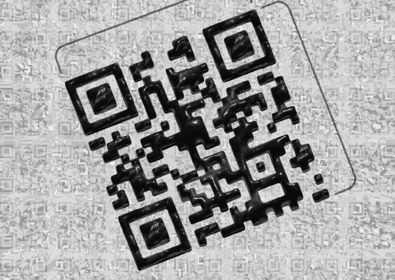
In Photoshop I made a background layer by copying the main exported design from Illustrator, applying a displacement layer, the displacement layer is just a photo of a wall I took on the street, the rest of the design involves:
Oil paint effect, wind effect applied to the background to give it that classic look as if it was part of an old poorly textured render, with a pinch of “real” texturing (the wind effect), a final touch of color lookup with a default Photoshop LUT to match the colors of the design.
The main design ported out of Illustrator received the same oil paint treatment and also the effect median to average out the sharp corners that the design exported as, and make it blend more, also adapt to a shape that would be easier to render for a computer from the era, a posterize effect to finish off the main subject.
The final touches; I copied the main subject, masked the top area, used “lighter color” blending option, and used the same effects as before, for the most part, added mosaic to pixelate it and noise to make it actually different and give the final subject a shine.
The text font I used is Orbitron and it plays a major role in defining the entire poster’s personality and outcome. The text is decorated within Photoshop with a Bevel & Emboss, Pattern Overlay, Outer Glow, Drop Shadow to make that 3D exaggerated look.
A simple combination of Gradient Map, Curves, Color Lookup, Vibrance and a white texture layer which is actually a photo of a wooden table, with an Inner Glow effect applied with the Overlay effect applied, with a lowered opacity created the perfect color design and a touch of glow/haze.

