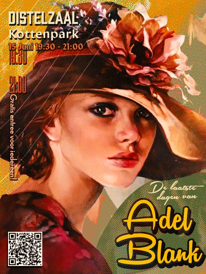
The design process behind the poster is not convoluted but it did require a few steps, since the whole process is divided in three categories.
- Subject
- Background
- Composition
Starting off with the subject in place, I needed to find out a good model that represented Adel Blank.
Now, luckily, the client had already a predefined image which was this Francesca Strino image they found, I went onto Francesca’s Strino website to research more about them, their style, and the background of Adel Blank, including what they did (again, roughly). Taking too much of Adel’s past or Francesca’s works would mean less originality for me.
After learning about about both of them, I went to gather some samples, some inspiration, and that’s where I stumbled upon this Dribbble design which inspired me to research more about pop-art. I went off to Wikipedia, Google, Dribbble, Pinterest, to research what made pop-art- “pop-art” itself.
When I had enough knowledge about pop-art to start working with it, I opened Photoshop and imported the Francesca’s Strino portrait that was sent to me by the client, and looked in silence.
I closed Photoshop.
After some leisure time and also relaxing my mind I now opened Photoshop again, and started editing the Subject

I took the image the client sent and removed all artifacts that could have bothered my work, such as the title of the book that was on the image, and cleaned other obstacles with the Patch tool to make it seamless and integrated with the background.
The first thing I did to emulate the pop-art style was apply one black and white halftone layer, I used the soft light blending mode, then I made another halftone layer with a bigger radius, less opacity to create a pseudorandom texture.
I duplicated the base image (always make a copy of the base image!) and blurred it, blended it with the darken mode and only applied it to the mids rather than the highlights of the subject to emulate those border radius halftone or “shadow halftone”, then used a black layer to enhance even more that effect.
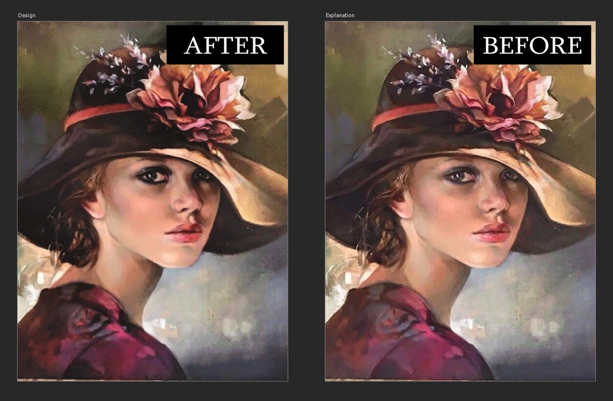
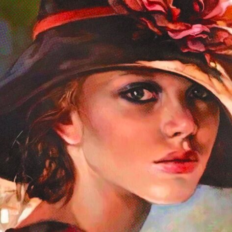
After this the next thing I had in mind, was to bring the portrait to life a bit more, it is too pale for mine and my client’s taste, so what I did is add a vibrance layer, adjusting the colors to my liking while being careful not to over saturate it, then applied a color lookup named 3Strip it is built into Photoshop and it helped achieve what my client had in mind.