Here are the final results first:
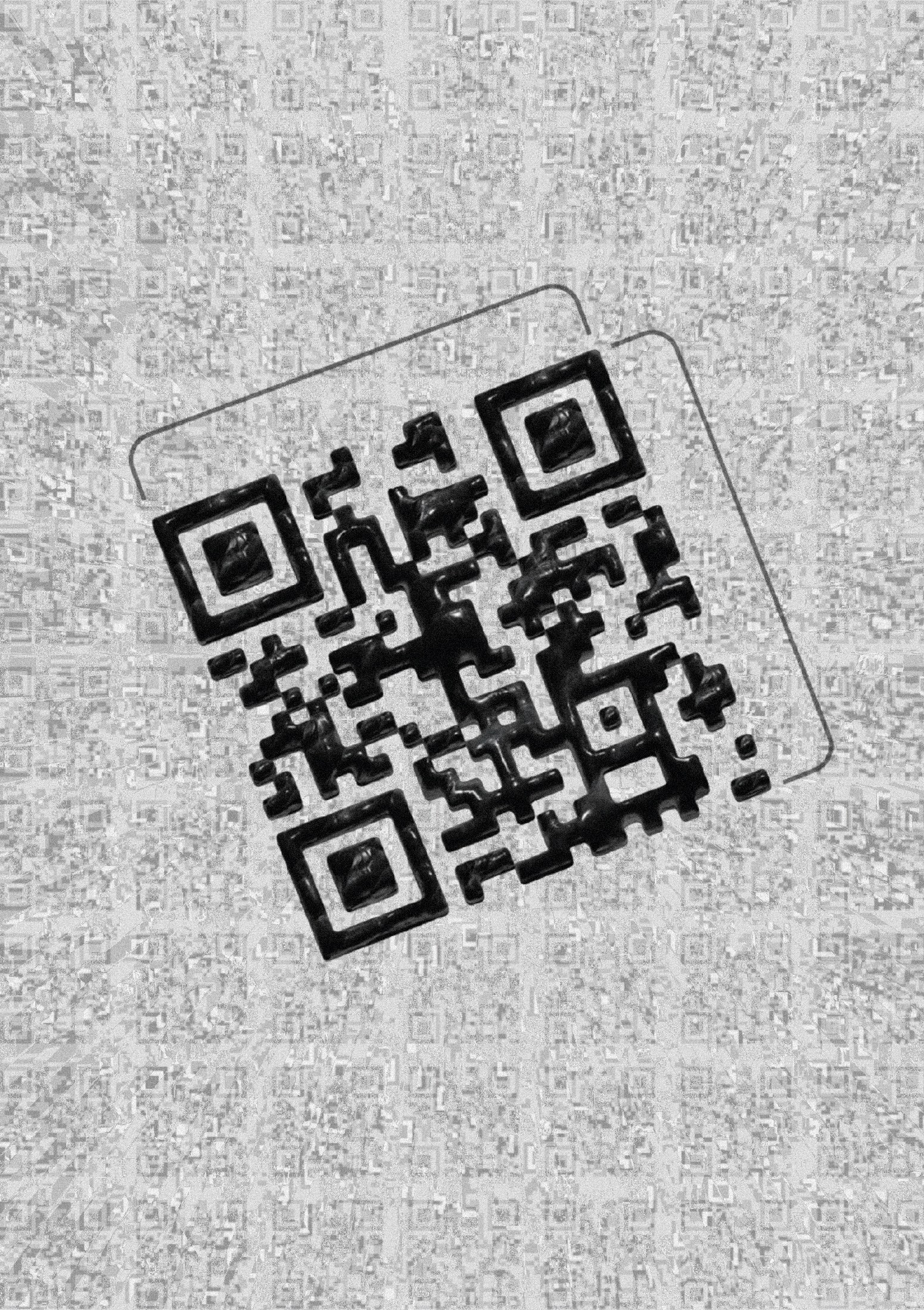
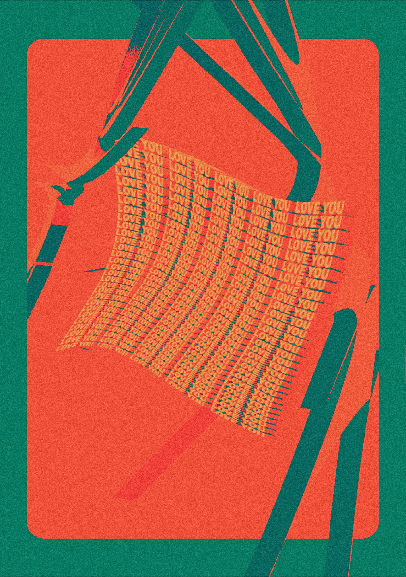
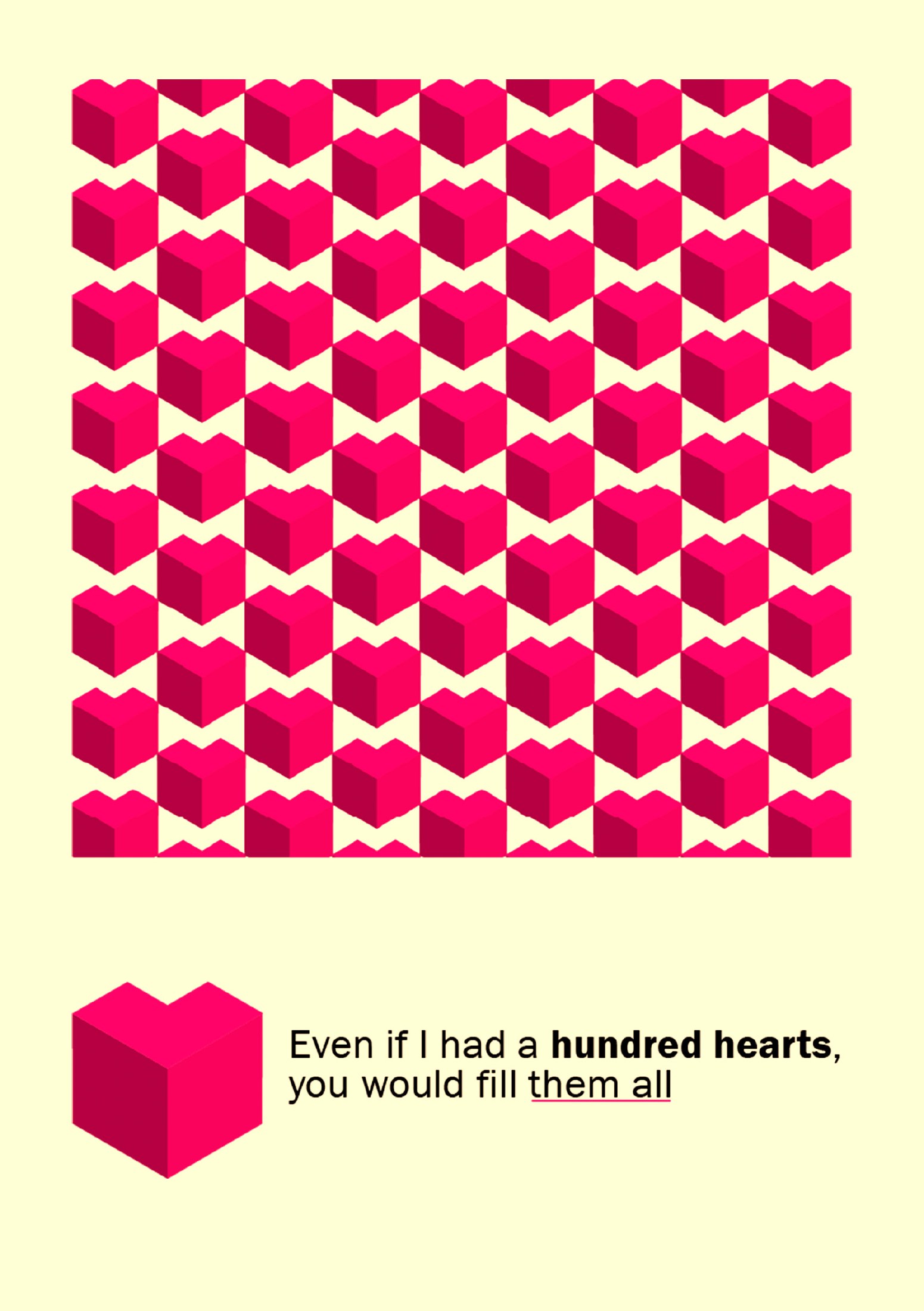
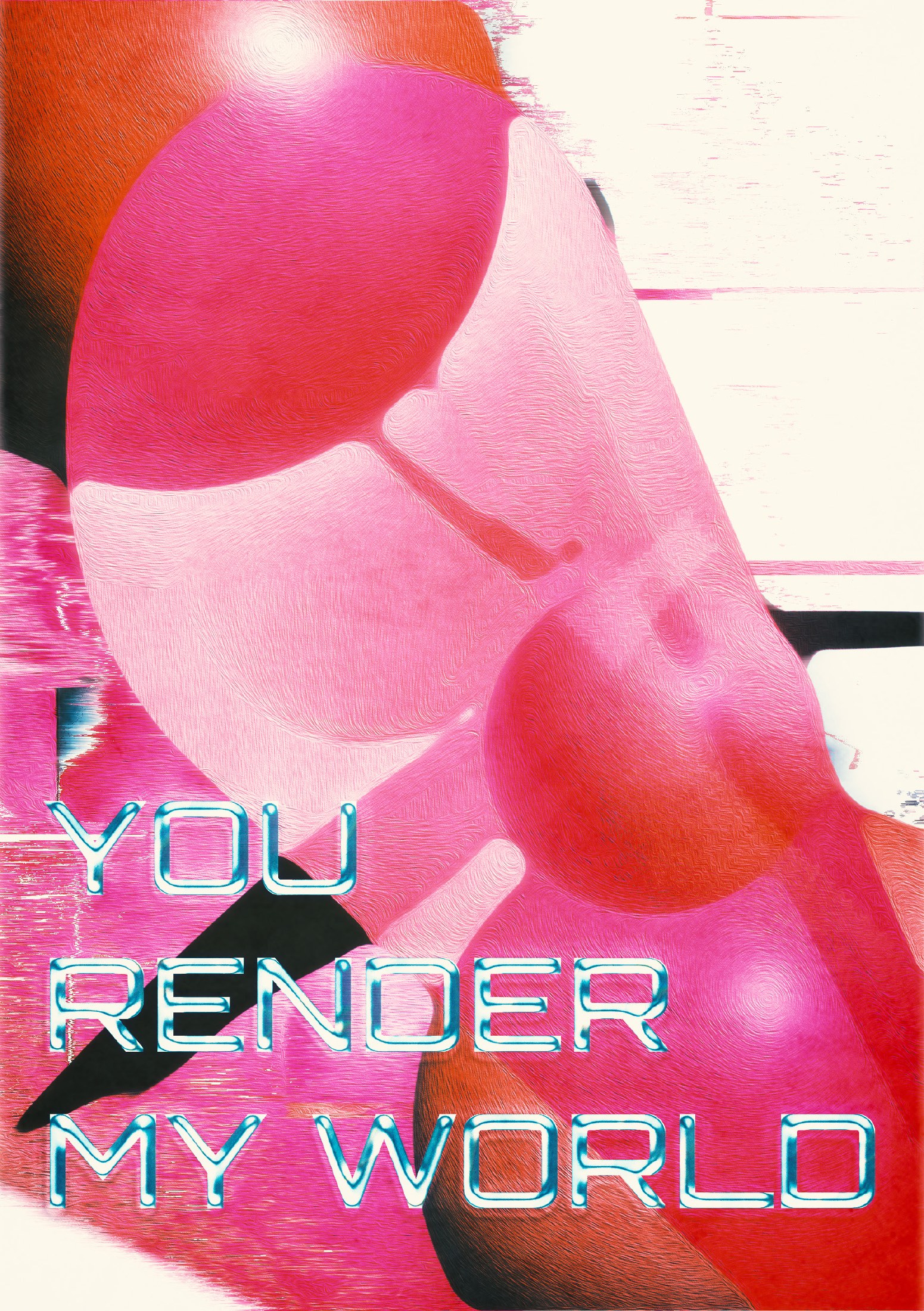
The full A5 Love set, assembled in InDesign — drag a corner or use the arrows to turn the pages.
This is a set of posters I made for my girlfriend in my free time, to surprise her for one of our Monthsaries which encompasses five different designs, and four different styles. Each style has it’s own theme and each theme has a sentence that goes hand in hand with the design.
Making-of
I made this entirely in Illustrator, Photoshop and to top it off I used InDesign to assemble the entire PDF together and put them in the correct order and made them available to print.
The first thing I did is think about what I wanted to do, my resolve for the surprise was to make her a few posters, at this point I still did not have in mind about what they were gonna be about nor what the sizing, colors, etc. After I took some inspiration on Dribbble, I came across a few Posters, with quite different and contrasting themes, namely;
Which sparked an idea in my mind and made me think, “It would be boring if all posters look the exact same, and all had the same colors/layout/theme, right?” and that’s when I thought, I will make multiple posters, specifically 5 (technically 4). I do not count the first page; the one with the QR code as a page, since it is more like a cover, like shown in the flip book above.
The first two (ignoring the QR code) are clearly digital. First one is a hyper-futuristic style poster that I made based on something I used to do years ago which is basically a form of title sequence or intro for YouTube channels that used to be popular around 2014-2016. It featured large texts, quite often accompanied by a lot of effects, and distortions applied to the name to display some sort of “power”?
Here is the Illustrator and Photoshop BTS of the first poster:
In Illustrator I used a few tools, but keeping it minimalist:

In Photoshop I just applied a Gradient Map layer with a custom gradient to achieve the colors that I wished to portray, mainly Teal & Orange because they are my favorite colors.

Invert because the gradient would apply the color orange where the blue now is, and I think orange for shadows and blue for highlights is not exactly easy on the eyes.
Color Lookup with a Photoshop default LUT to change the overall vibrancy of the image and adjust the colors even further, to achieve what I had in mind.
Curves layer to add the finishing touches.
Second one is a simple, stylish and cute design of a isometric 3D stylistic heart that I made, heavily inspired by Valve’s Aperture Lab entire aesthetic. It was by far the simplest and easiest to do, but it is also the sweetest in my opinion since the tagline,
Even if I had a hundred hearts,
you would fill them all
Takes the initial design based off of Valve’s replicating isometric work cubicle and gives the idea a twist, making a heartwarming quote that indicates, no matter who I am or how much I change, I would still fall in love for you.
Here is the Illustrator and Photoshop BTS of the second poster:
This time in Illustrator I used even less tools:

In Photoshop I added the background since I exported in Illustrator just the assets,

Followed by a Color Lookup with a Photoshop default LUT to change the coloring and style.
That’s it, simple huh?
The third and fourth poster have a totally different and contrasting theme, and here is went for different eras too, this third poster is inspired by SGI, and those early eerie but atmospheric looking 3D graphics commonly used in the late 1990s that show a very early moment in the history of 3D graphics, I also watched a documentary at the time about one of those computers and how it worked, so I felt inspired by it. I wanted to imitate the art style, but done with modern tools, of course.
Here is the Illustrator and Photoshop BTS of the third poster:
The tools used in Illustrator:

In Photoshop I made a background layer by copying the main exported design from Illustrator, applying a displacement layer, the displacement layer is just a photo of a wall I took on the street, the rest of the design involves:

Oil paint effect, wind effect applied to the background to give it that classic look as if it was part of an old poorly textured render, with a pinch of “real” texturing (the wind effect), a final touch of color lookup with a default Photoshop LUT to match the colors of the design.
The main design ported out of Illustrator received the same oil paint treatment and also the effect median to average out the sharp corners that the design exported as, and make it blend more, also adapt to a shape that would be easier to render for a computer from the era, a posterize effect to finish off the main subject.
The final touches; I copied the main subject, masked the top area, used “lighter color” blending option, and used the same effects as before, for the most part, added mosaic to pixelate it and noise to make it actually different and give the final subject a shine.
The text font I used is Orbitron and it plays a major role in defining the entire poster’s personality and outcome. The text is decorated within Photoshop with a Bevel & Emboss, Pattern Overlay, Outer Glow, Drop Shadow to make that 3D exaggerated look.
A simple combination of Gradient Map, Curves, Color Lookup, Vibrance and a white texture layer which is actually a photo of a wooden table, with an Inner Glow effect applied with the Overlay effect applied, with a lowered opacity created the perfect color design and a touch of glow/haze.
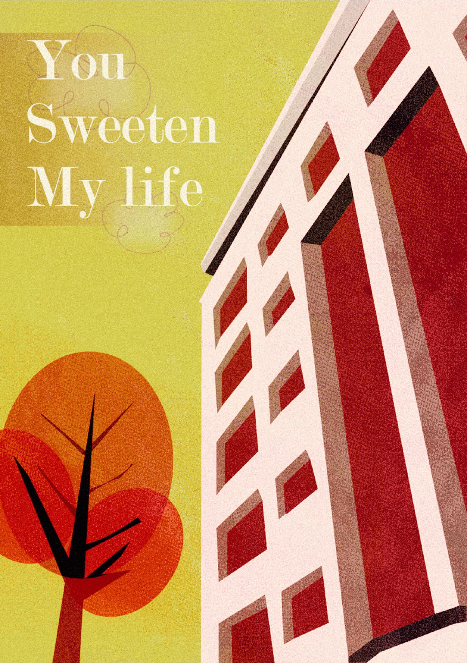
Fourth, last, but not least, a poster inspired heavily by Powerpuff Girls, I used to love this series as a child and now that I am able to design myself, I said to myself once, “I should try their style.” I really love how unique their style is, my main inspiration is this collage of images I found online.

I took pictures outside at night, at day, till I found one neighbourhood that suited the exact idea I wanted to replicate, an apartment building face that was seen from a low angle, like street photography.
After I was done photographing the building I imported it into Illustrator and started using the Pen tool to map out the entire building and making it a vector, separating each detail like shadows, highlights and windows from each other, ended up with this vector art.
The tree on the left side as well as the clouds are also drawn by me, took me a couple of tries but I ended up with a tree and clouds that resembled heavily those from the Powerpuff series, added the text “You sweeten my life”; completing the quartet of love related quotes that the posters follow. Then proceeded to export it to Photoshop.
Here is the Illustrator and Photoshop BTS of the fourth poster:
The tools used in Illustrator to create this vector art:

Photoshop is where all the magic happened, although it was not that long of a process.

First thing I did was add noise as soon as I opened the exported vector art, why? Because noise is what made the old films so nostalgic and so pure, because back then we did not have the sharpest nor the best video quality, be it scan lines, added CRT noise, it all just added imperfections which made the old stuff better.
After that I duplicated the same vector art, used a Halftone effect on it, I tinkered around till I found the perfect match, and displaced it with a photo I took of the ground in real life. This adds that paper-comic like texture to the whole thing.
Followed by not one but two Gradient Maps that brightened and exposed the picture even more, like the old Powerpuff series where everything was so bright and lively. A vibrance filter that fixes the colors and makes them slightly more fake-HDR like and the last Color Lookup that tones down the contrast a bit and makes the colors not too overexposed. And that’s it! There’s the four posters! Yay!
Here is an example of them hung on a wall in real life:

Thank you for reading 🙂