


This is a recent school project where we had to imagine from scratch a new product for the company “Drank Fabriek” who makes a series of drinks, we had to think of a concept based on a multi choice given by our professors, to create a drink that is either a Beer, Wine, Soda or Energy drink. I chose an Energy drink. My idea was to make a drink that inspired gamers, the new generation and provided a fresh competition in the current market of drinks.
The brainstorming started, I thought of so many different possibilities and yet the best one was probably the first one I thought of, I wanted to do a soda meant for scientists, a beer inspired by James Bond, and ended up with an energy drink for gamers, I know, quite the generic approach but I genuinely wanted a cyberpunk-esque drink in today’s market. All the energy drinks are trying to look ‘cool’ and ‘sporty’ even, but mine reeks of gamer, it’s so gamer in fact that it’s even a bit cringe. But I love it, It’s my baby, it’s my creation and yes I USED AI.
AI rant
I am not an illustrator and no I will not pick up a pencil I have a massive skill issue drawing but! I respect artists and this is not a professional project, I strive to use current technology, and while I would never use AI to this level for a professional product, I think at this level, it’s perfectly acceptable and artists do have a point for publicly executing someone for using AI, I agree, I still think it’s okay for non-commercial stuff.
This is a handout for the second phase (final phase) of the project with a bit of a summary, and showing everything in detail and explaining it too.
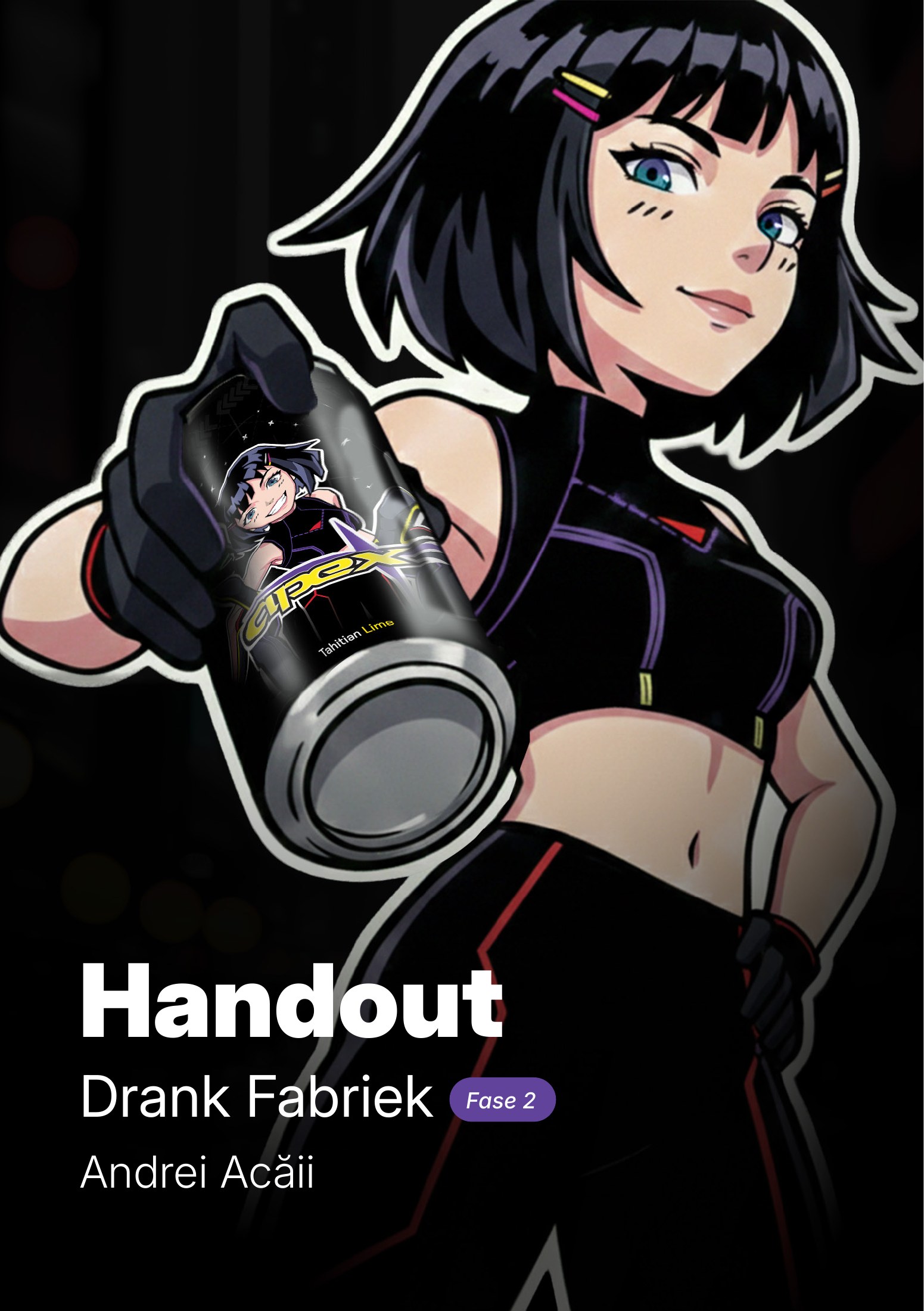
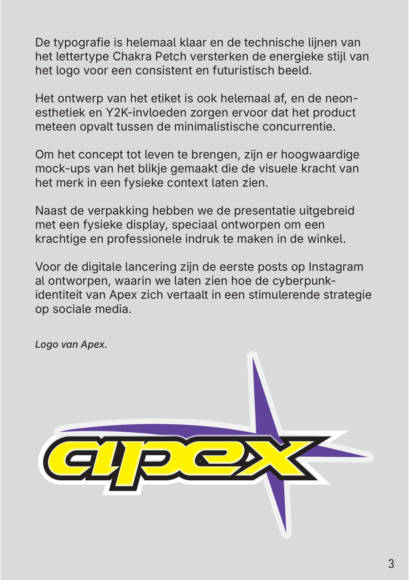
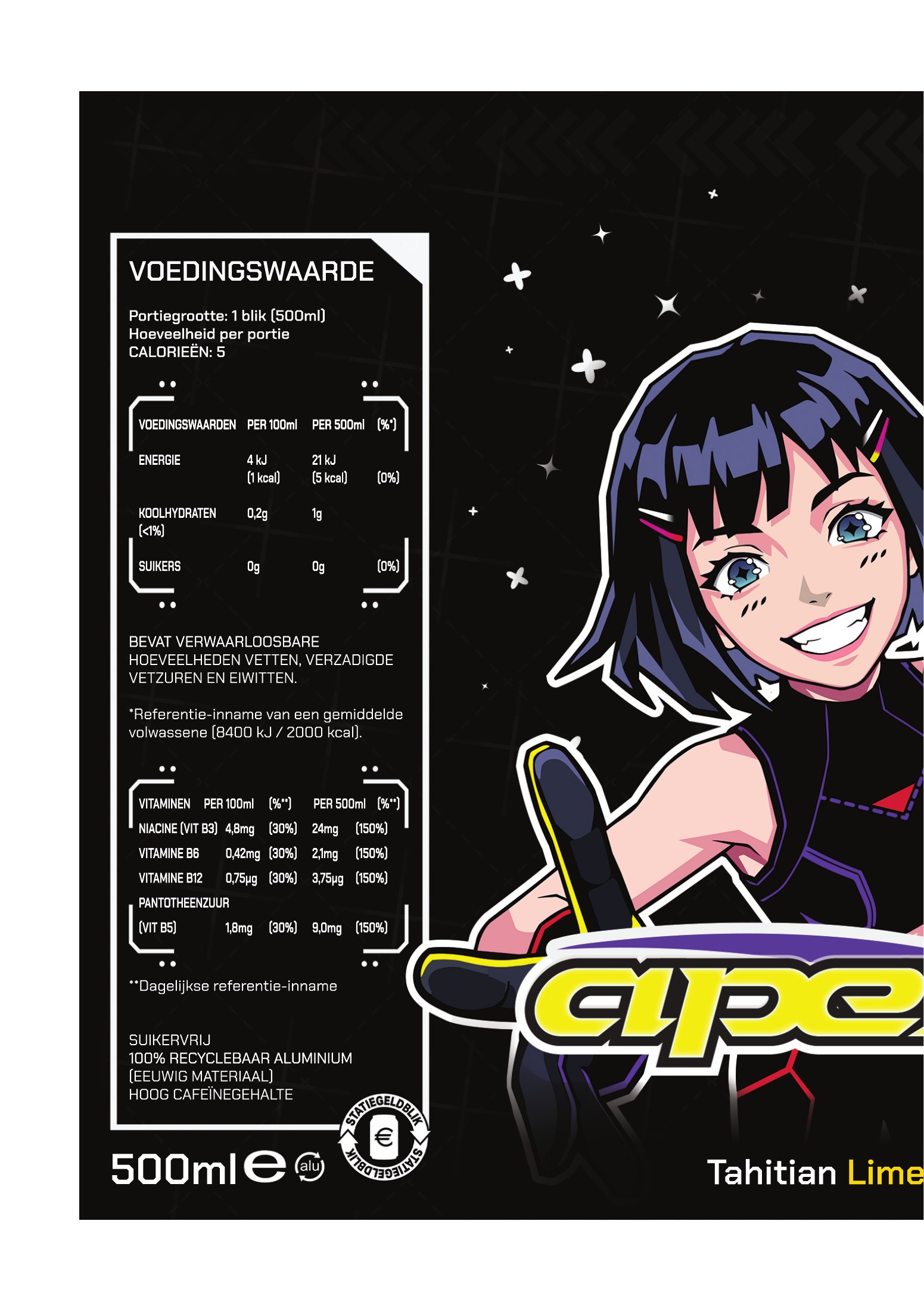
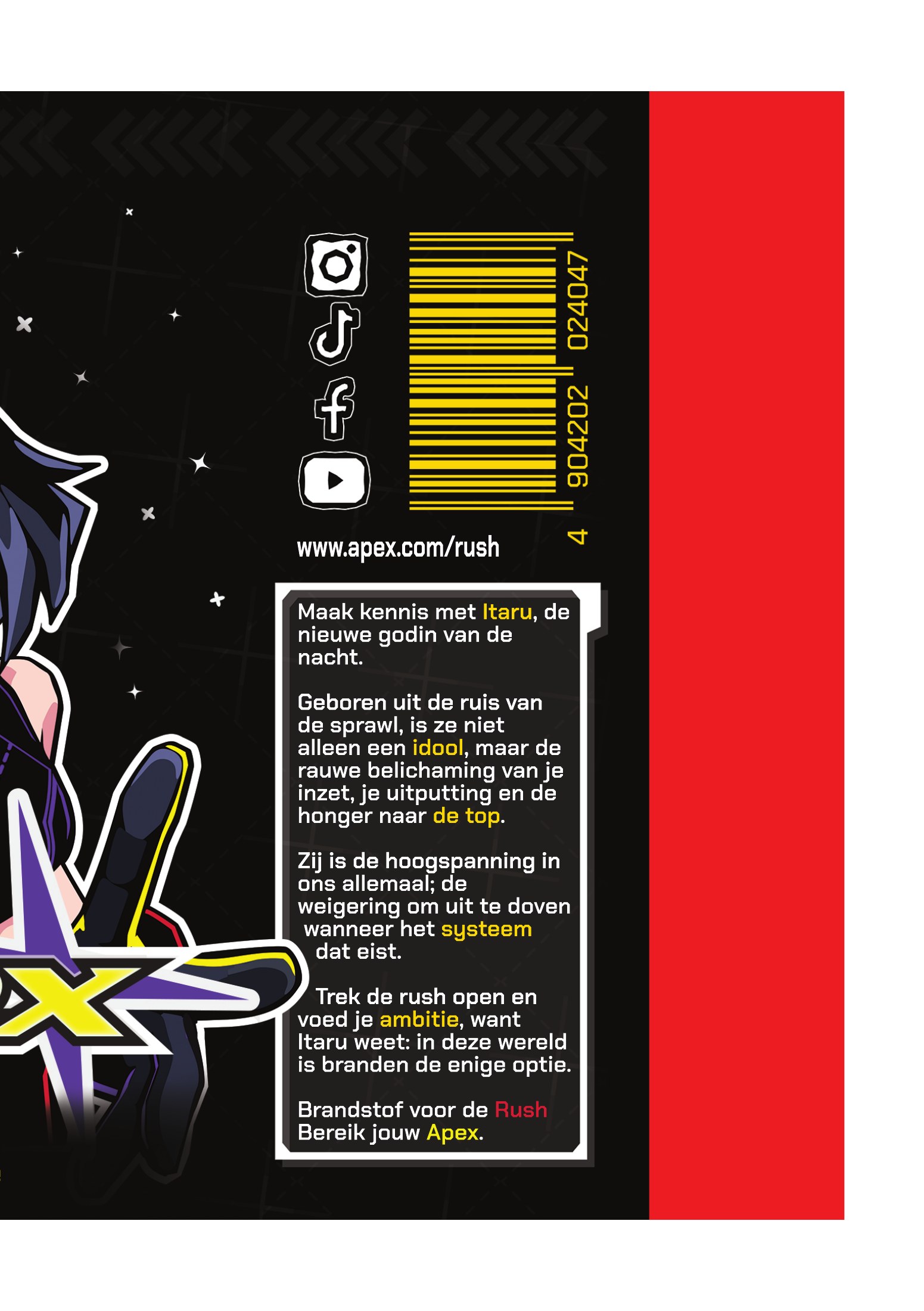
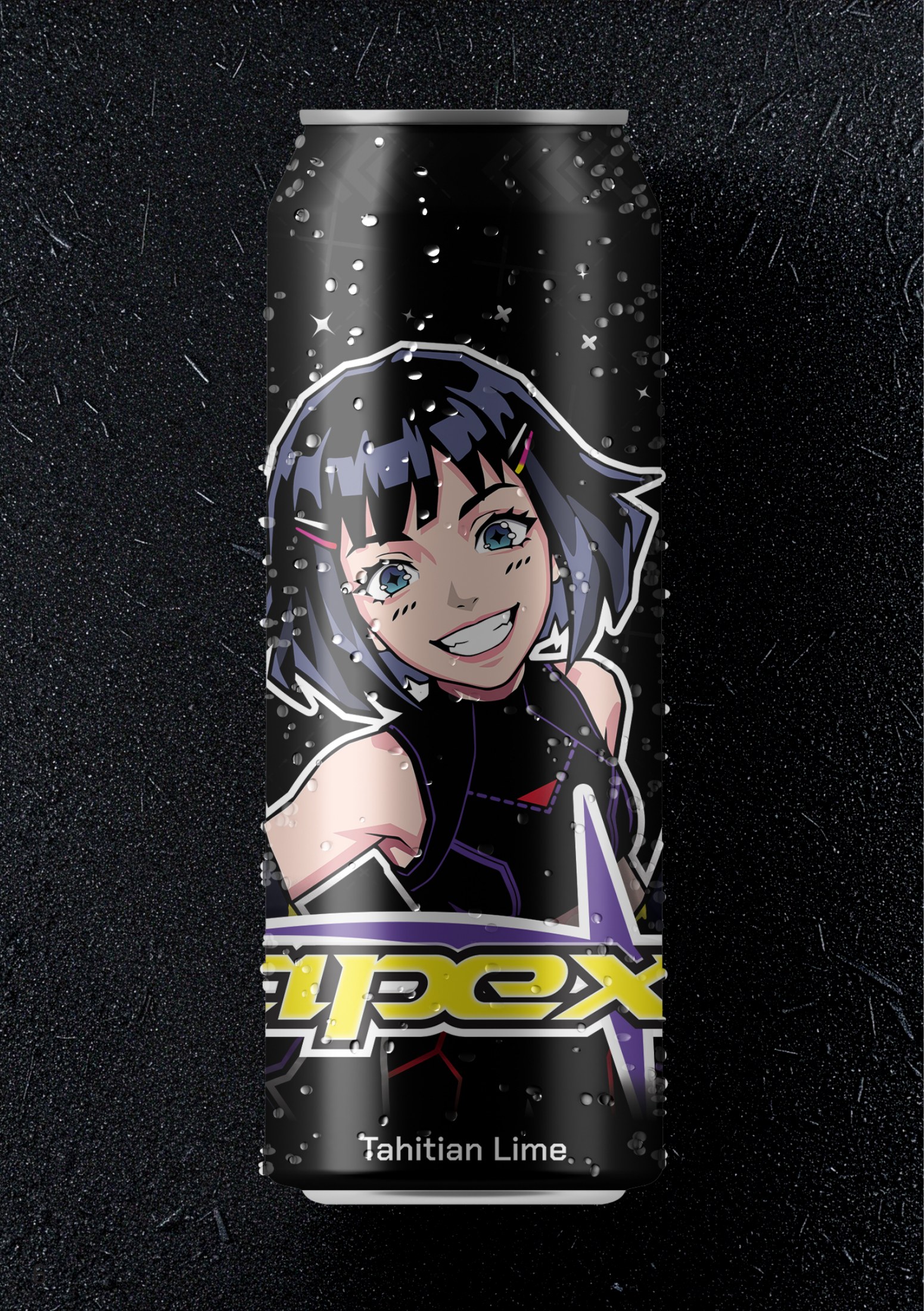
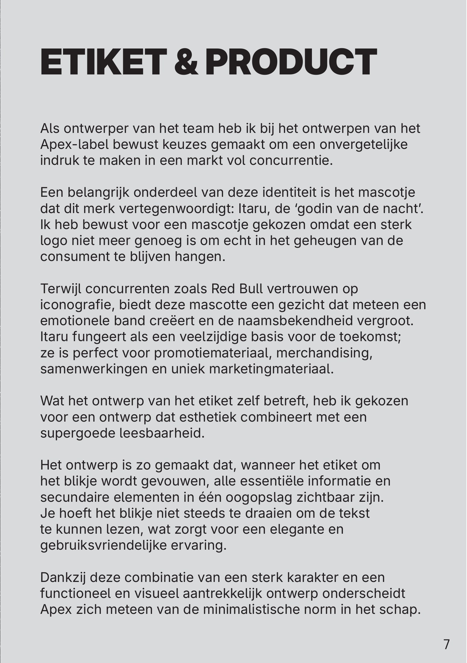
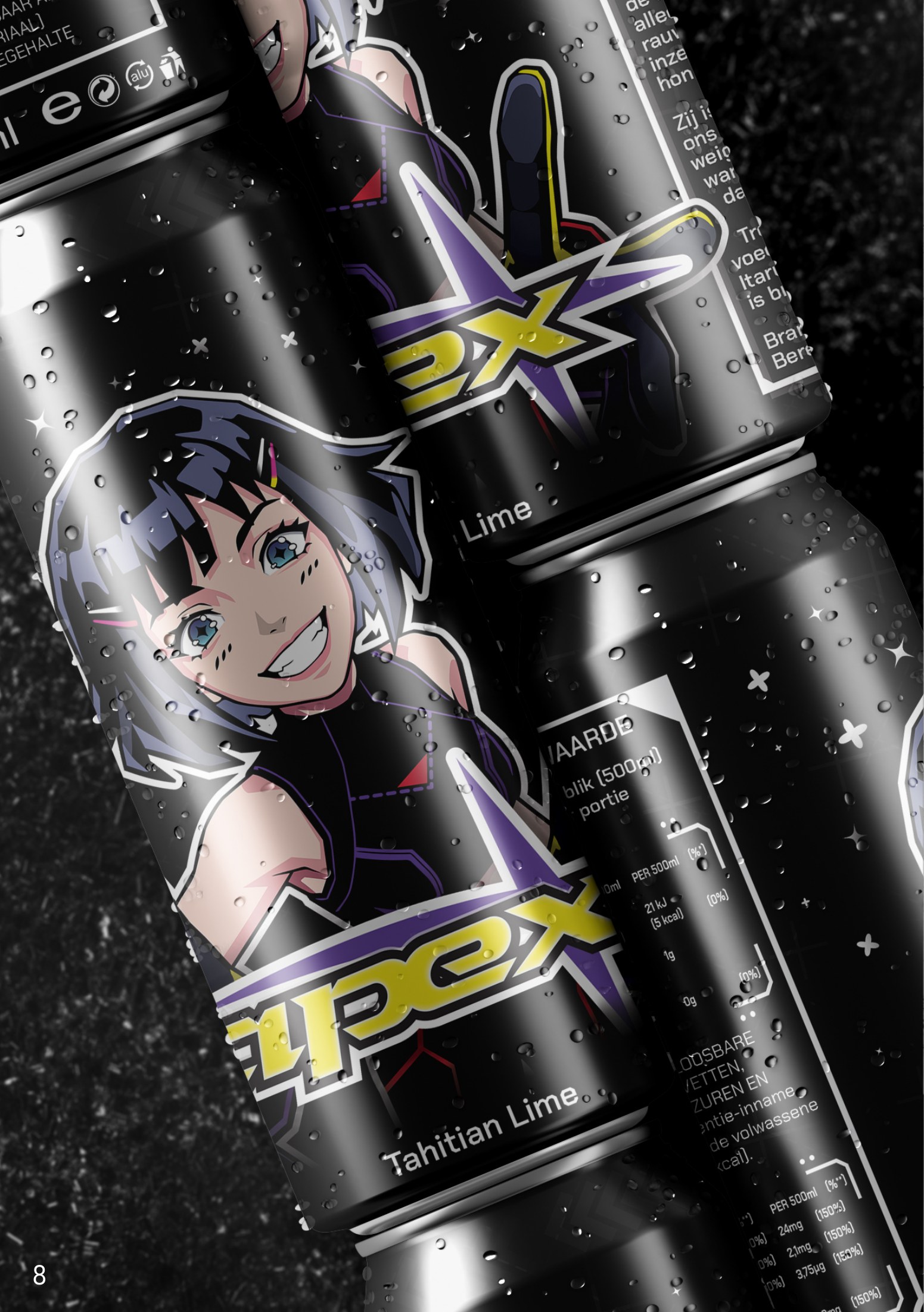
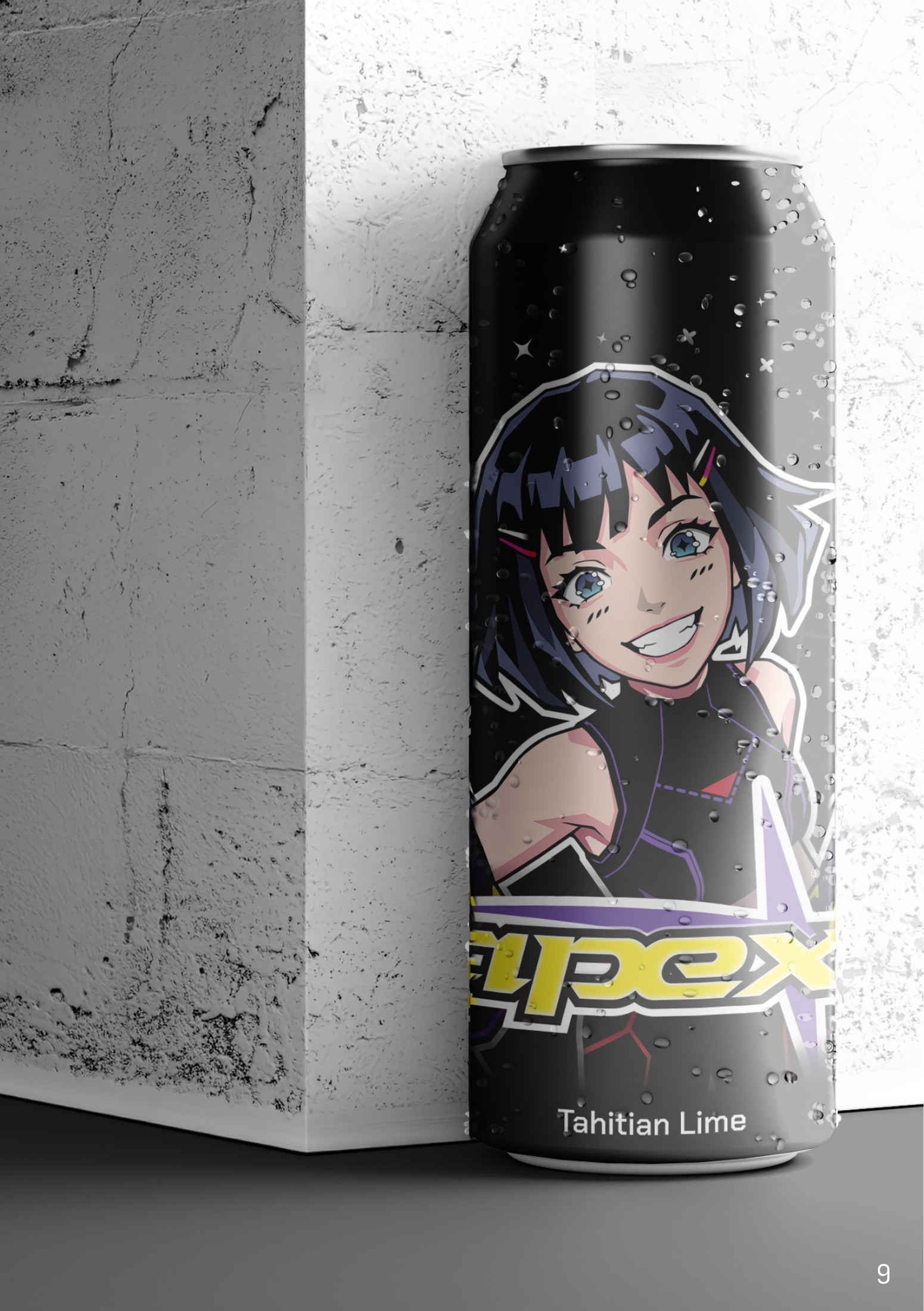
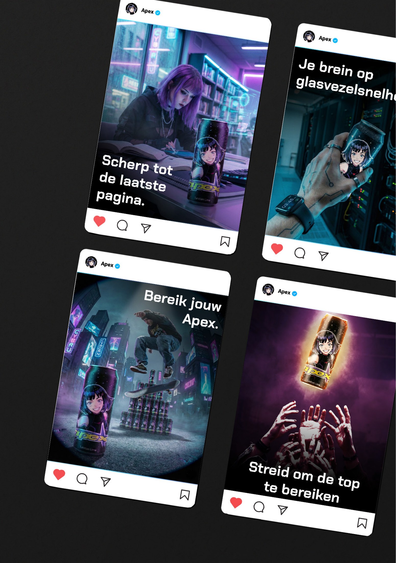
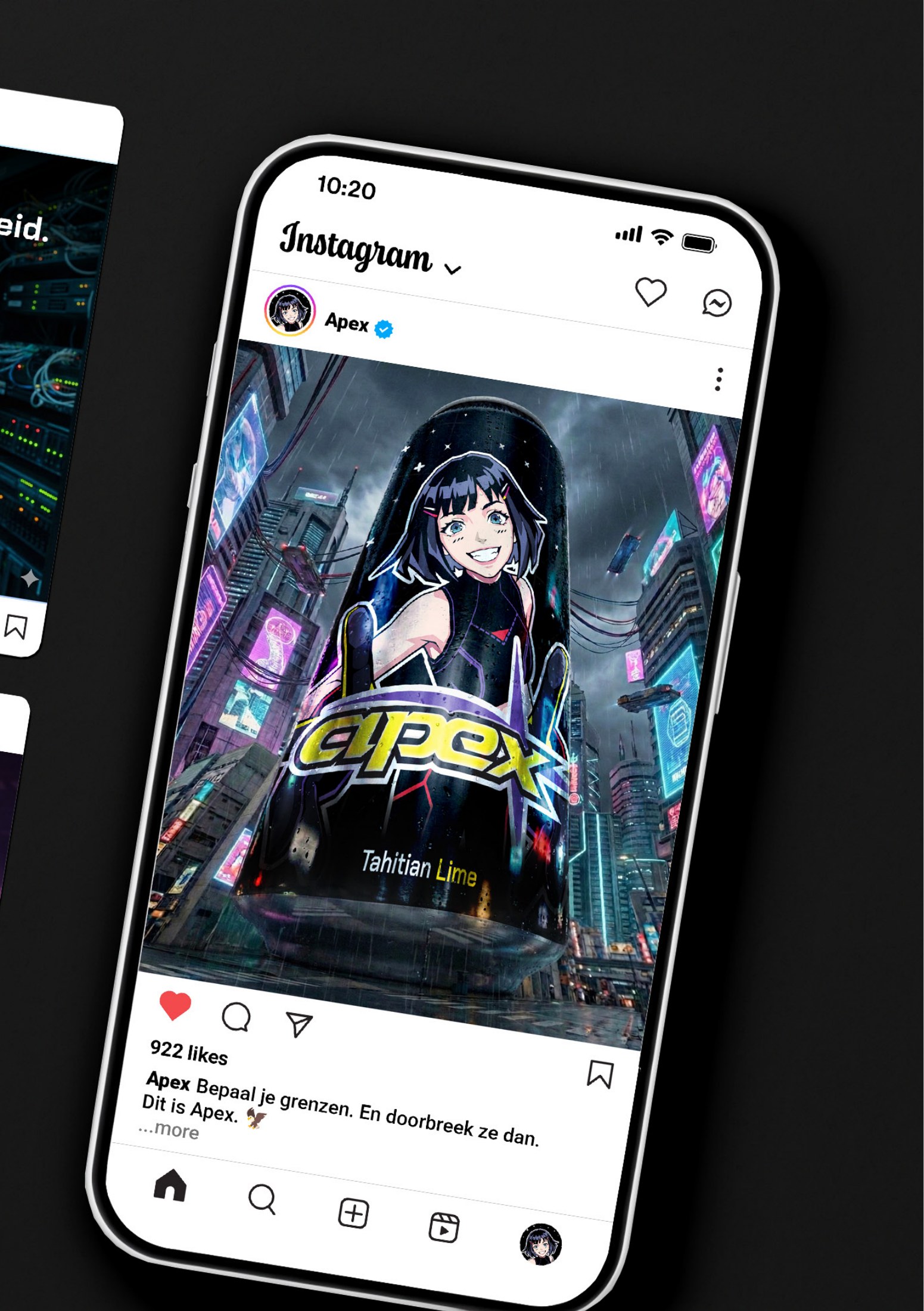
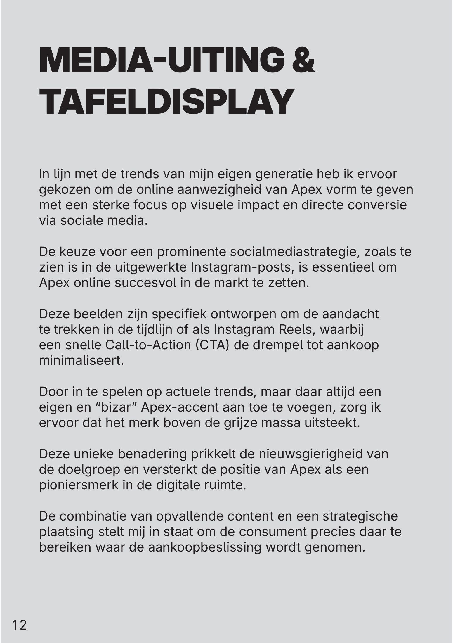
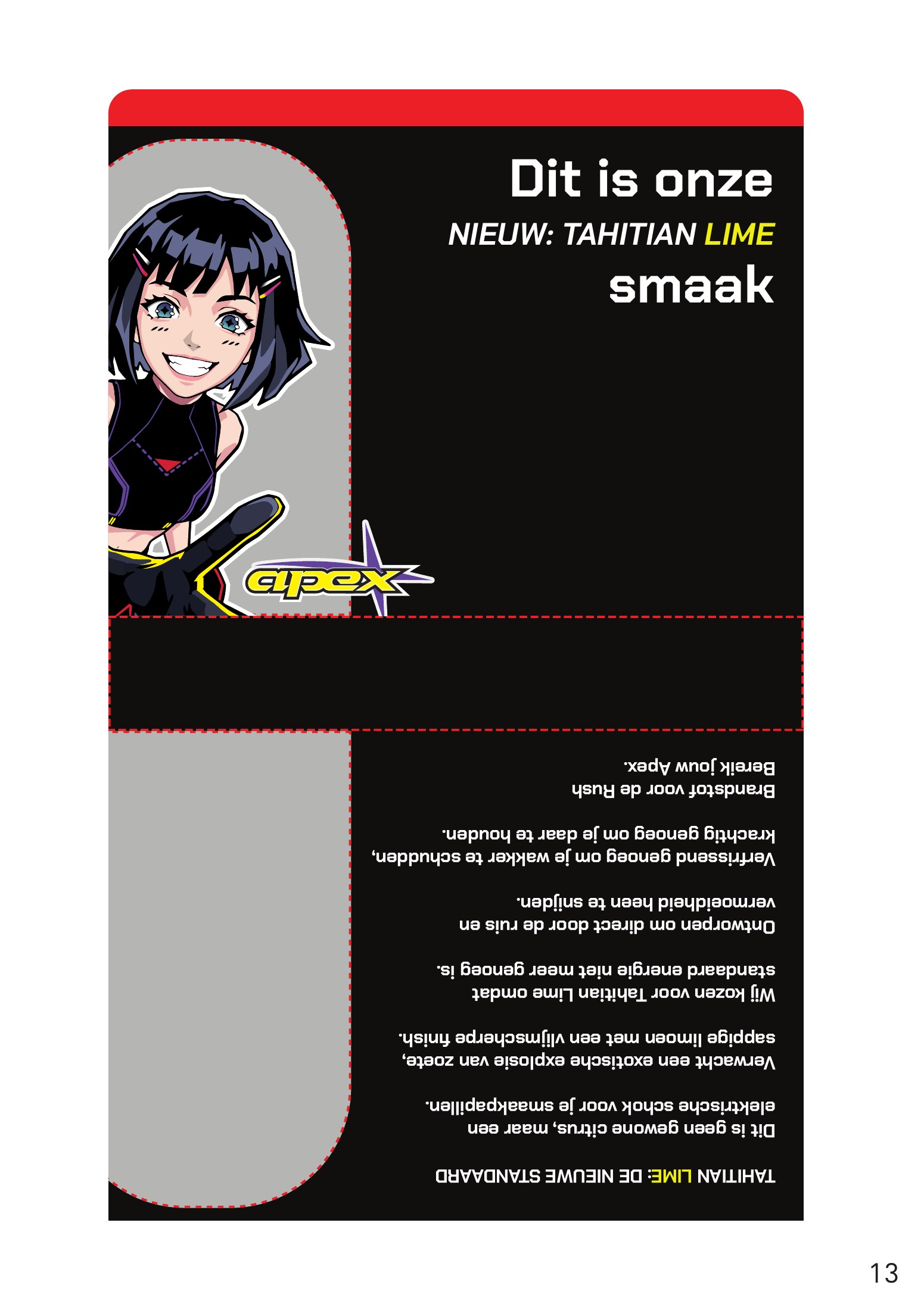
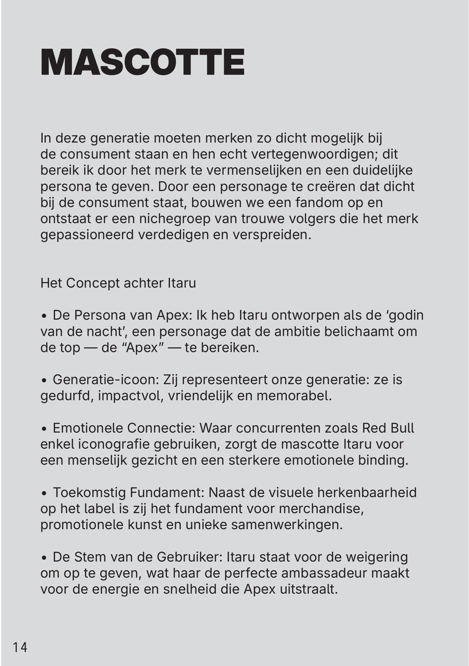
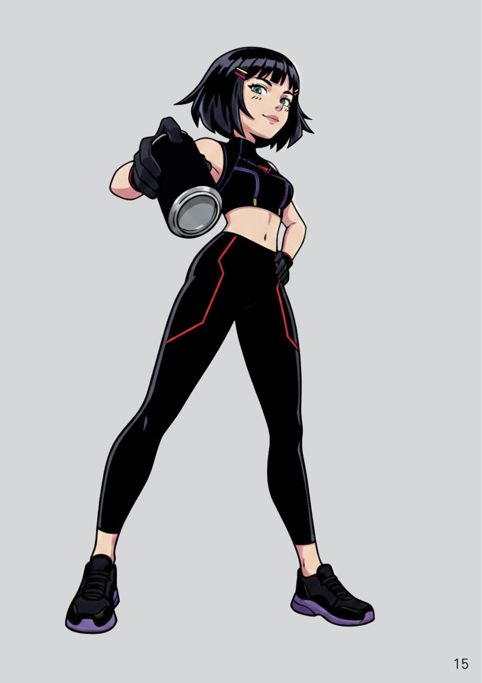
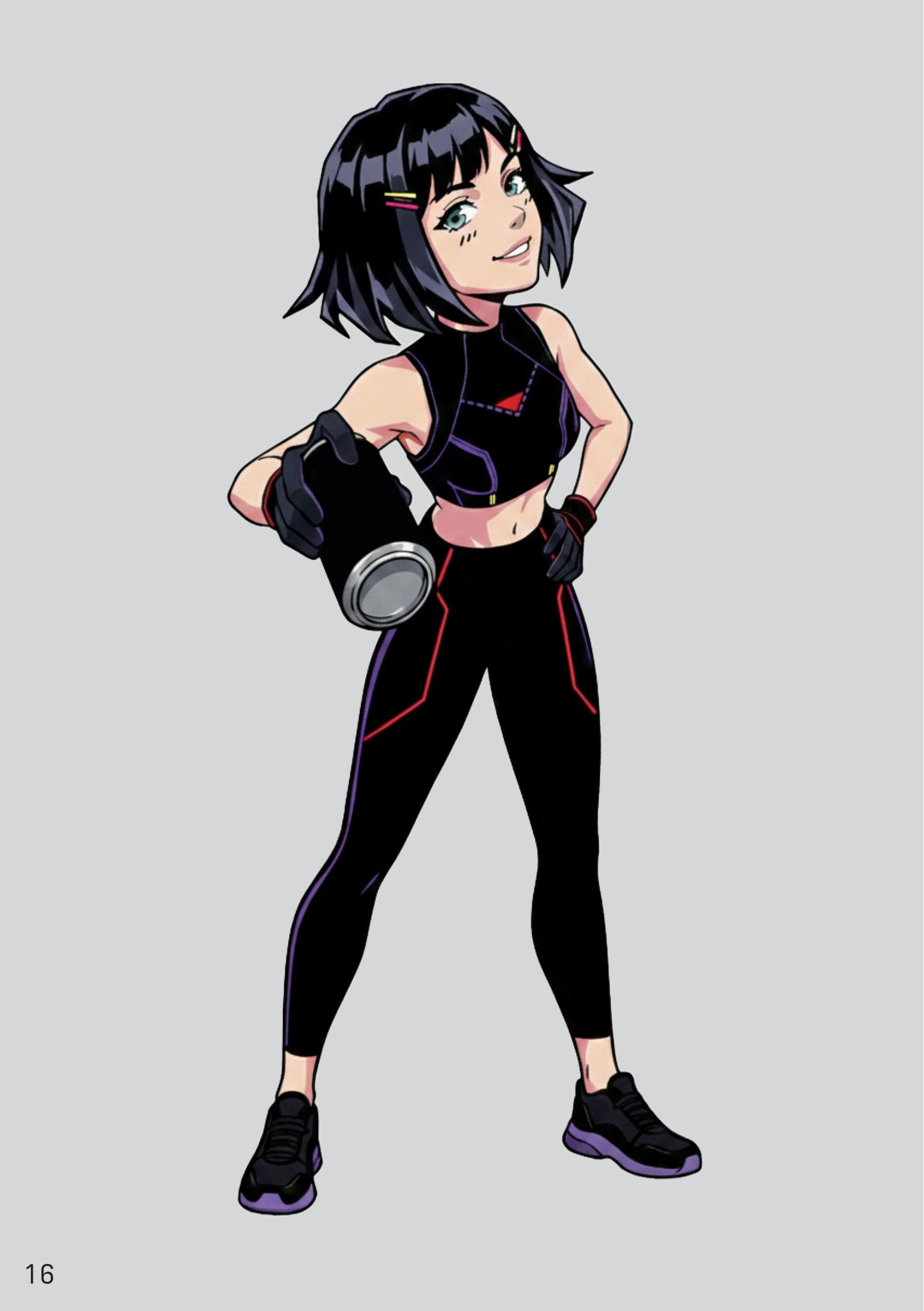
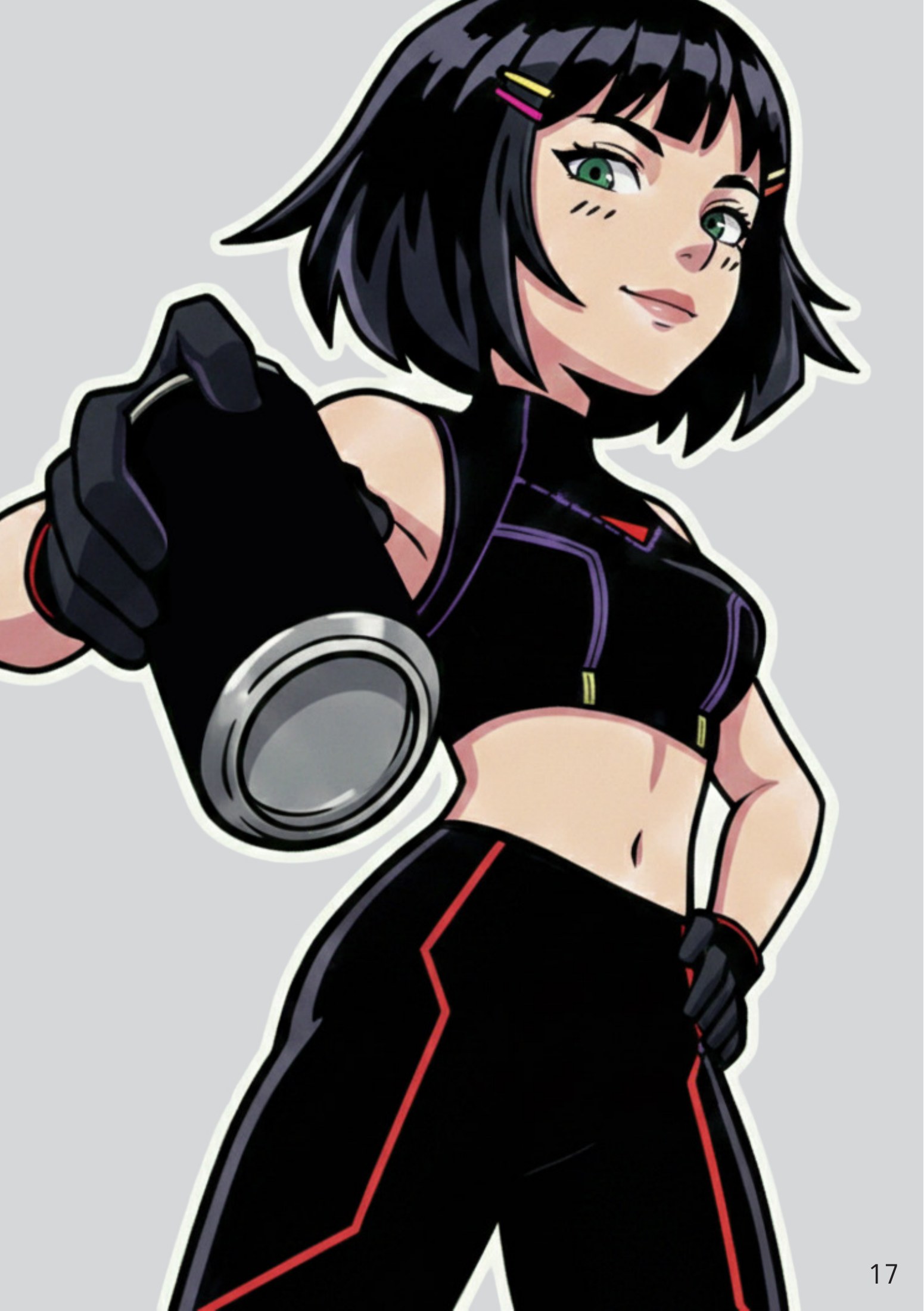
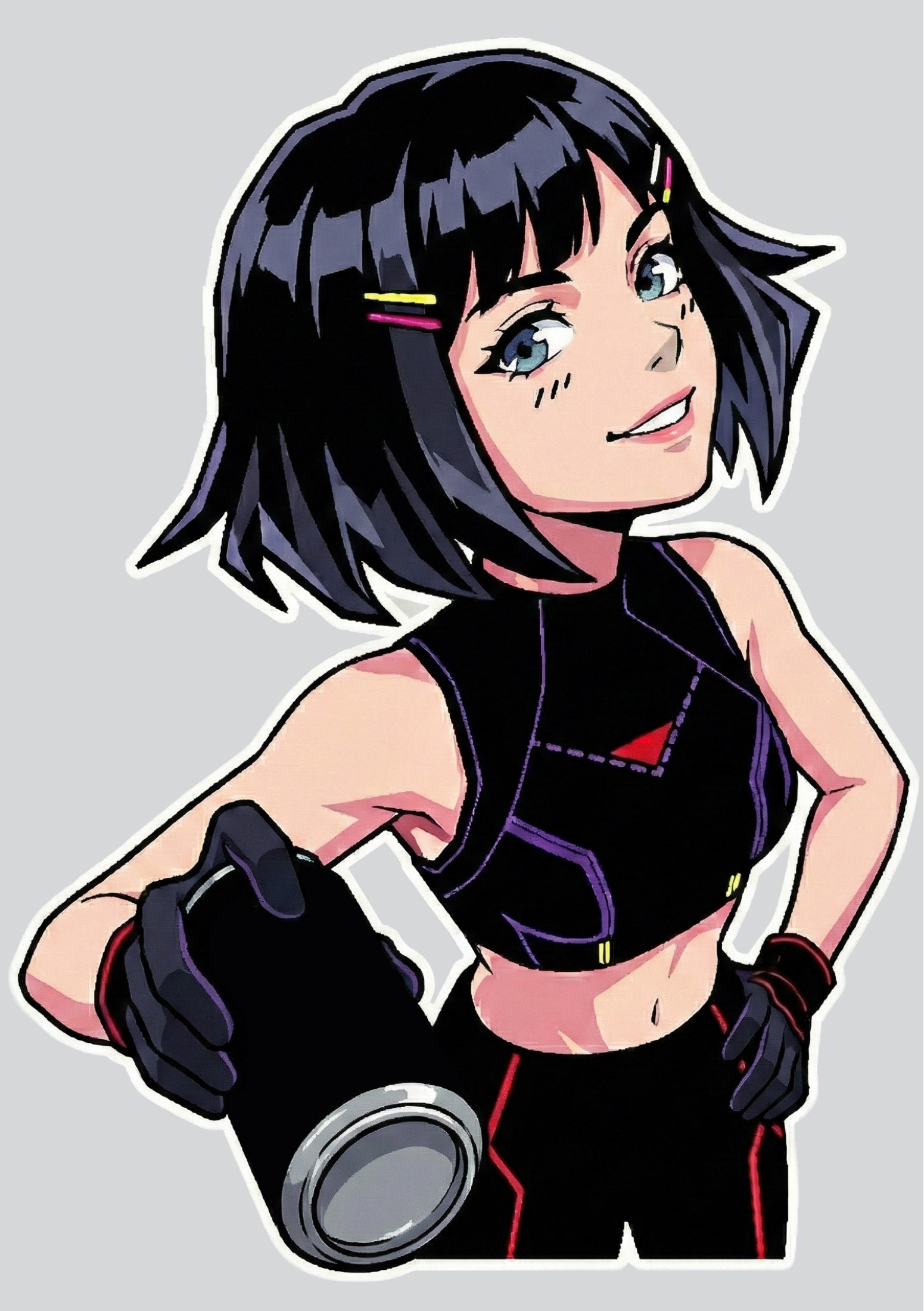
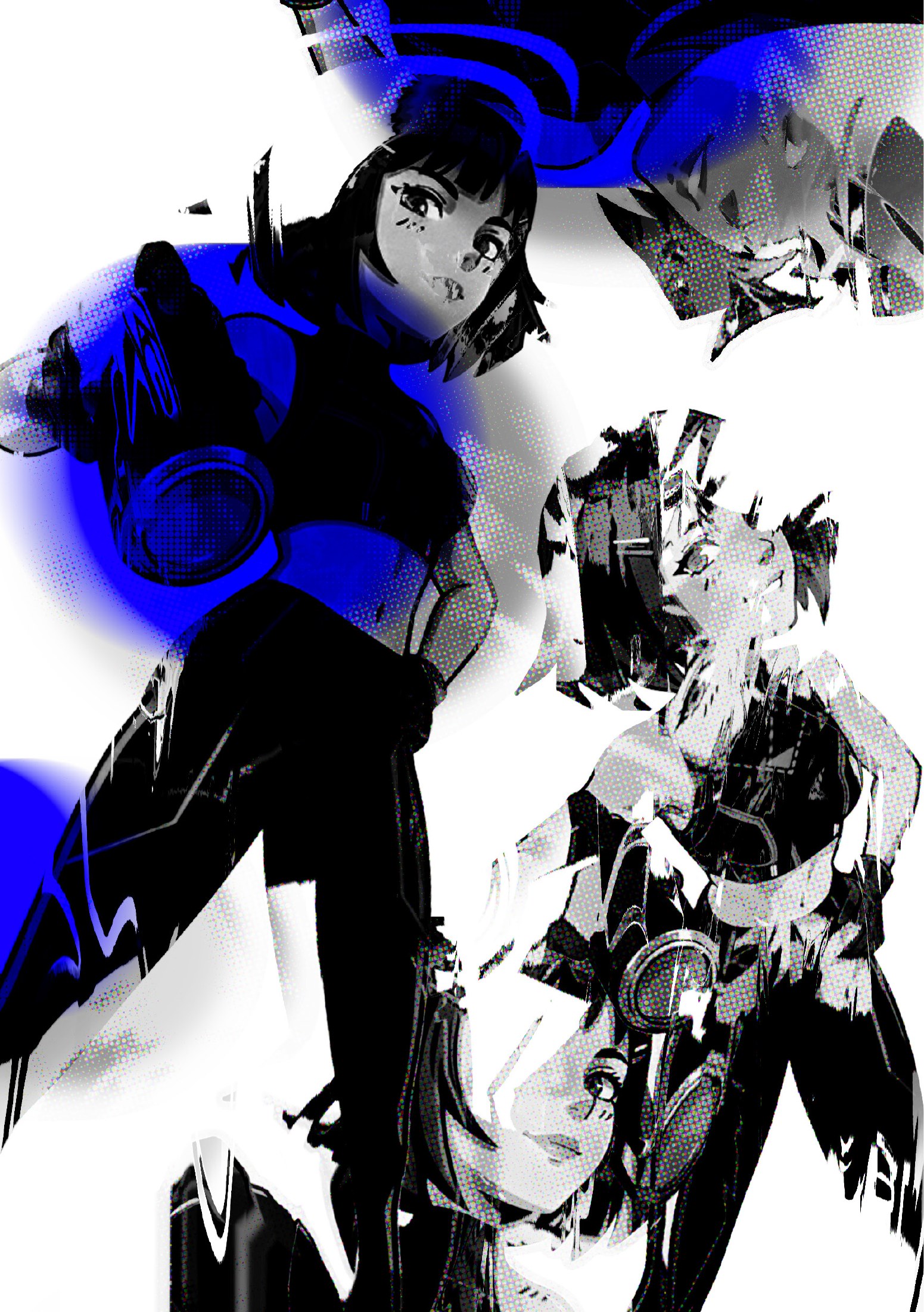
The full phase 2 handout, drag a corner or use the arrows to turn the pages.
- Step 1 of 9
Strategy first
So for Phase 1 of this project, I really had to nail down the strategy before I could even think about the fun design stuff.
- Step 2 of 9
The Golden Circle
For this phase, I relied heavily on the Golden Circle framework. I was basically figuring out the Why, How, and What for these two brands because they are total opposites. First up is Apex, which is my Lemon Cyberpunk energy drink. The Why here was all about sparking curiosity and giving people that high energy, futuristic vibe with a cool ass mascot
- Step 3 of 9
Audience & positioning
I wanted to target people who think normal lemon drinks are boring lol, so the How was creating a soft taste citrus profile and using a chaotic, neon Y2K aesthetic to cause some visual disruption. Then there is Vessel, which is basically the clean girl of beverages. It’s a premium, zero additive fruit drink that’s all about purity and Precision Engineering.
- Step 4 of 9
Visual direction
For Vessel, I went with an aesthetic scientific look, even using an Element Table system for the flavors like Pg or Sb, Bn, Pr… (Pomegranate, Strawberry, Banana, Pear..) because it makes the consumer feel like a body optimizer who actually knows what they’re drinking. To get the visual direction right, I put together two completely different moodboards. I made one that is all Neon Shadows and tech heavy for Apex, and one that is clinical and minimalist for Vessel.
- Step 5 of 9
Market reality check
I also had to look into the actual Dutch market stuff, like the sugar tax increase and the statiegeld rules, to make sure my babies could actually survive in a real store but seems like only one could 💀
- Step 6 of 9
First logo iterations
I finished the phase by creating the first logo iterations in black and white for both brands, making sure they looked just as good on a screen as they would on a can or a bottle. It was a lot of work to jump between these two different worlds, but it really set the stage for the design phase and made sure I wasn’t just making things look pretty without a reason.
- Step 7 of 9
Finding Apex
After the logos I kept working on Apex. I came to it inspired by Sonic and the Y2K look, and that became the base of its visual language.
- Step 8 of 9
Developing the character
Following some more market research, I developed a mascot character for the brand.
- Step 9 of 9
It all clicks
Once the character was done, the whole thing snapped together in my head: it should be cyberpunk-ish. That is how I finished the project.