
This is my most recent school project: a complete visual identity and brandbook for Gilde DevOps Solutions, the ICT learning environment where students work like real engineers on real assignments, with their teachers acting as Product Owner. The client (their own words: #hetechtewerk) wanted something that looks like the industry it prepares you for, instead of a school.
The brief was a bridge. The identity had to connect Software Development and DevOps, feel industrial and technological, yet stay modern and approachable without the “hackery” look. So I went brutalist and systematic, borrowing from terminals, old BIOS screens and the minimal bitmap language of early system interfaces.


- Step 1 of 4
The brief
I started with a debriefing letter to the client to confirm what they wanted: a logo based on the infinity sign that still works at favicon size, a colour palette that fits the Gilde house style with an accent of its own, and a digital brandbook that makes the whole thing easy to apply for anyone, whoever is making the material.
- Step 2 of 4
Concept and brand image
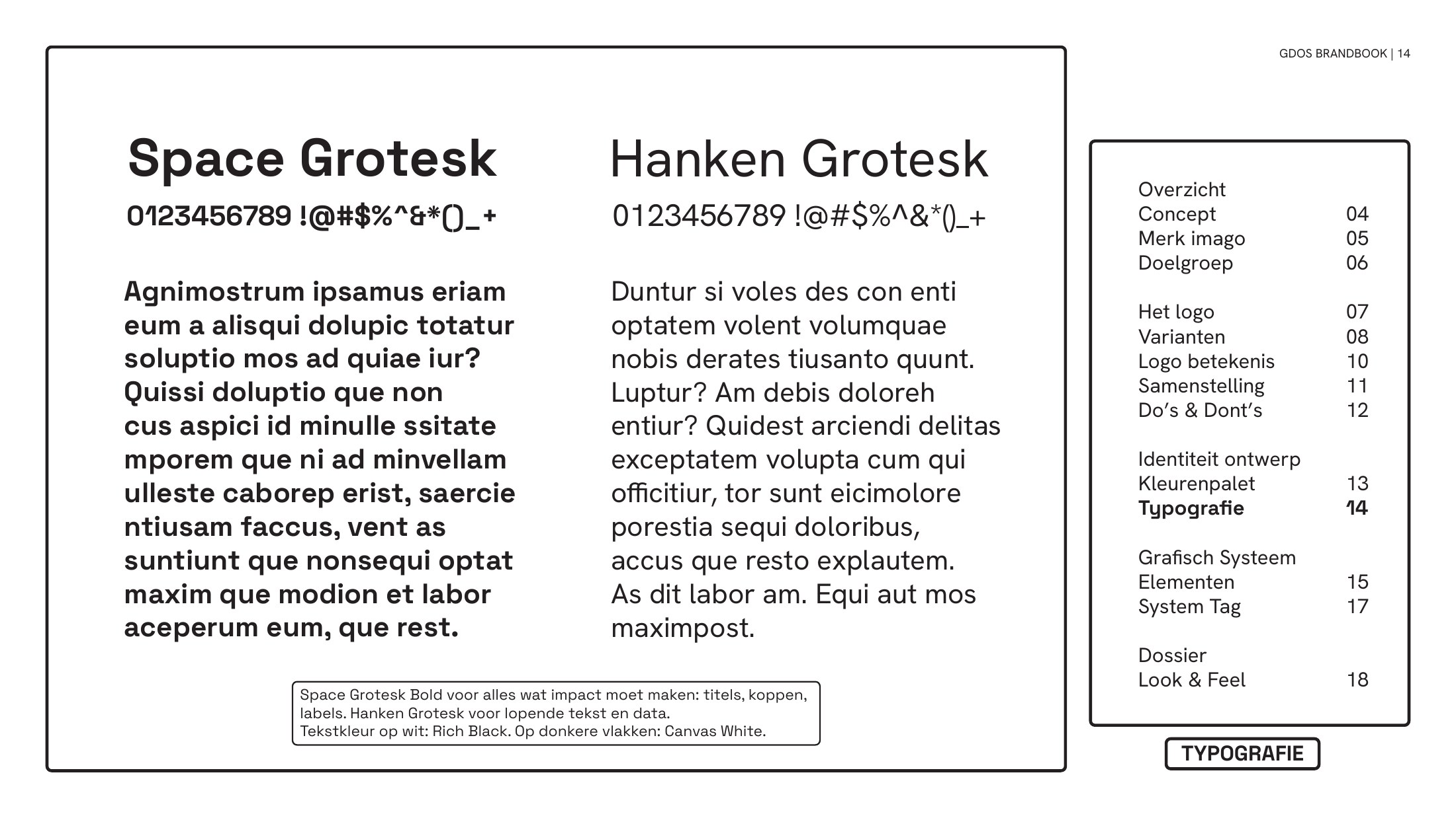
The concept is a triple-tone systems identity for cloud-native architecture. Three pillars, Infrastructure, Engineering and Deployment, translated into three flat, fully saturated colours. Every element has a function. Nothing is decorative, just like in a real system. Typography is split by role: Space Grotesk for the loud, experience-driven parts, Hanken Grotesk for the data.
- Step 3 of 4
The logo
“gdos” is short for Gilde DevOps Solutions, and the client was already using that name, for example in the URL of their website. The mark puts it inside a rounded rectangular frame, a nod to a terminal window or a UI button. The “d” and the “o” form one continuous line that reads as the infinity sign, tying it straight into the DevOps cycle. It comes in colour and black-and-white, with or without the frame.
- Step 4 of 4
Colour and type
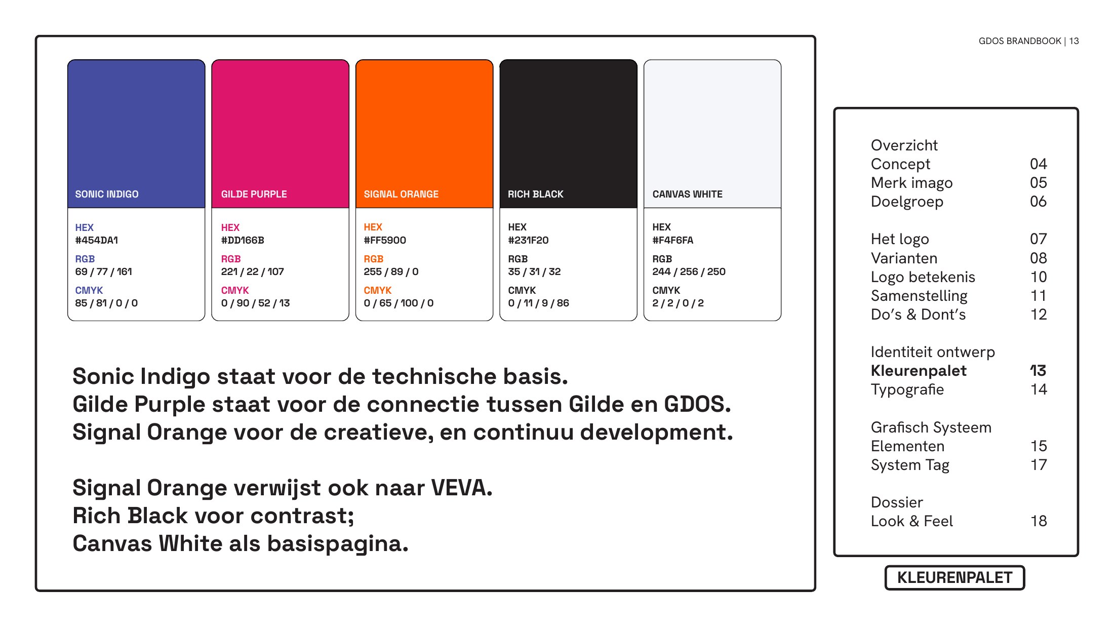
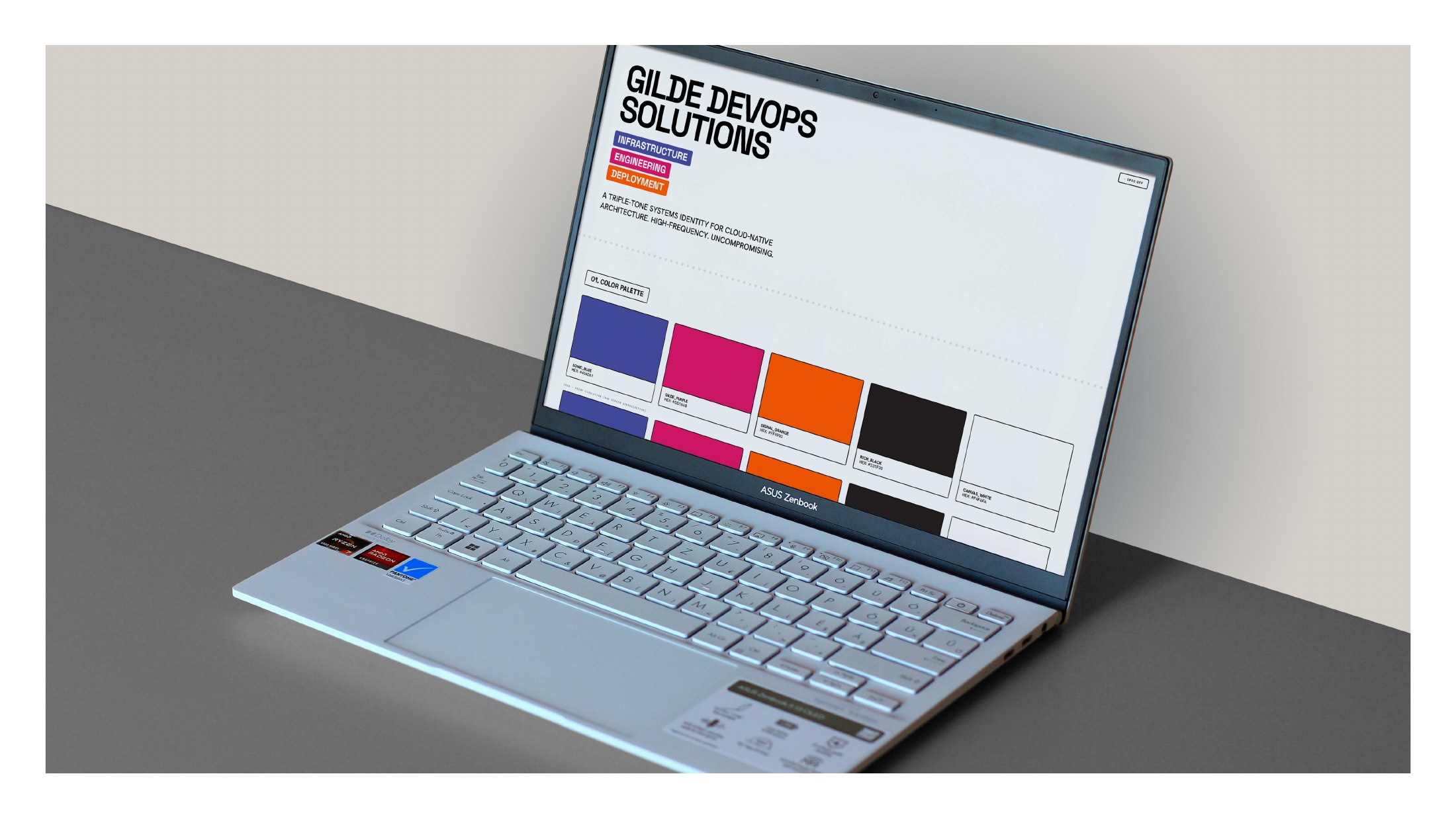
Sonic Indigo for the technical base. Gilde Purple for the connection between Gilde and gdos. Signal Orange for the creative and continuous development. Rich Black for contrast and Canvas White as the page. Colours are always flat and saturated: no gradients, no transparency.
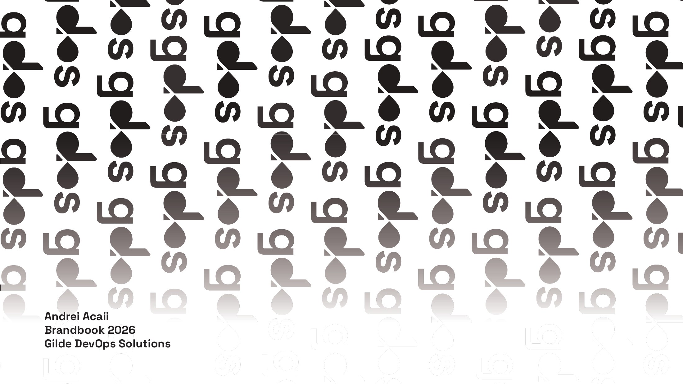
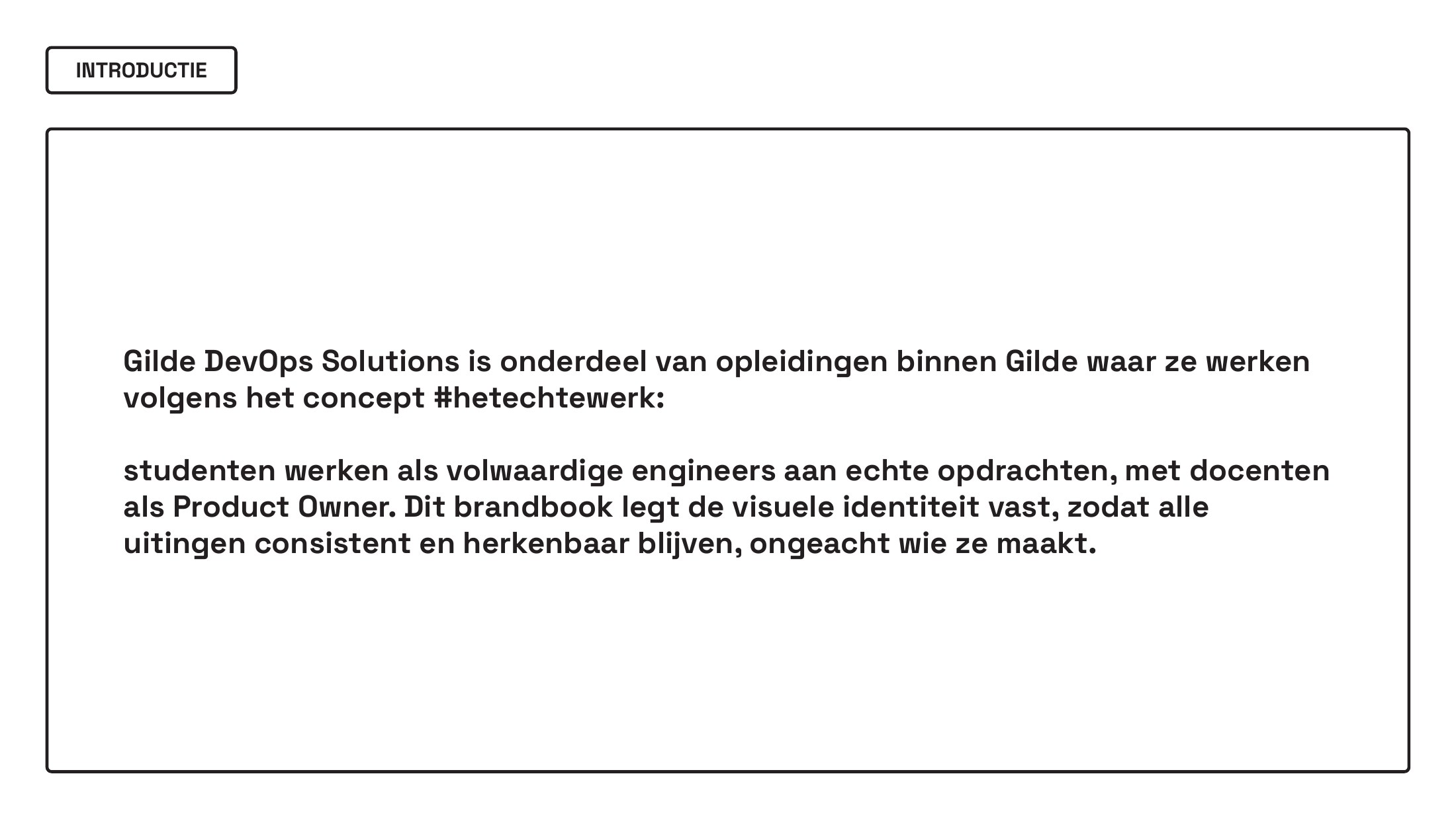
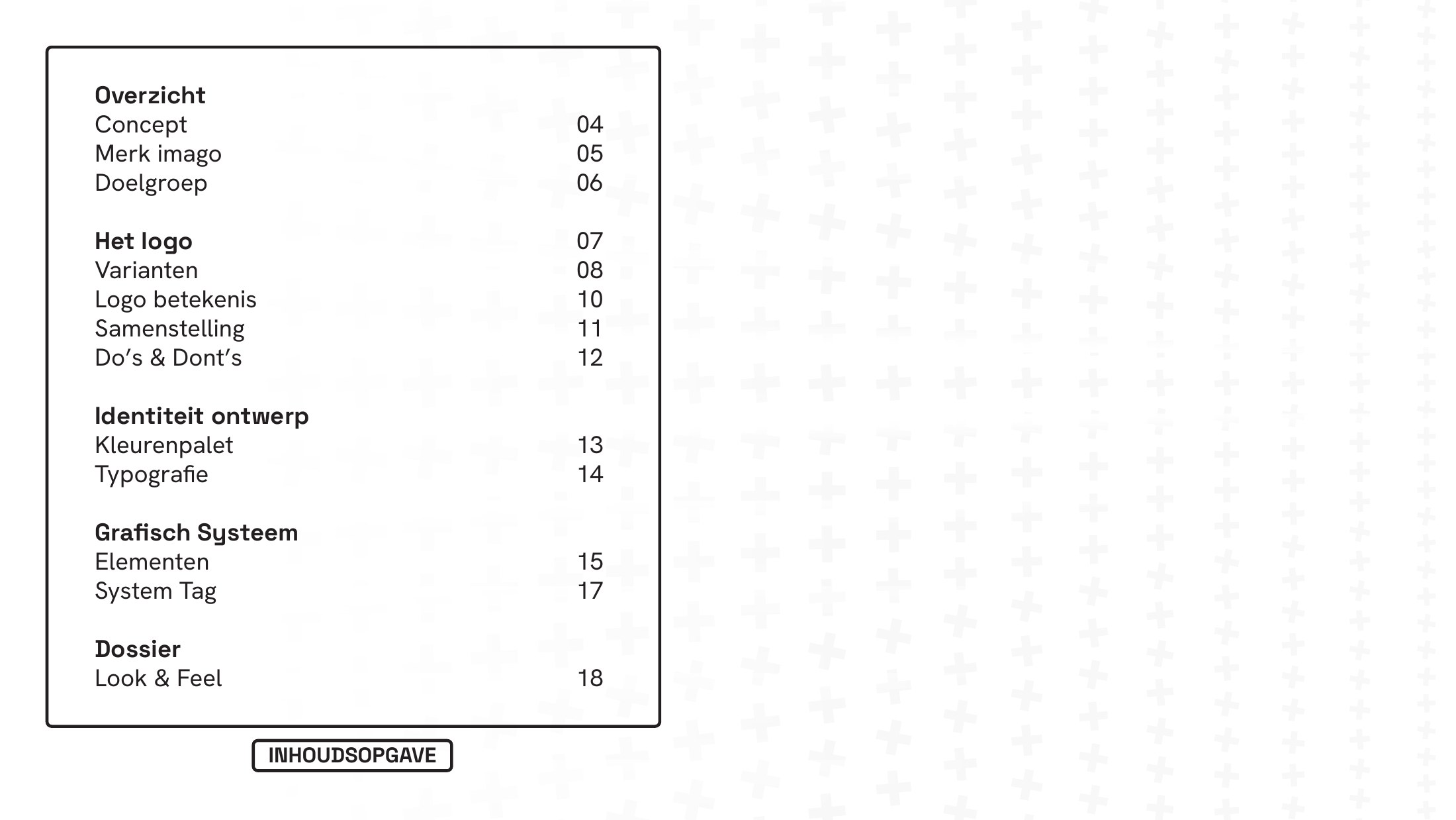
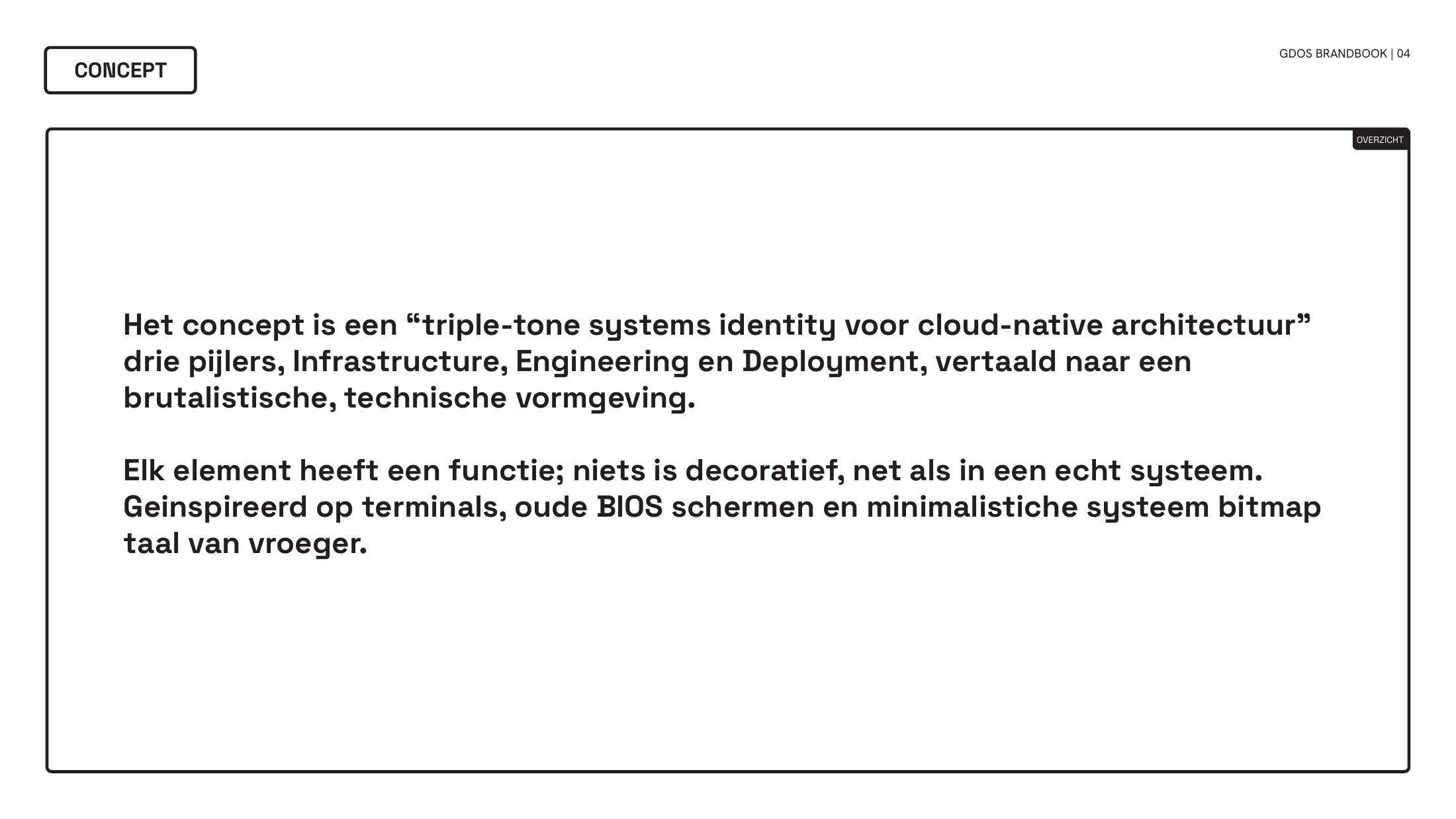
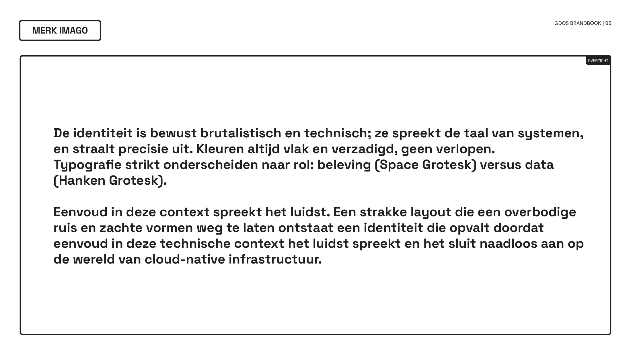
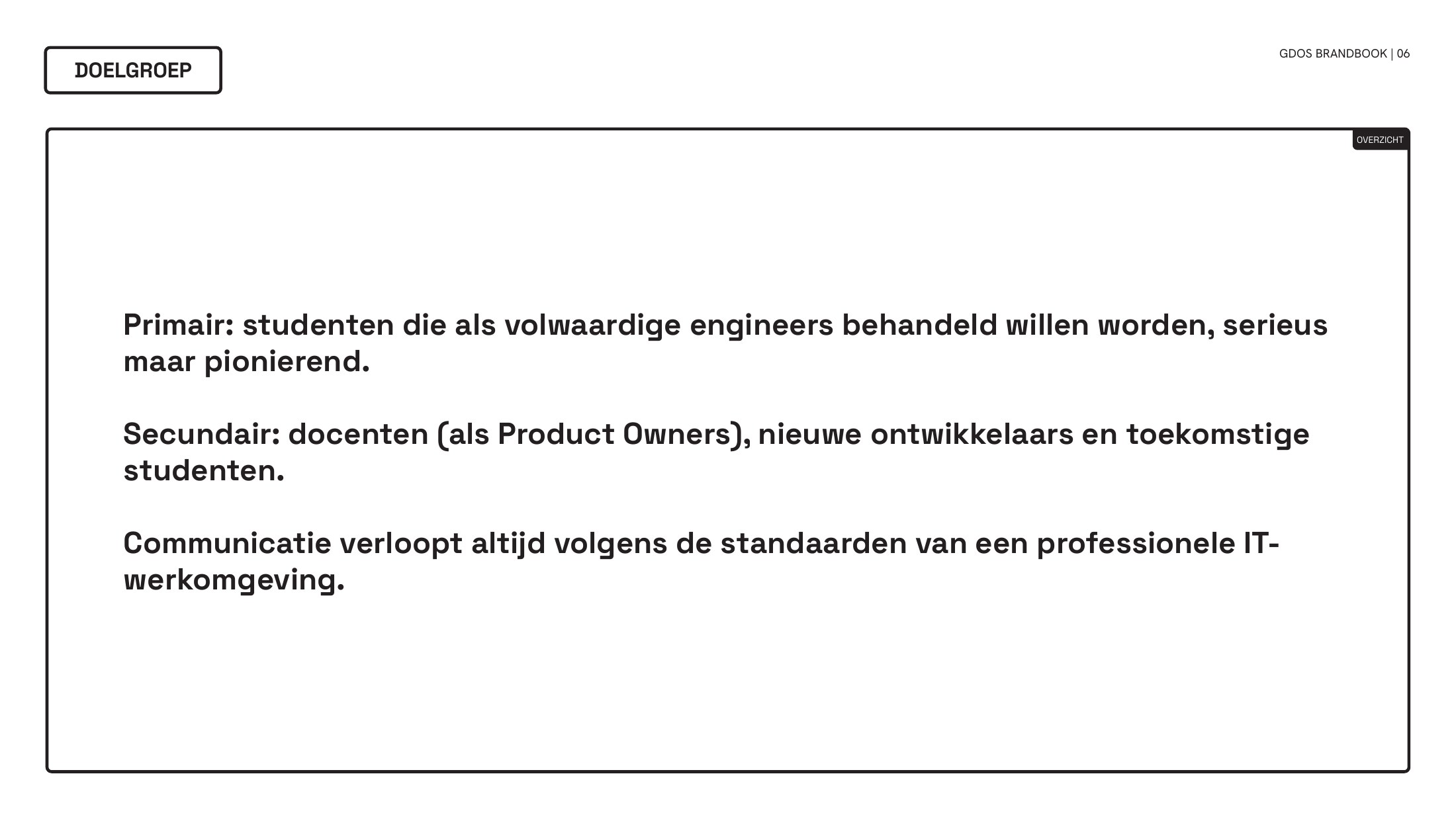
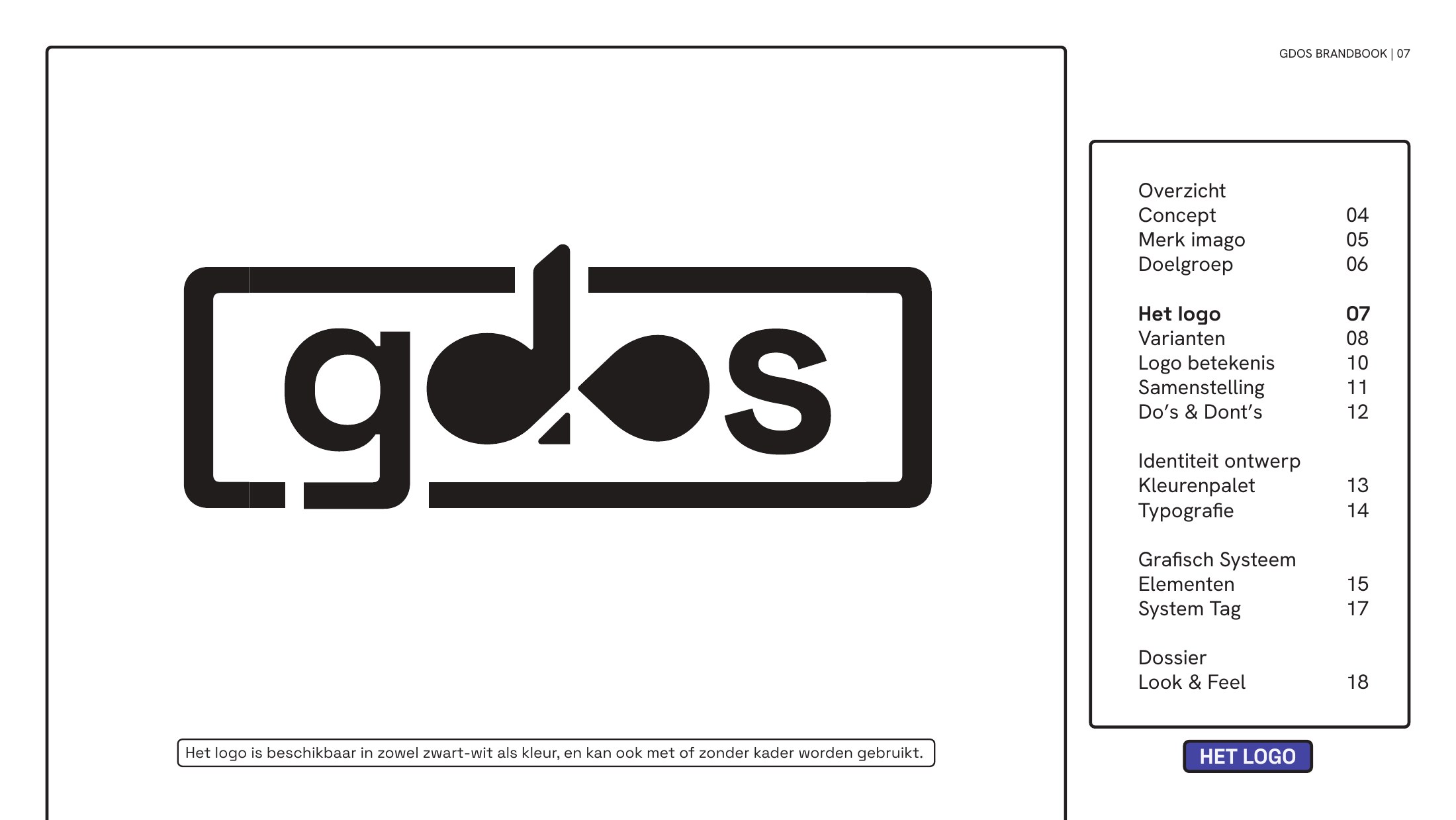
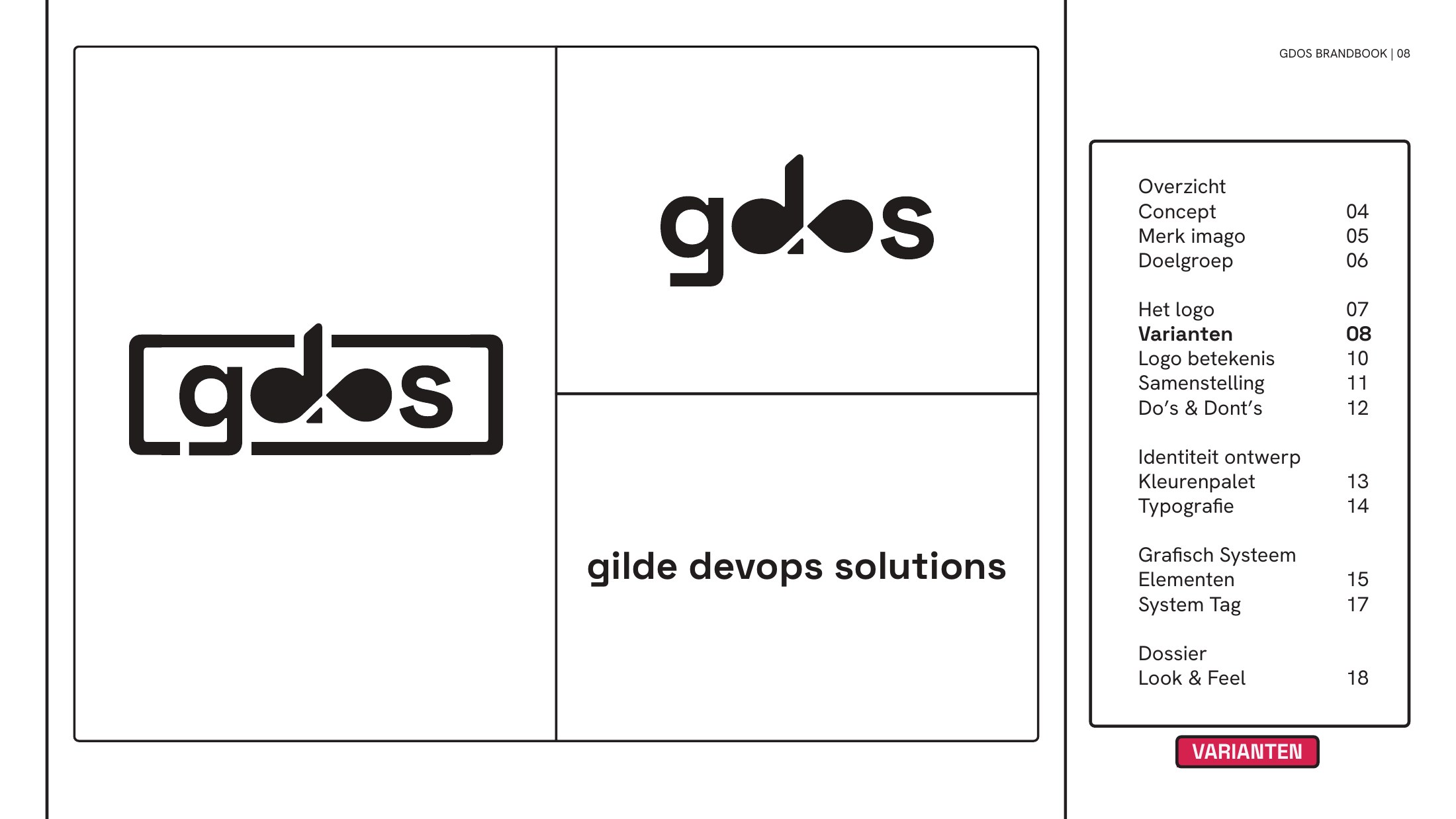
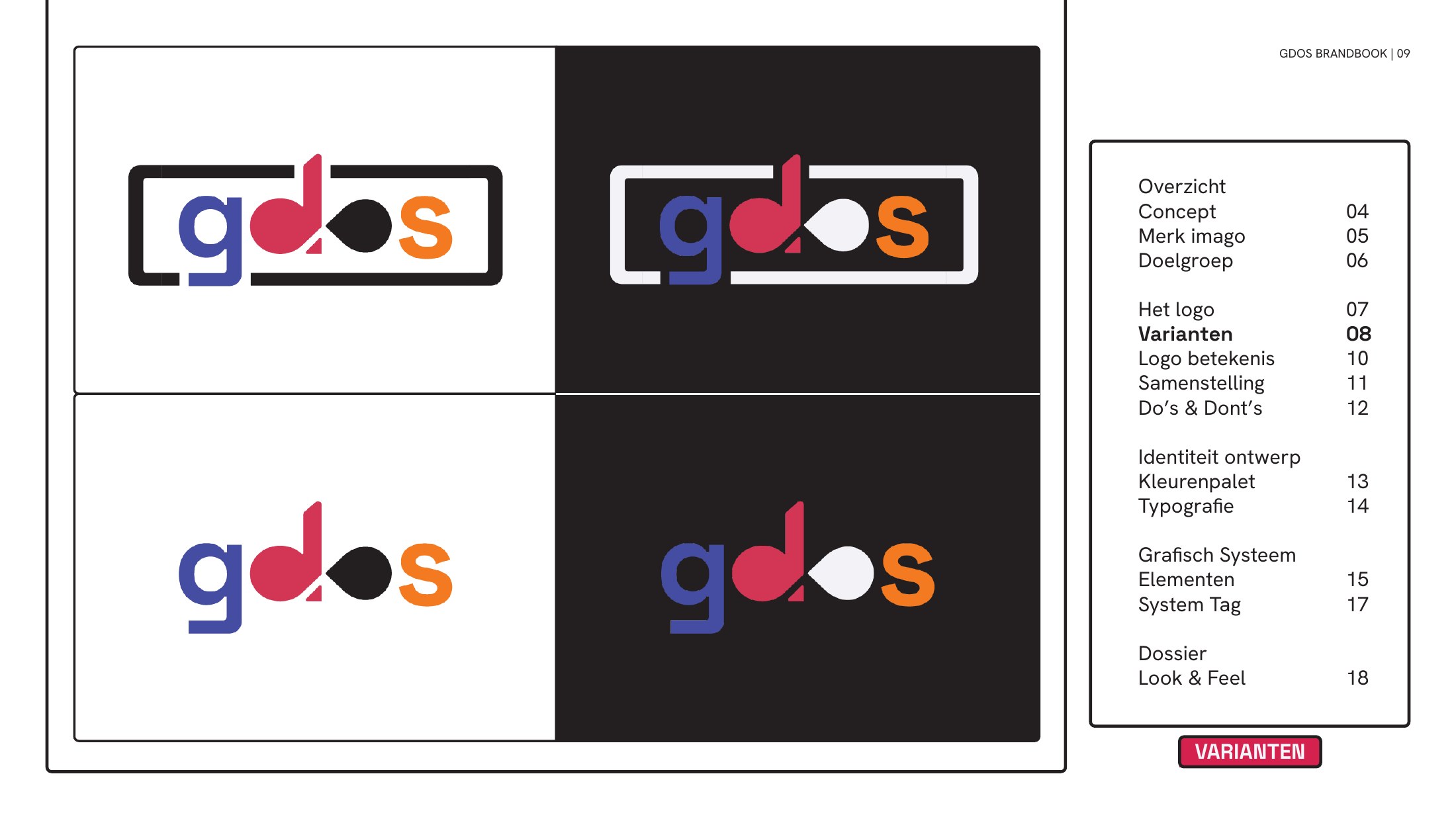
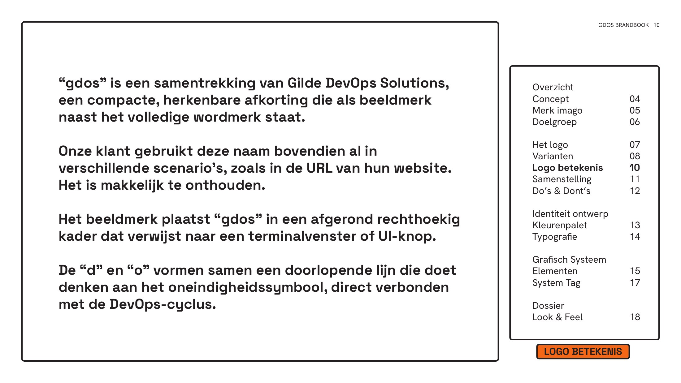
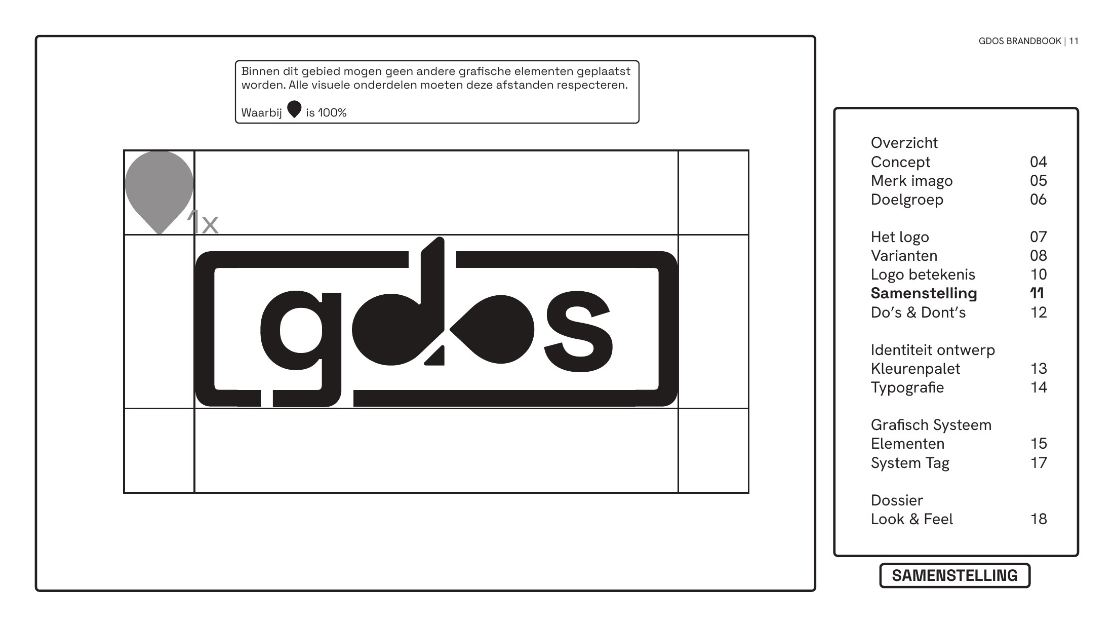
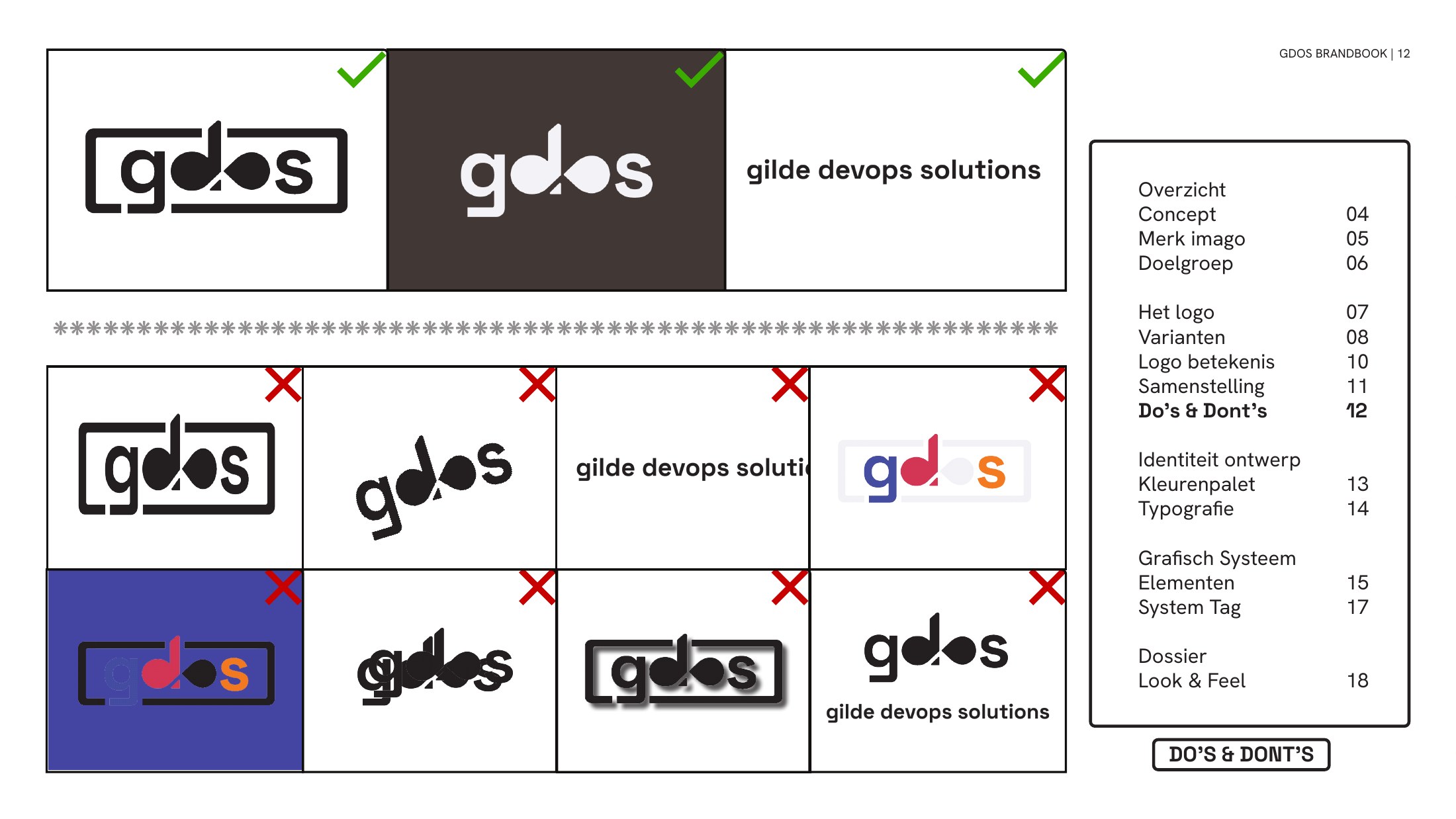
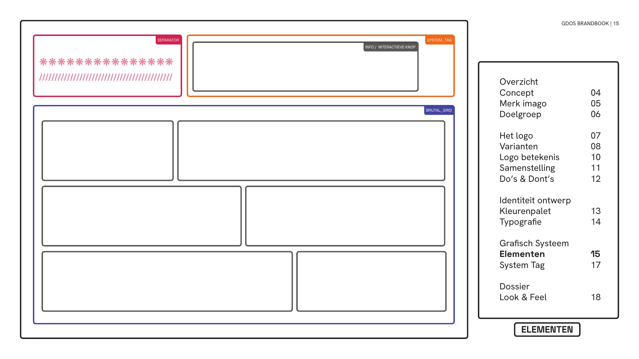
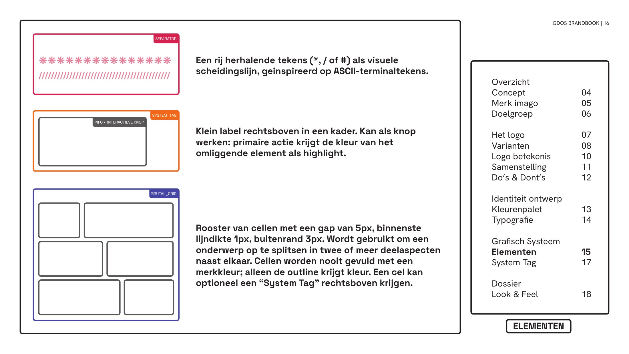
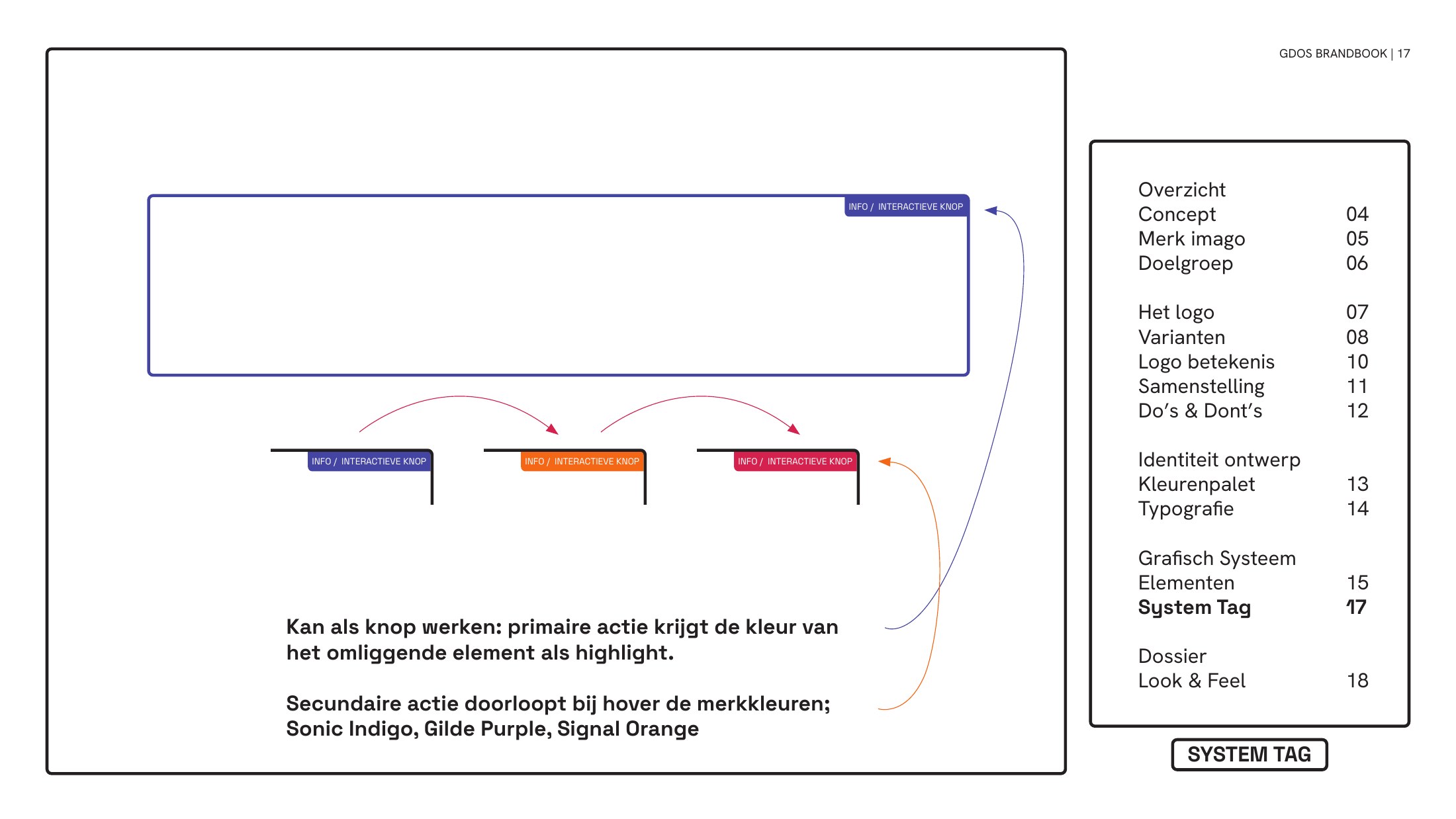


The brandbook (in Dutch, 27 pages). Drag a corner or use the arrows to turn the pages.
- Step 1 of 1
Building the showcase
Alongside the brandbook I built an interactive brand showcase page, a spec sheet for the identity written in HTML. Scroll to watch it come together stage by stage, from empty boxes to the final layout.
Boxes first
Before any colour or font, the page is only blocks: a zone for the logotype and the three pillars, then palette, typography, brand primitives and a systems visualisation. Layout first, looks later.
All the words
Then every piece of copy goes in with no styling at all. The tagline, the pillars (Infrastructure, Engineering, Deployment), the hex codes and the terminal lines are all in place, as plain content.
The type locks in
Space Grotesk for display, Hanken Grotesk for body. The scale is set before any colour is allowed near it.
Colour and grid
Flat, saturated colour goes on and the layout starts to hold together as a grid. Two sections are still missing.
The page documents itself
Annotations, rulers and measurements are added so the showcase reads like a spec sheet for the identity.
First final build
The bugs are fixed and the spec system is complete. This is the first version I would have called finished.
Hunting for the blue
Choosing the blue took a few rounds, with the candidates tested side by side. First one: #0047FF, Royal Blue.
Test B
#2952FF, Electric Sky.
Test C
#1A4FFF, Ultravivid.
Test D
#0038D0, Deep Royal.
Sonic Indigo
The blue that stayed is #454DA1, Sonic Indigo: the technical base of the palette, and the “g” in the logo.
Corners, round one
A corner system for the interface boxes: 26 px on the outside, 8 px on the inside.
Corners, refined
Then refined: 6 px on the outside and 3 px on the inside.
Rich Black joins the palette
The palette gets its contrast colour: Rich Black, #231F20.
Becoming a brandbook
Finally the showcase grows a sidebar and breadcrumbs, and starts to behave like the brandbook itself: The Logo, The Visual System, The Dossier.
- Step 1 of 1
Mood
For the look and feel I collected references of BIOS screens, systems typography, brutalist posters, pixel textures and the saturated blues and oranges the palette is built on.

- Step 1 of 1
Out in the world
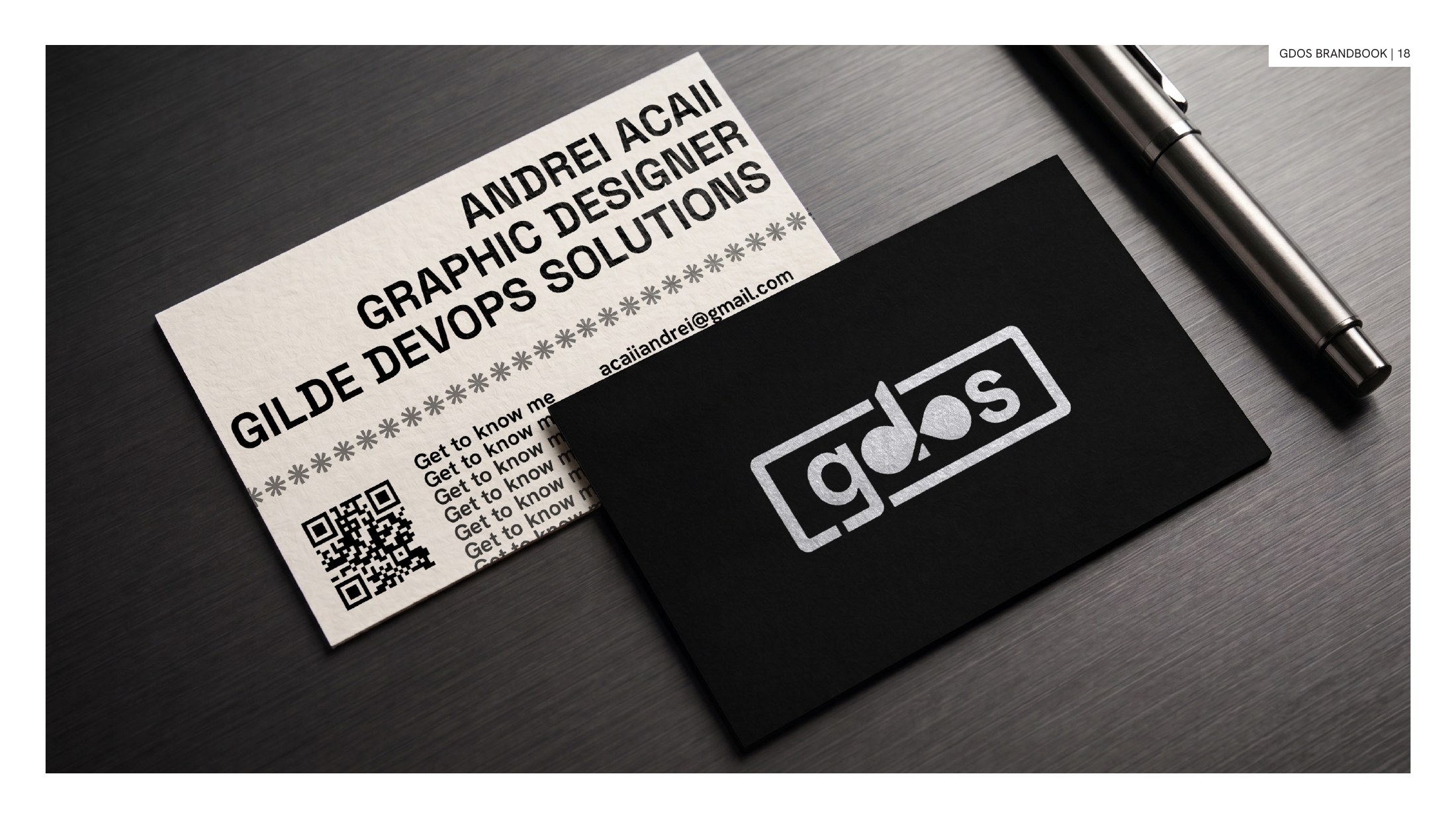
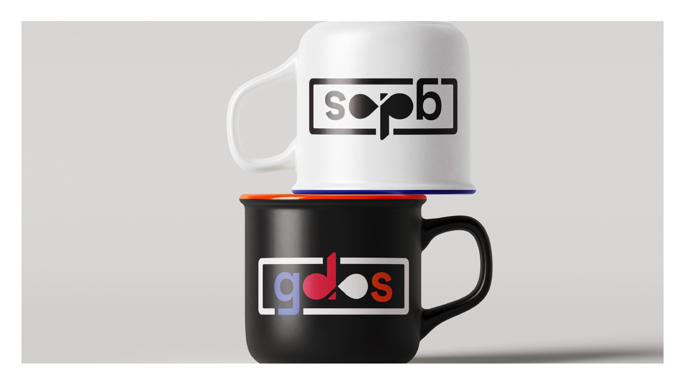
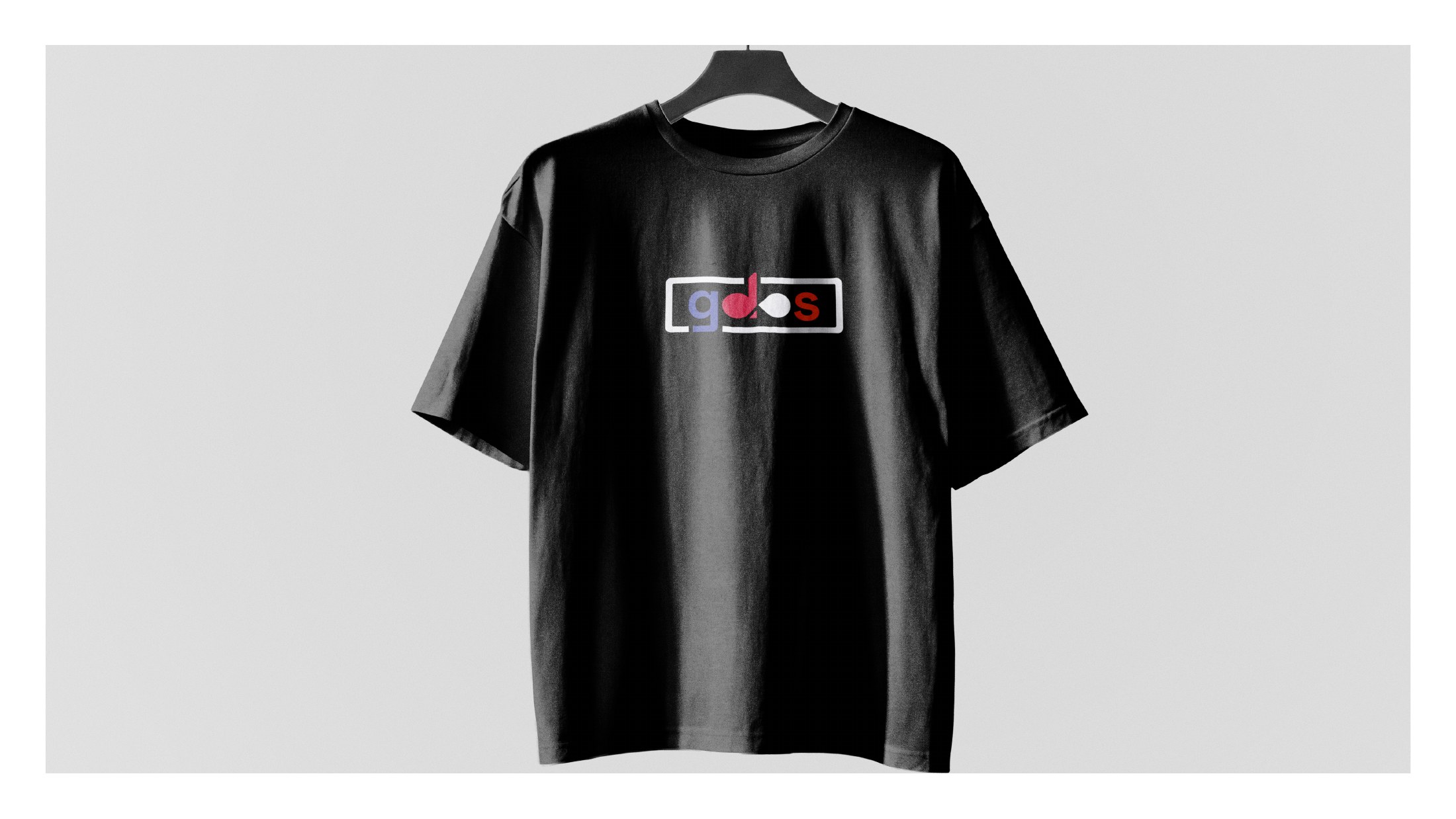
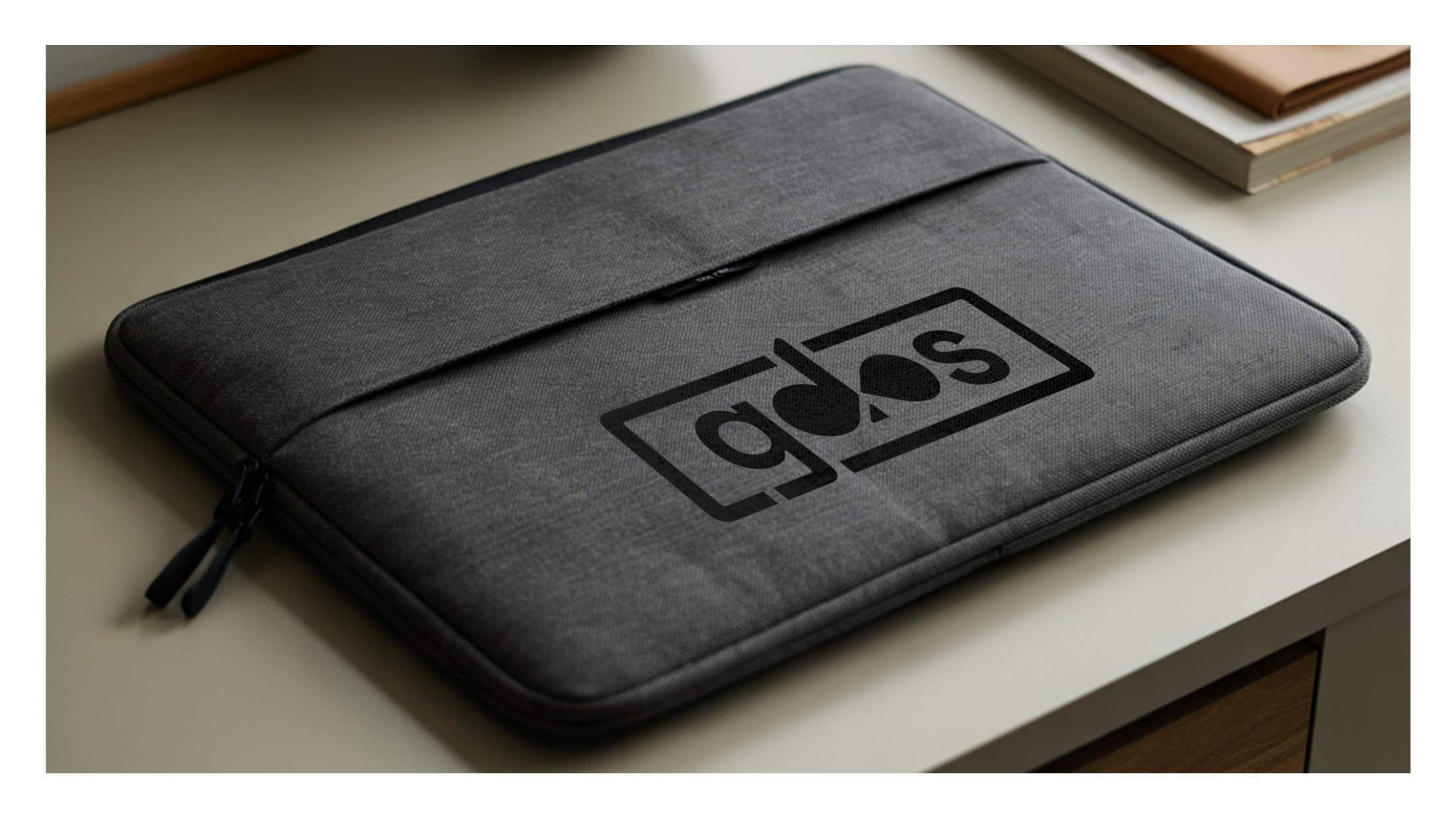
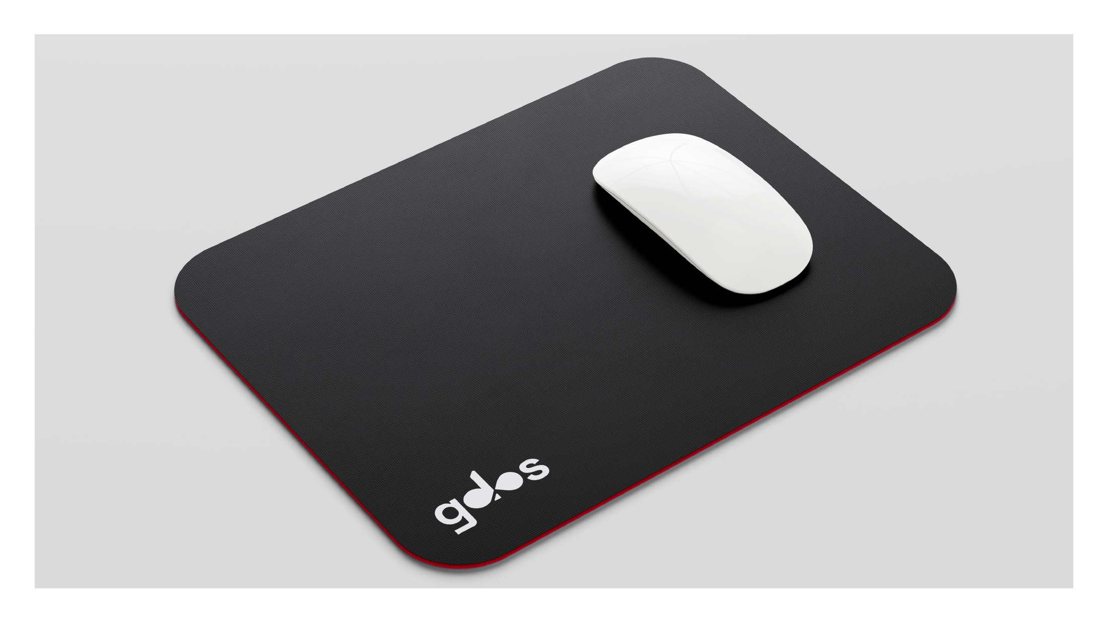
The last step of the brandbook is the dossier: how the identity looks on actual things. I made mockups of business cards, a laptop sleeve, mugs, a mousepad, a T-shirt, a sticker and the showcase on a laptop. Here are all of them.


