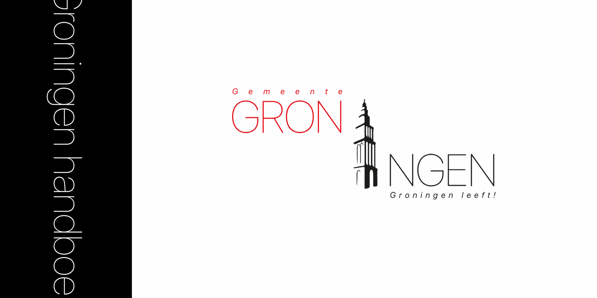
For this school work we had to reimagine and repurpose the old logo of a randomly chosen municipality from a random province in The Netherlands. I ended up with Groningen, the old logo was so different and (in my opinion) outdated that it needed a whole redesign from the ground up, typeface, style, and it needed to encompass something from that region of The Netherlands. I took the Martini Tower and made it the central piece of the logo itself, while keeping it very minimalist and modern.
