
A complete visual identity for Aqua Zoo Triton, an imagined aquatic zoo in South Limburg, and the first school project where I had to take a client from a blank page to a finished brandbook. The brief: design a house style that looks inviting, works on very different media, and shows visitors what the place is about. Aqua Zoo Triton is a place that wants to give visitors a sense of optimism and wonder about the underwater world and the future, by combining technology with nature.
The target group is families from the Euregio. For the research I wrote a persona, Sophie (34, mother of two, from Heerlen), who wants a trip that is educational and relaxing at the same time and feels a little nostalgic, like the school trips she remembers. That nostalgia ended up steering the whole style: translucent glossy windows, soft gradients and a bit of early-2000s desktop magic, with the real animals still as the main attraction.


- Step 1 of 2
The brief and the problem
Aqua Zoo Triton needs a house style to show who it is, and it has to work in print, on screen and on the tickets people hold at the entrance. In Phase 1 I wrote the problem statement and the message: what do we promise? A recognisable, hopeful and connecting experience for families. I committed to a final logo and visual elements, a slogan and a complete house style handbook in A5 landscape.
- Step 2 of 2
The problem we solve
In a busy world full of smartphones there is little calm and little real closeness to nature. Everything is flat, minimalist, artificial and everyone is staring at screens, even when looking at nature. At Aqua Zoo Triton you can learn about life underwater and take part in the computer installations and game stations in a way where the phone stays in the pocket and you rediscover both the animals and the technology. In three words: wonder, calm, connection.
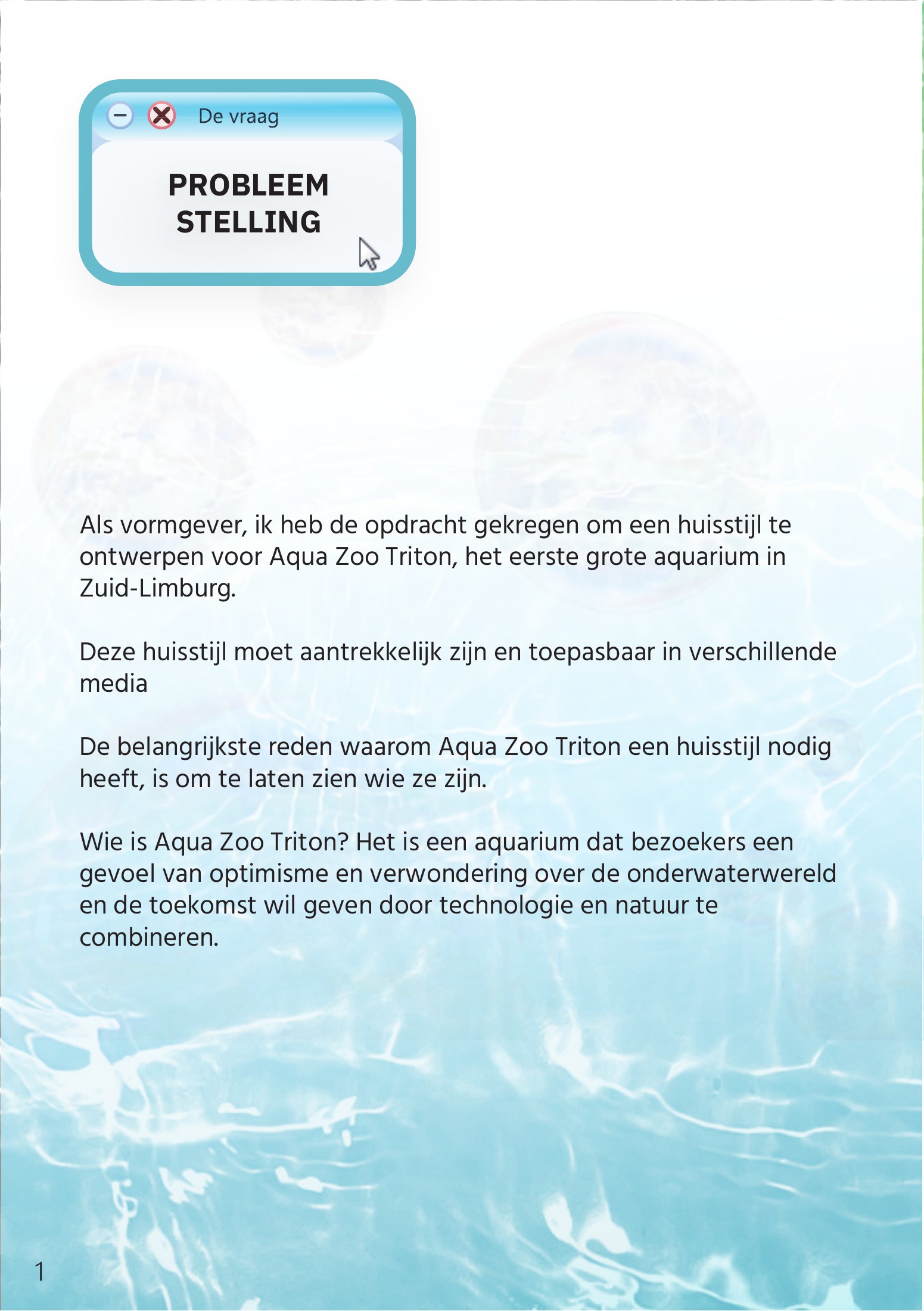
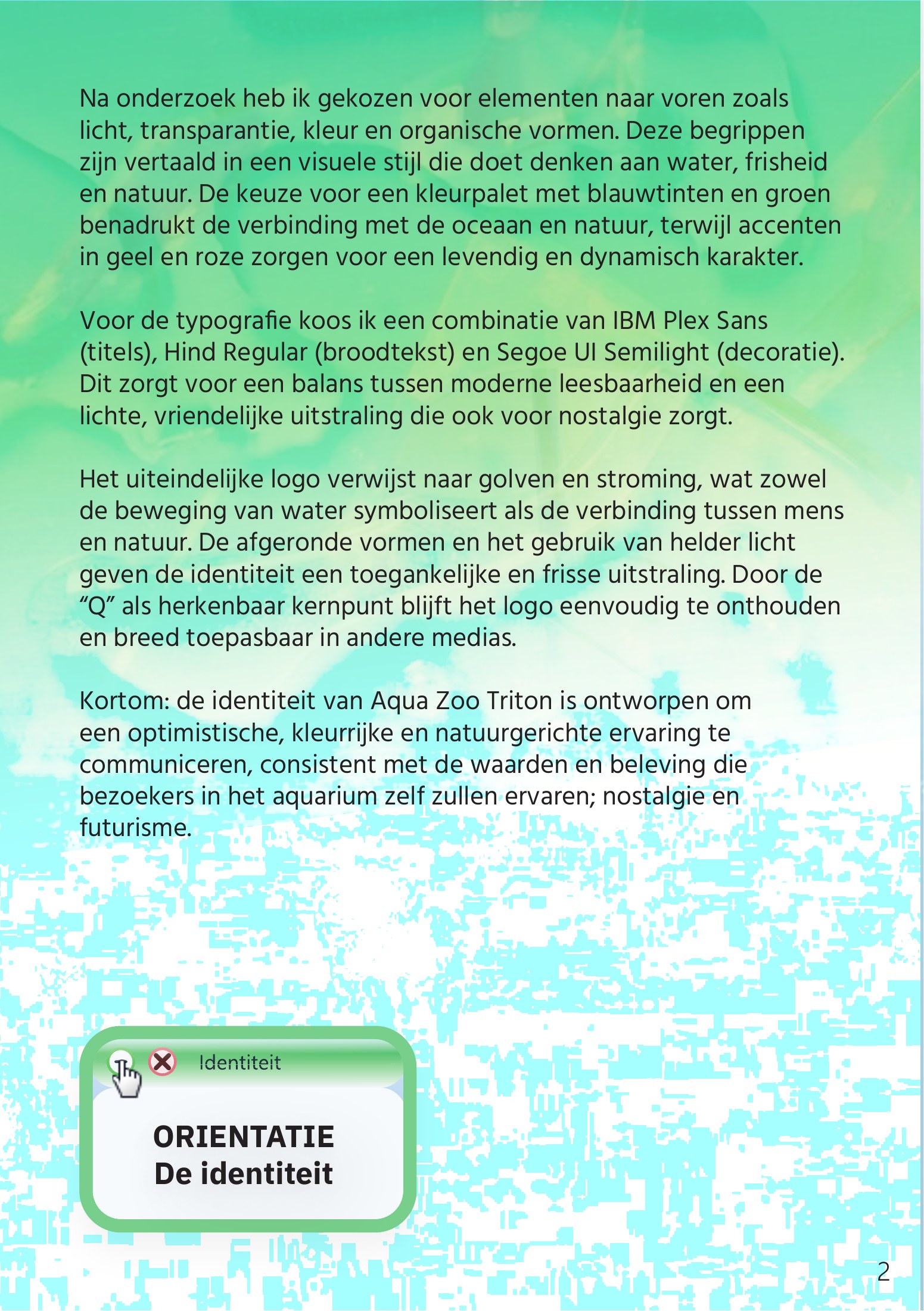
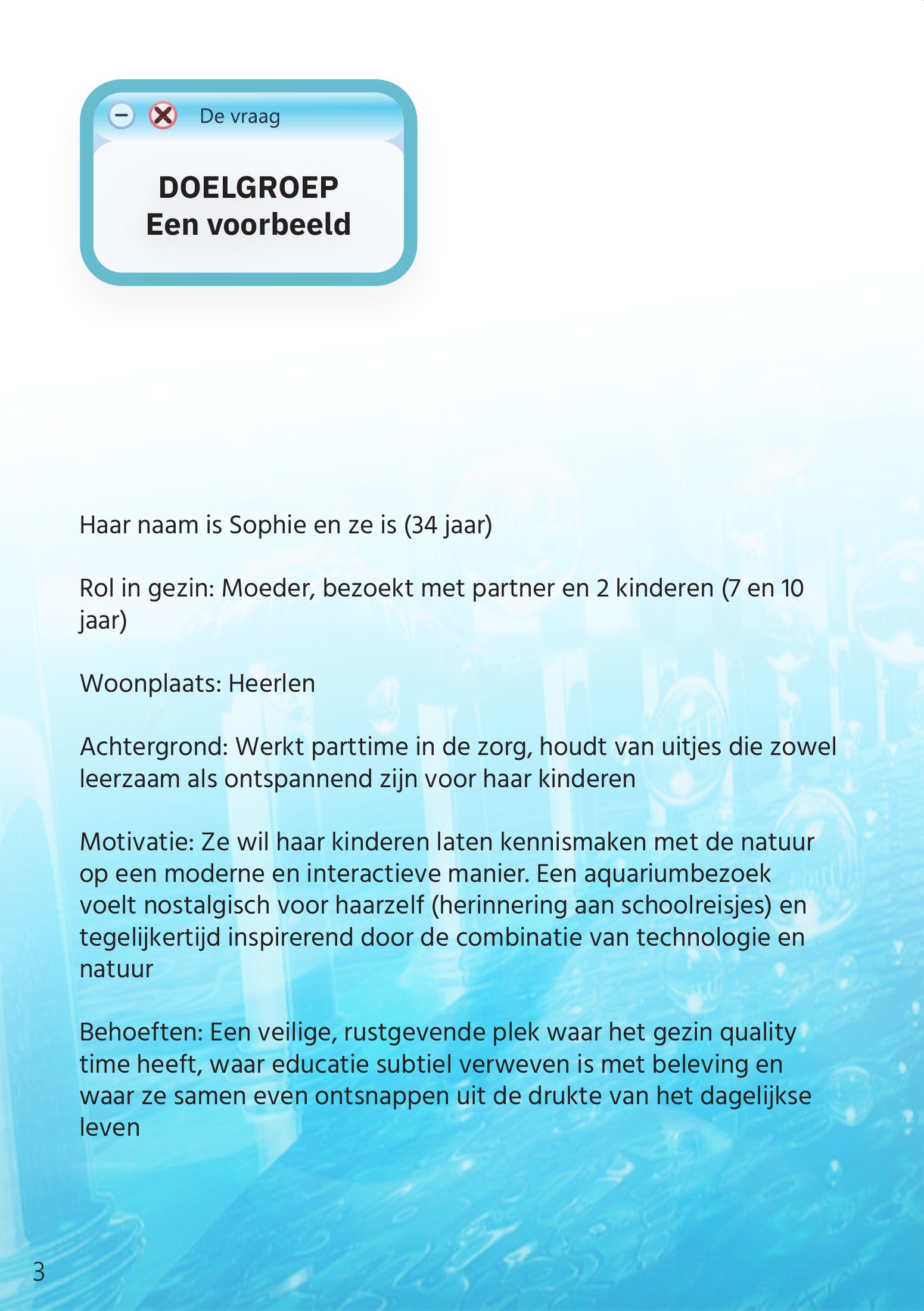
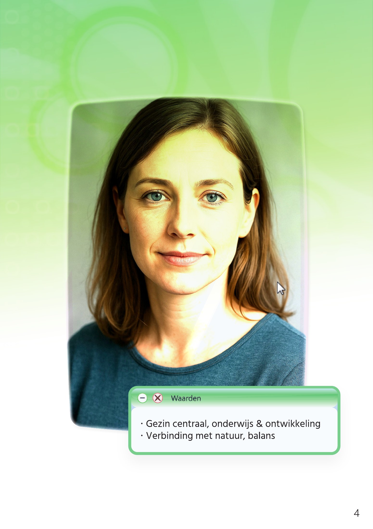
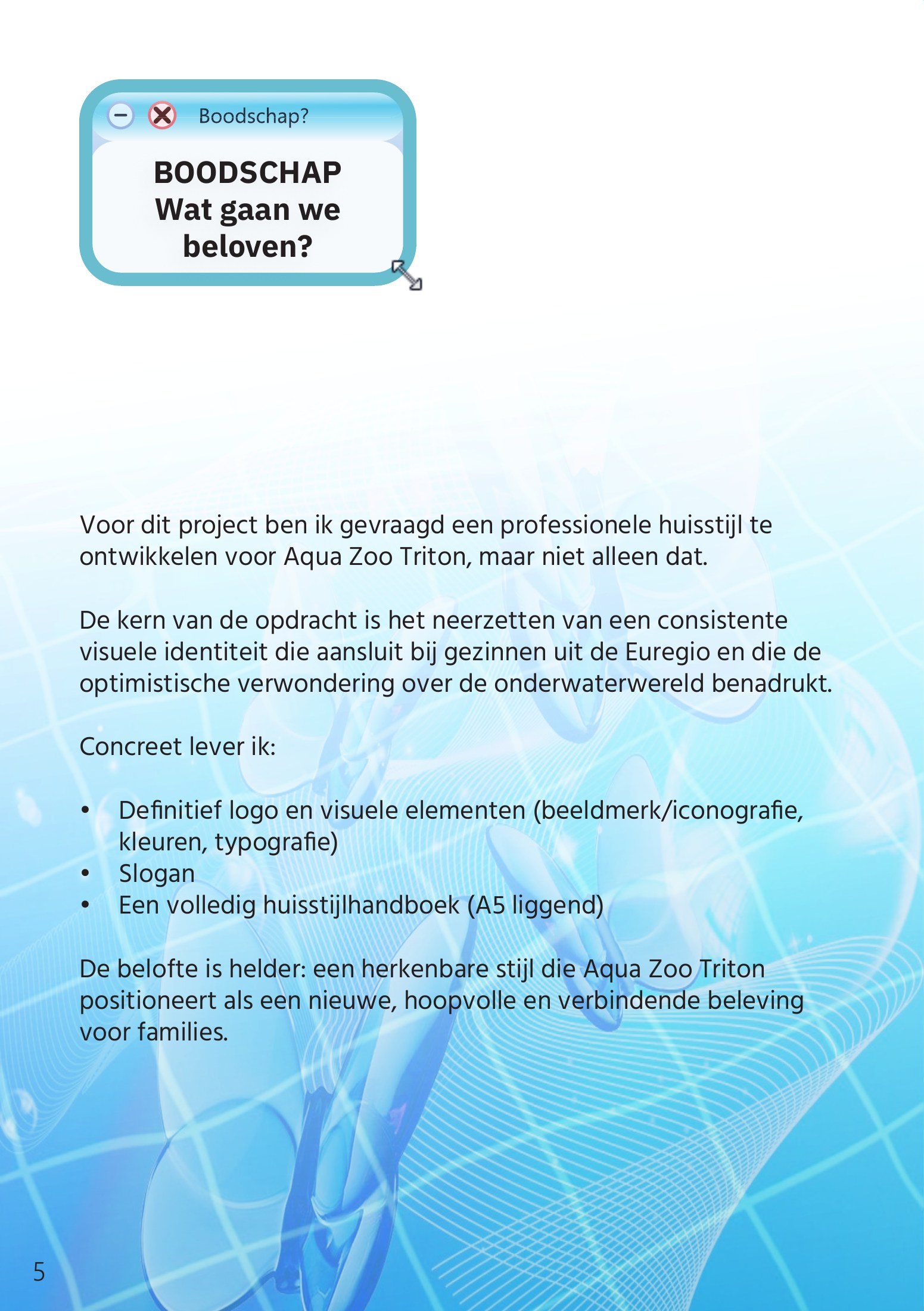
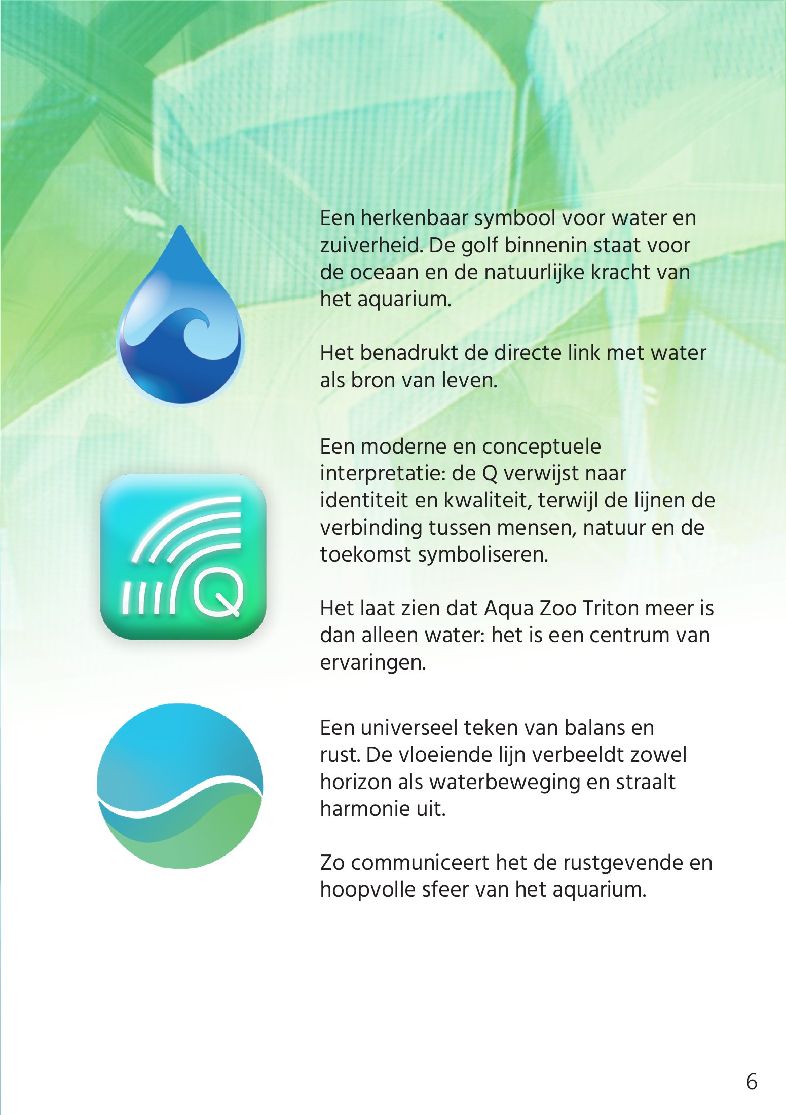
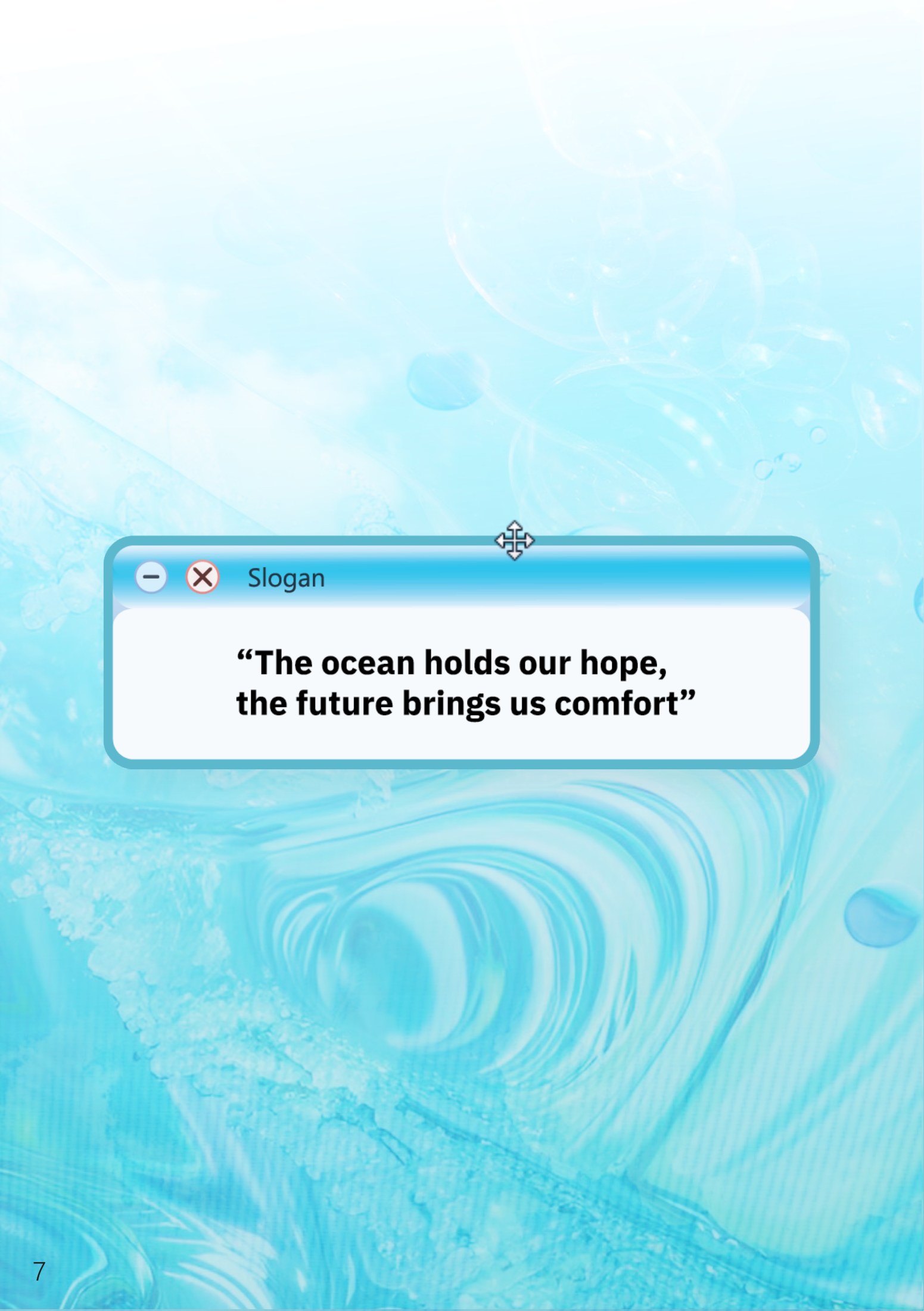
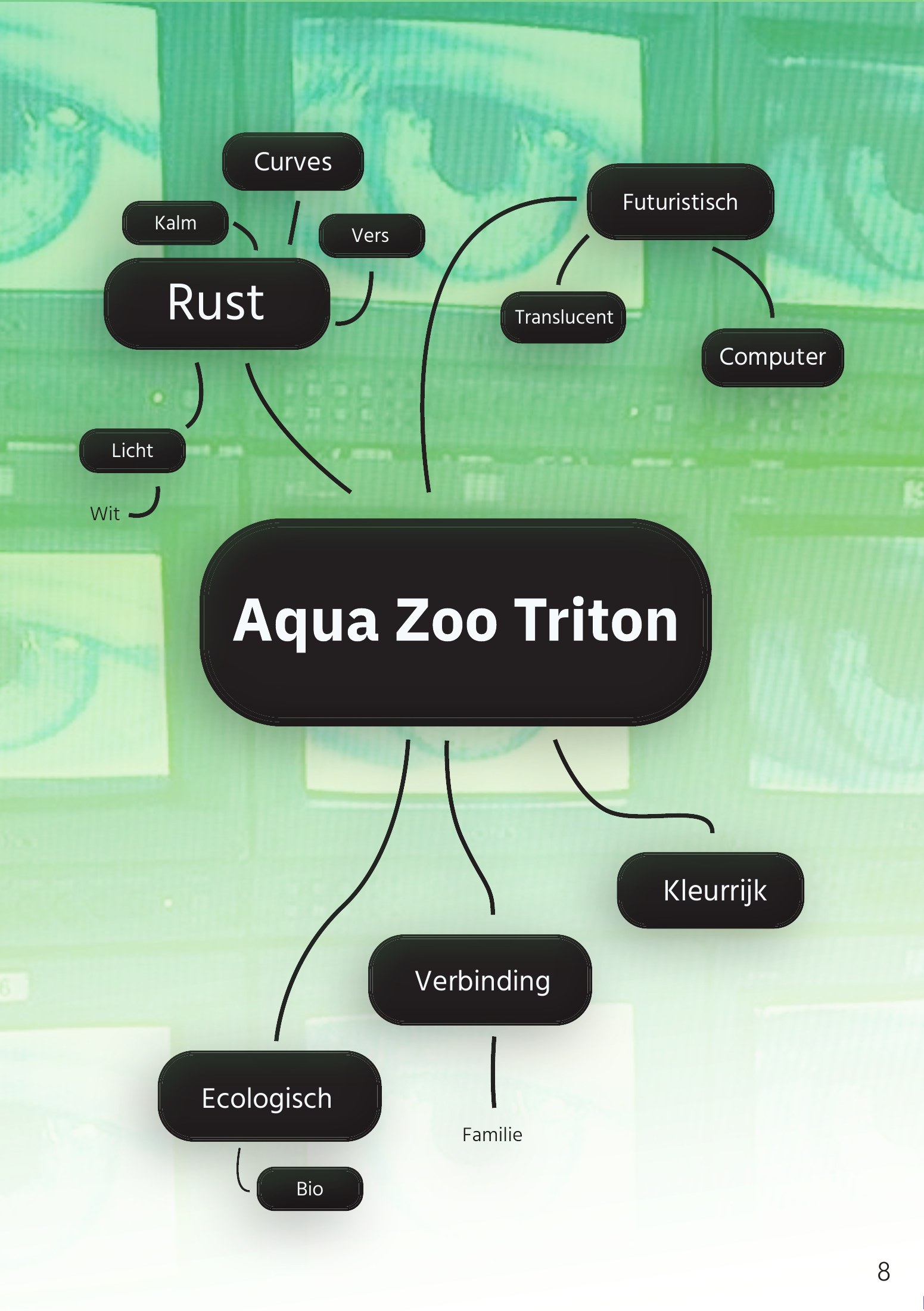
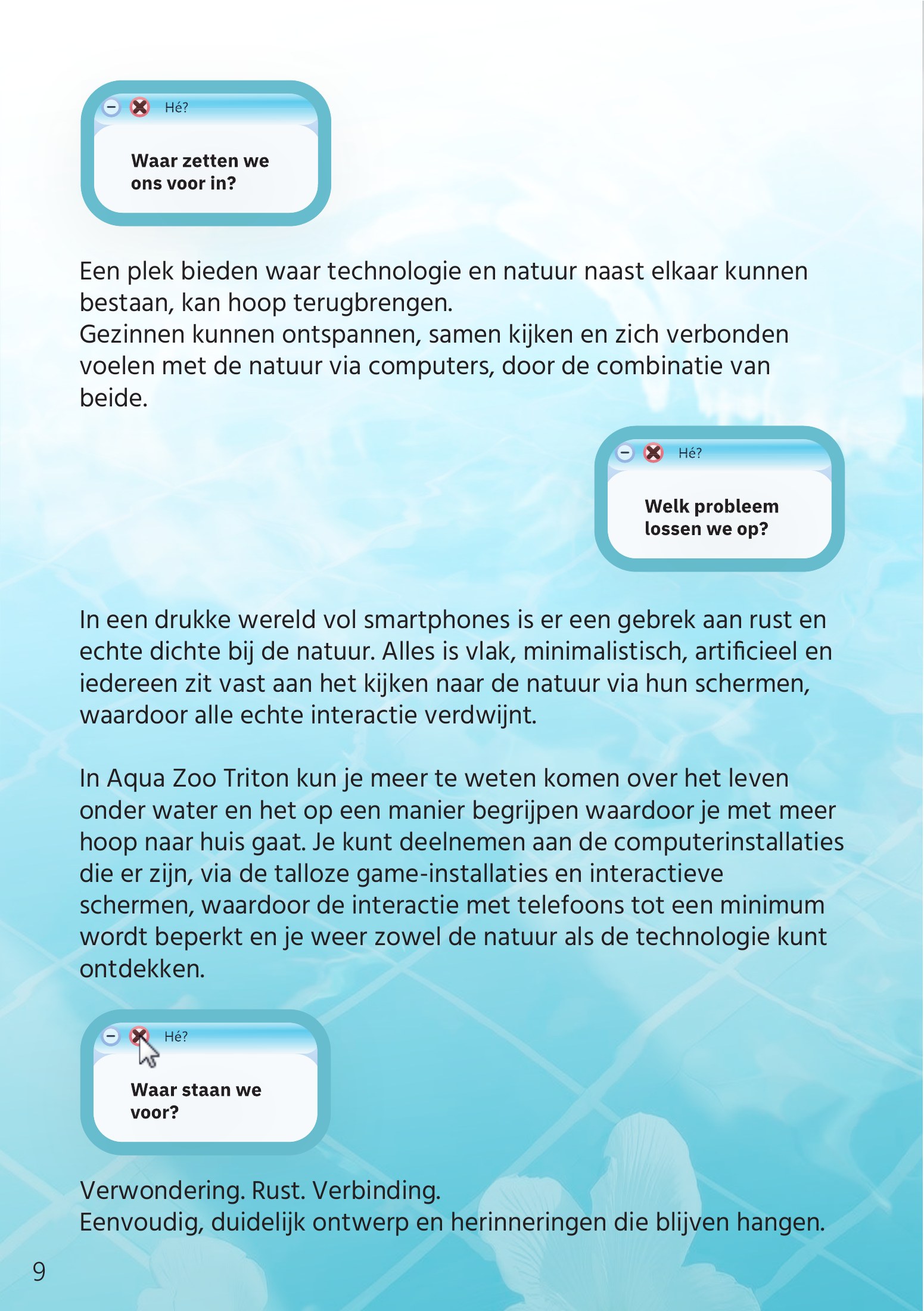
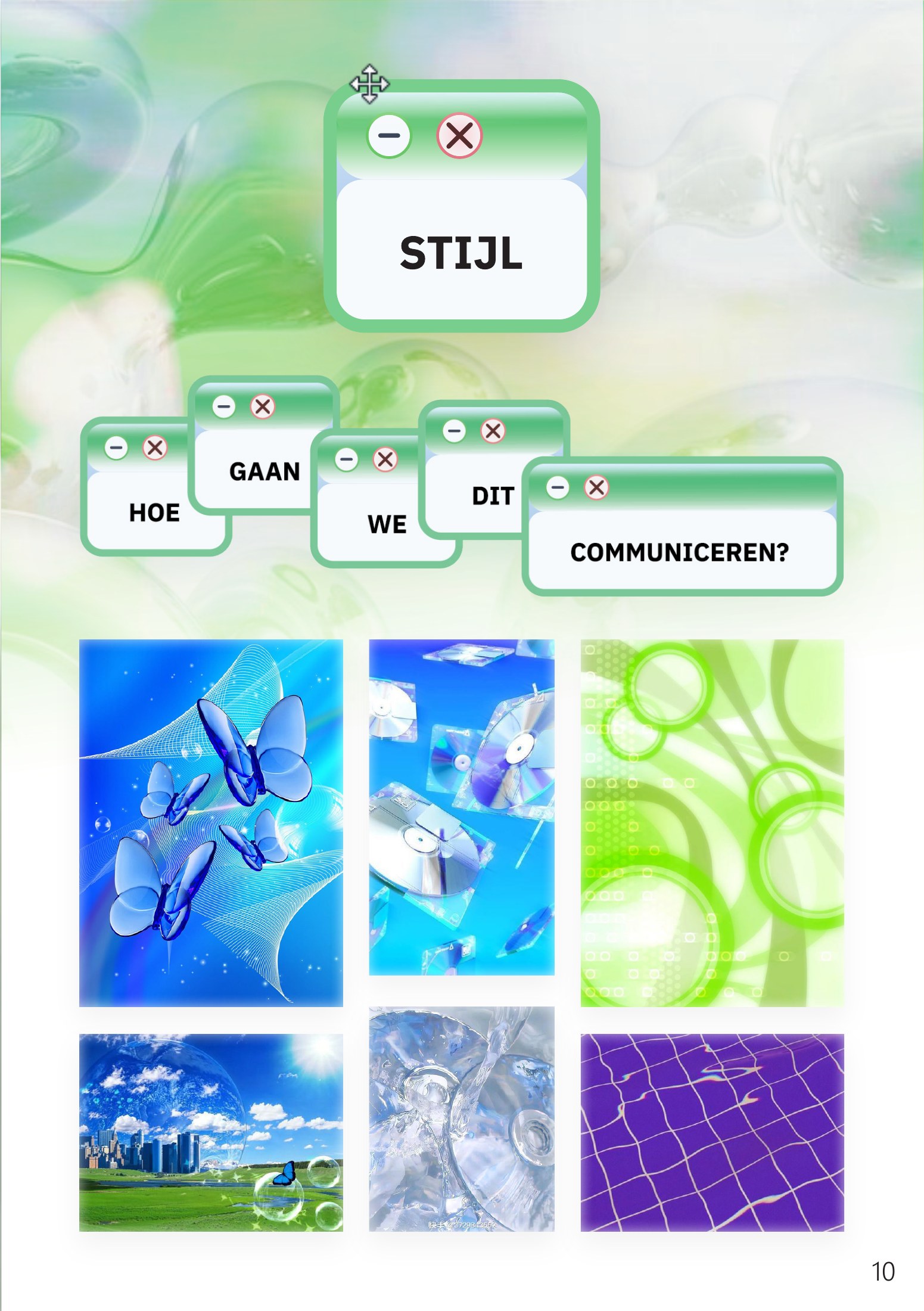
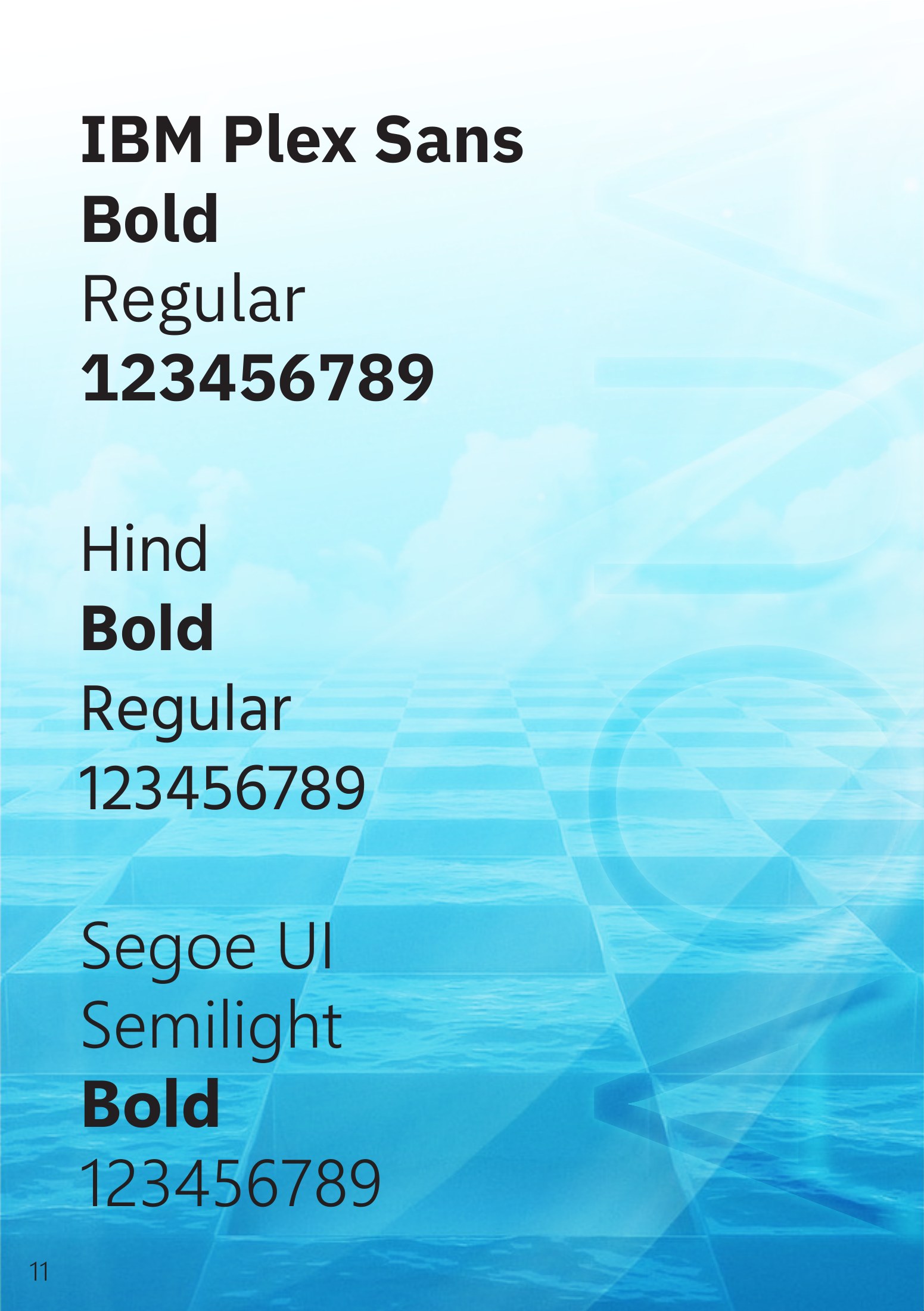
The Phase 1 handout (in Dutch, 14 pages): problem statement, target group, message, first logo ideas, slogan, mind map and style research. Drag a corner or use the arrows to turn the pages.
- Step 1 of 1
Mind map and style
I started with a mind map around the name, with the words calm, light, futuristic, translucent, colourful, ecological and connection. For the style I collected references of glossy glass buttons, bubbles, butterflies, CDs, lens flares and water, a kind of “technology that feels like nature” look. The palette had to be blue-and-green, with accents of yellow and pink for a lively character.


- Step 1 of 3
First logo ideas
The first round was three concepts: a droplet with a wave inside, a modern Q with lines for the connection between people, nature and the future, and a round shape with a flowing horizon line. They were pretty, but they all said “water” and nothing else. They could have belonged to any aquarium or water company. I felt they didn't say anything about the zoo, or about the interaction that makes this one different.
- Step 2 of 3
The octopus and the cursor
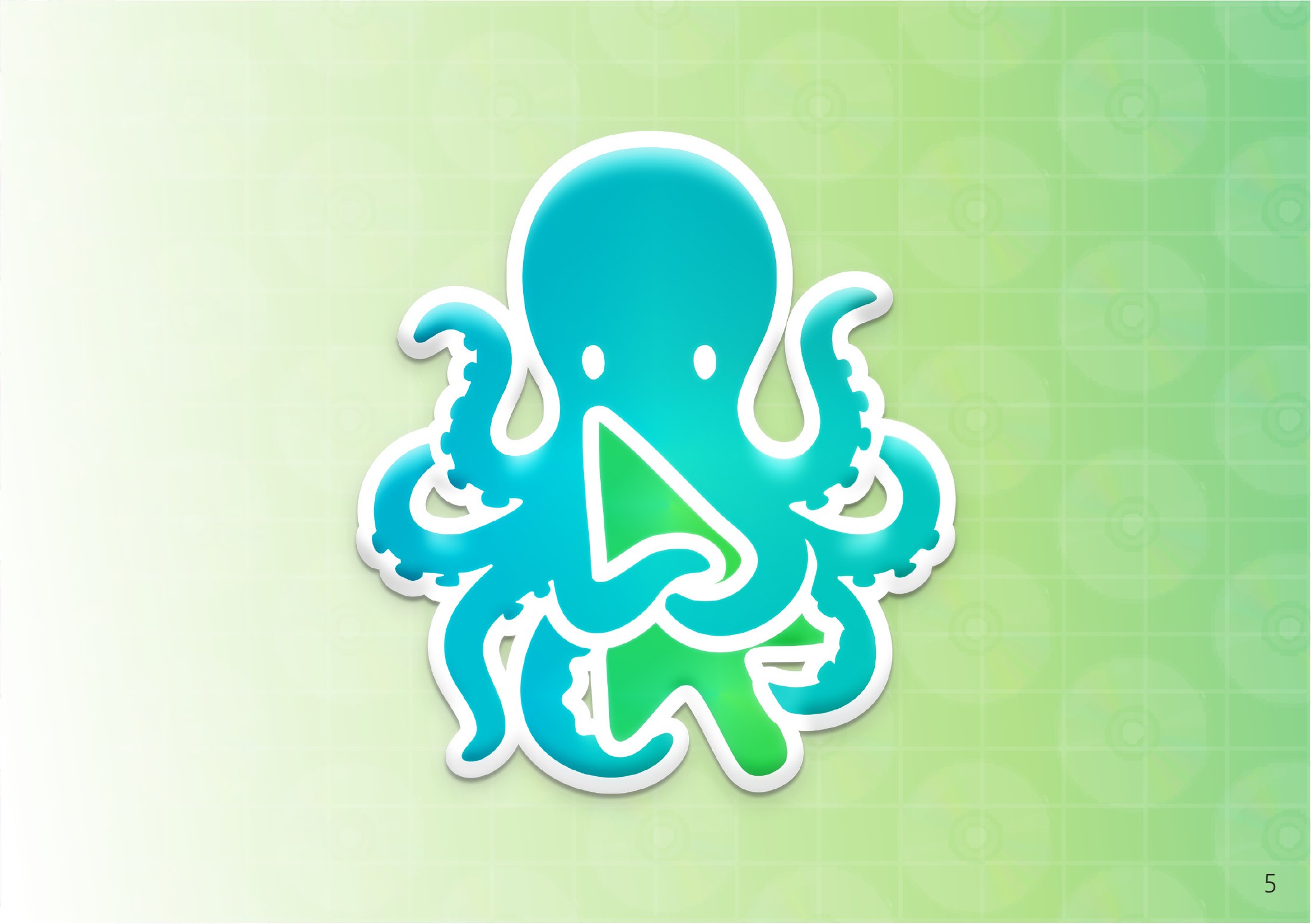
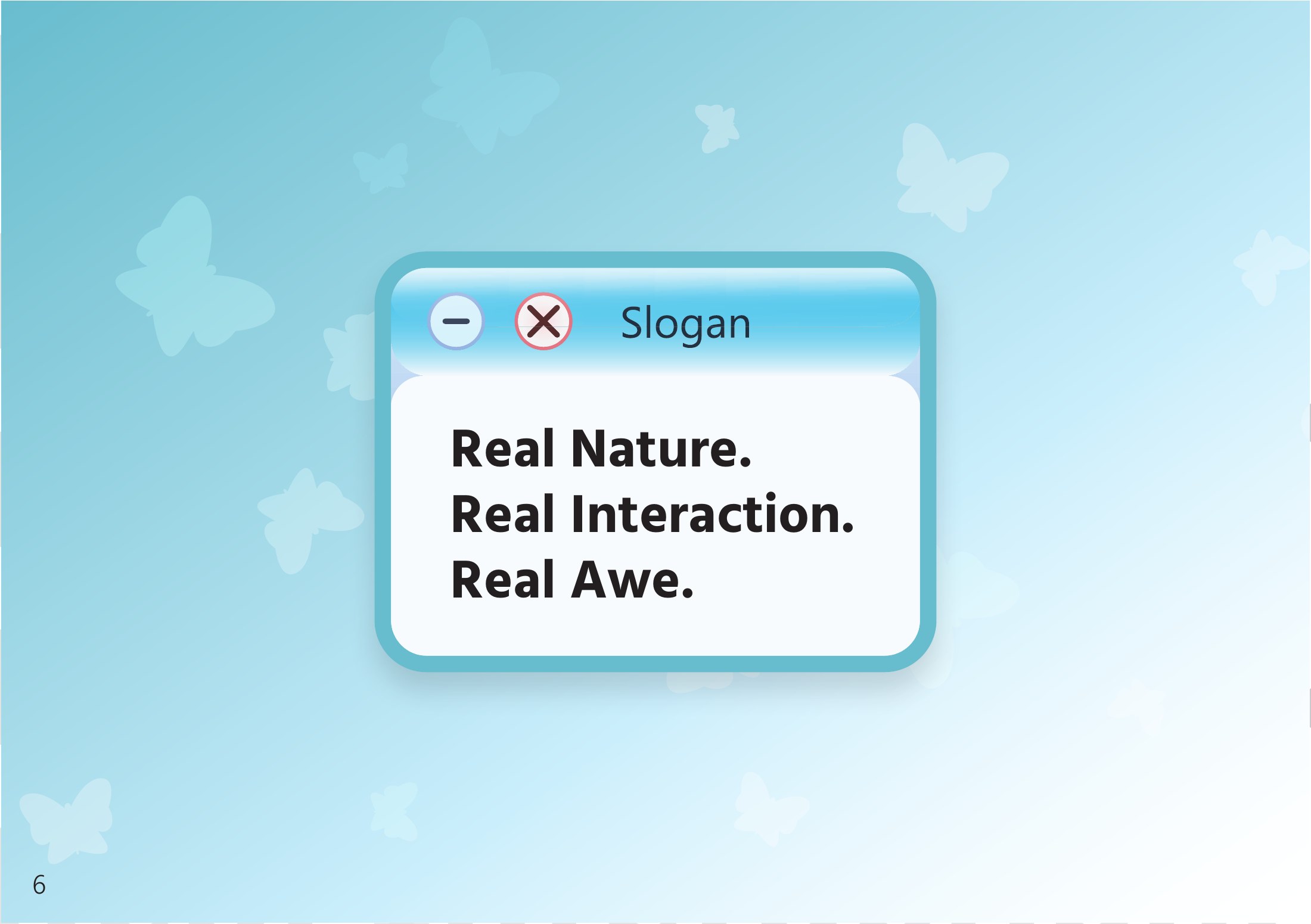
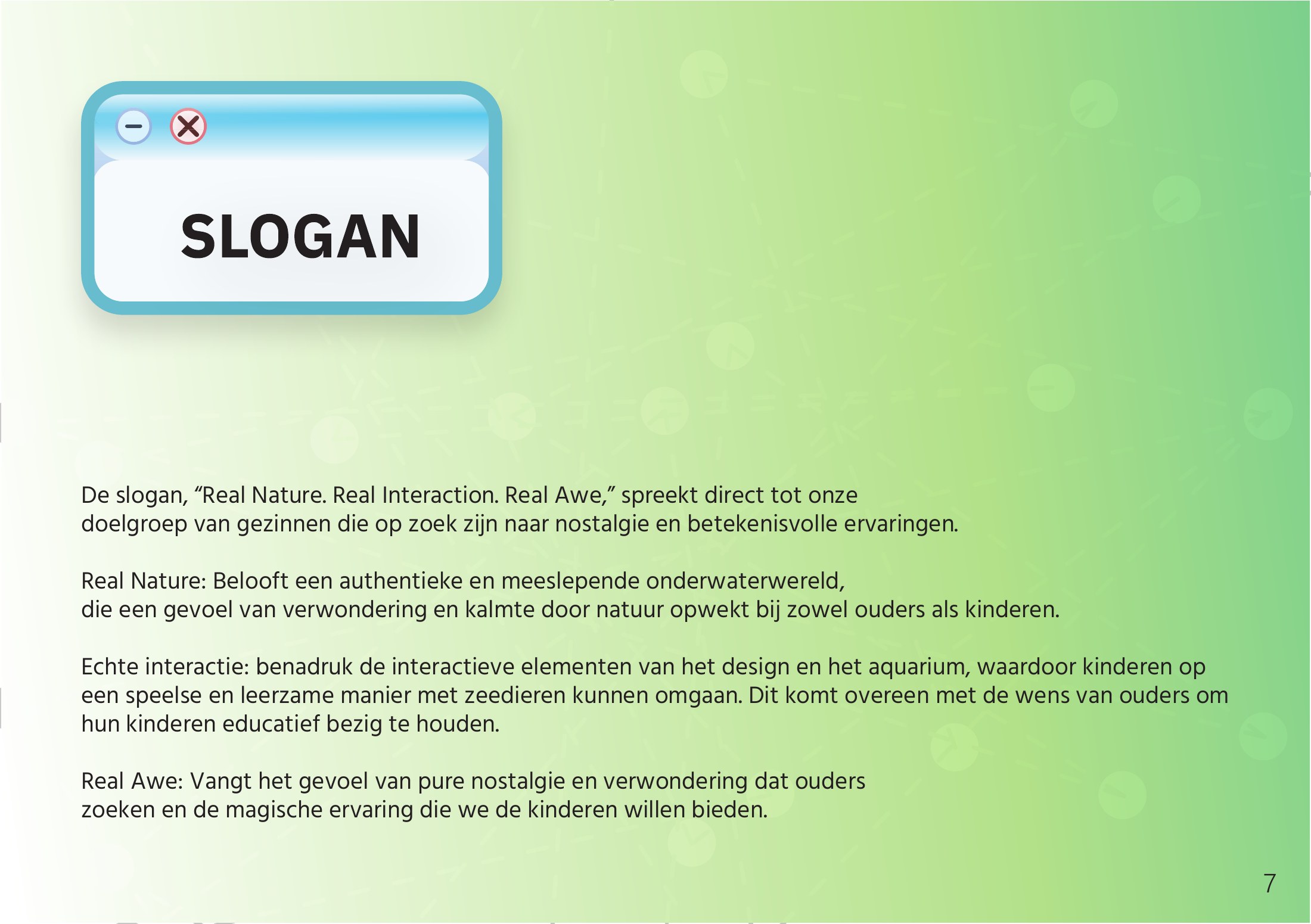
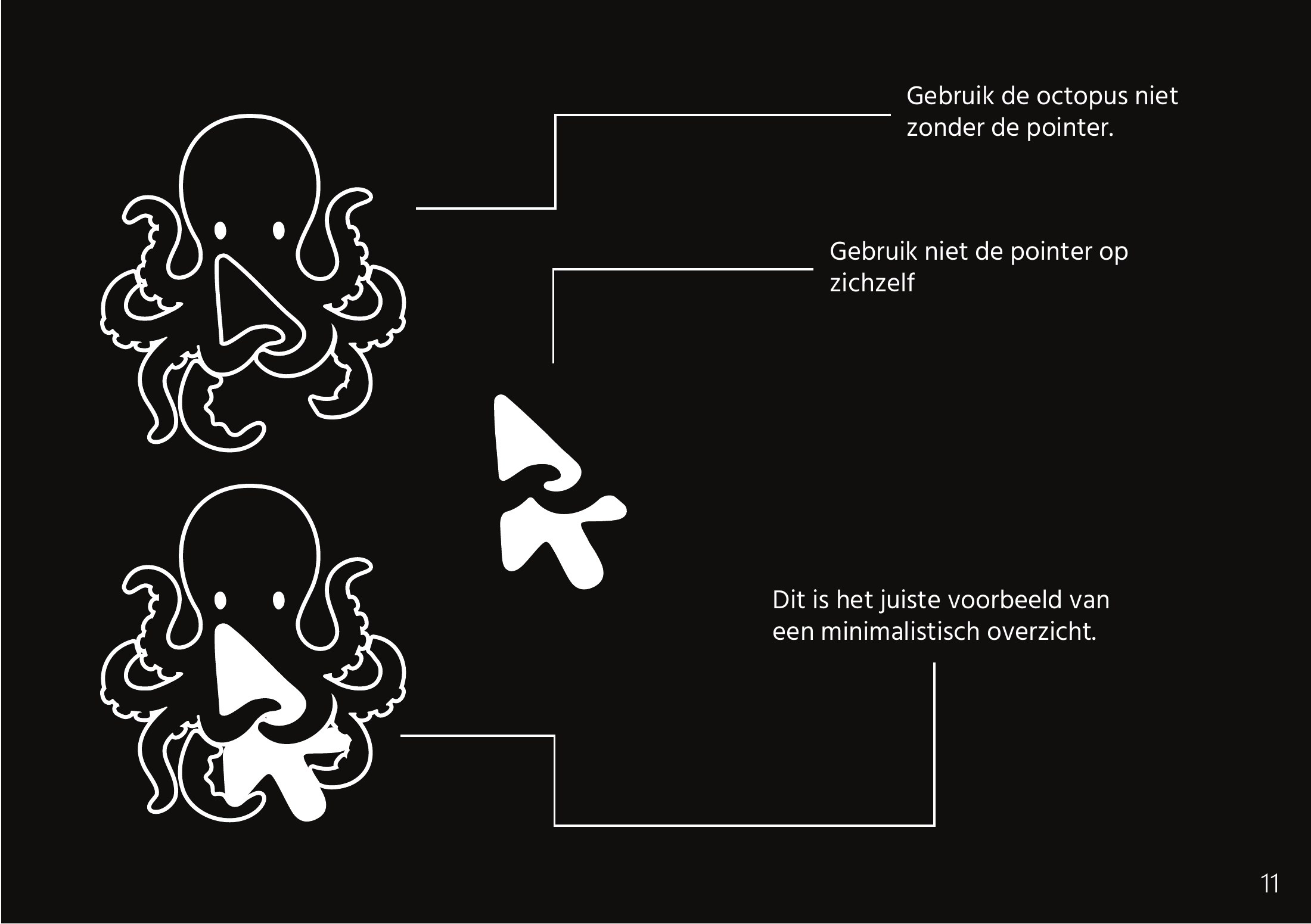
So I started over from the name. Triton is the mythical sea god, and a sea creature with eight arms is the perfect mascot to hold things. The final logo is a friendly octopus caught in an unexpected moment: it is playing with a digital cursor. The octopus stands for marine life and the playful curiosity of nature, the cursor is a universal symbol for interaction. Together they show the core of the brand: the harmonic connection between sea life and interactive technology, and how visitors can ‘click’ with the underwater world through the games in the park. The slogan changed with it, from the first “The ocean holds our hope, the future brings us comfort” to something that says what you actually get: Real Nature. Real Interaction. Real Awe.
- Step 3 of 3
Logo rules
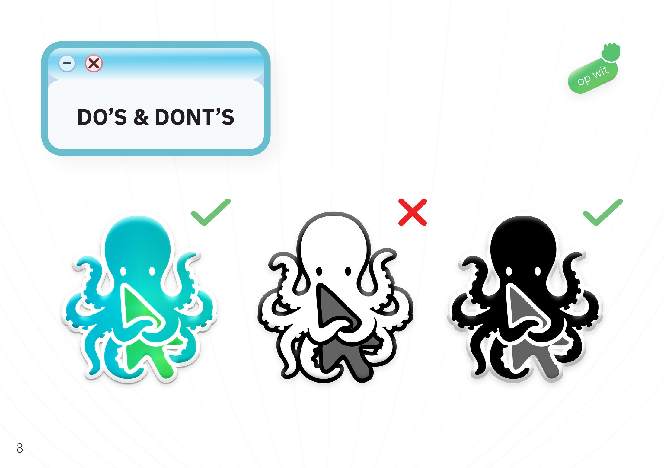
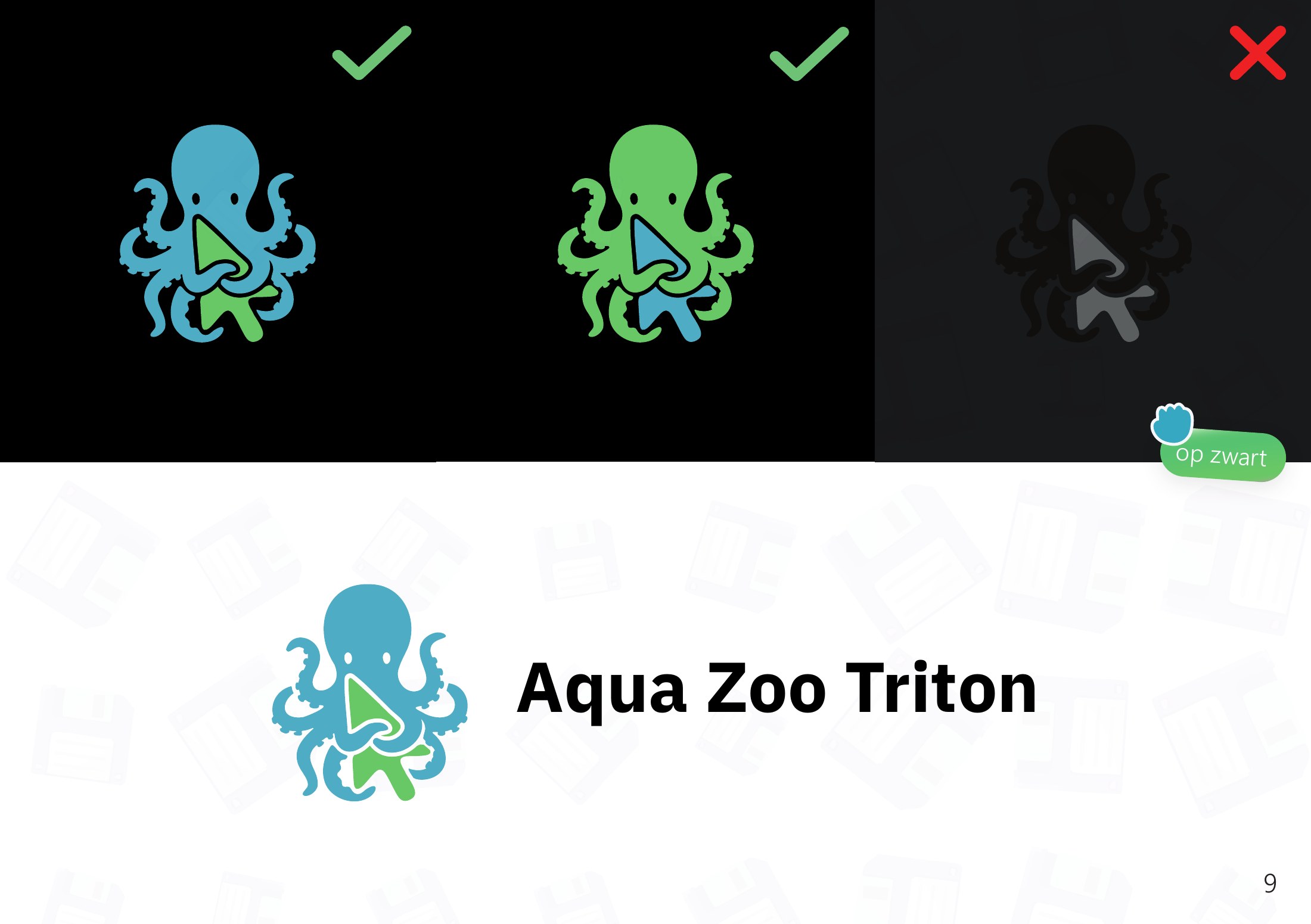
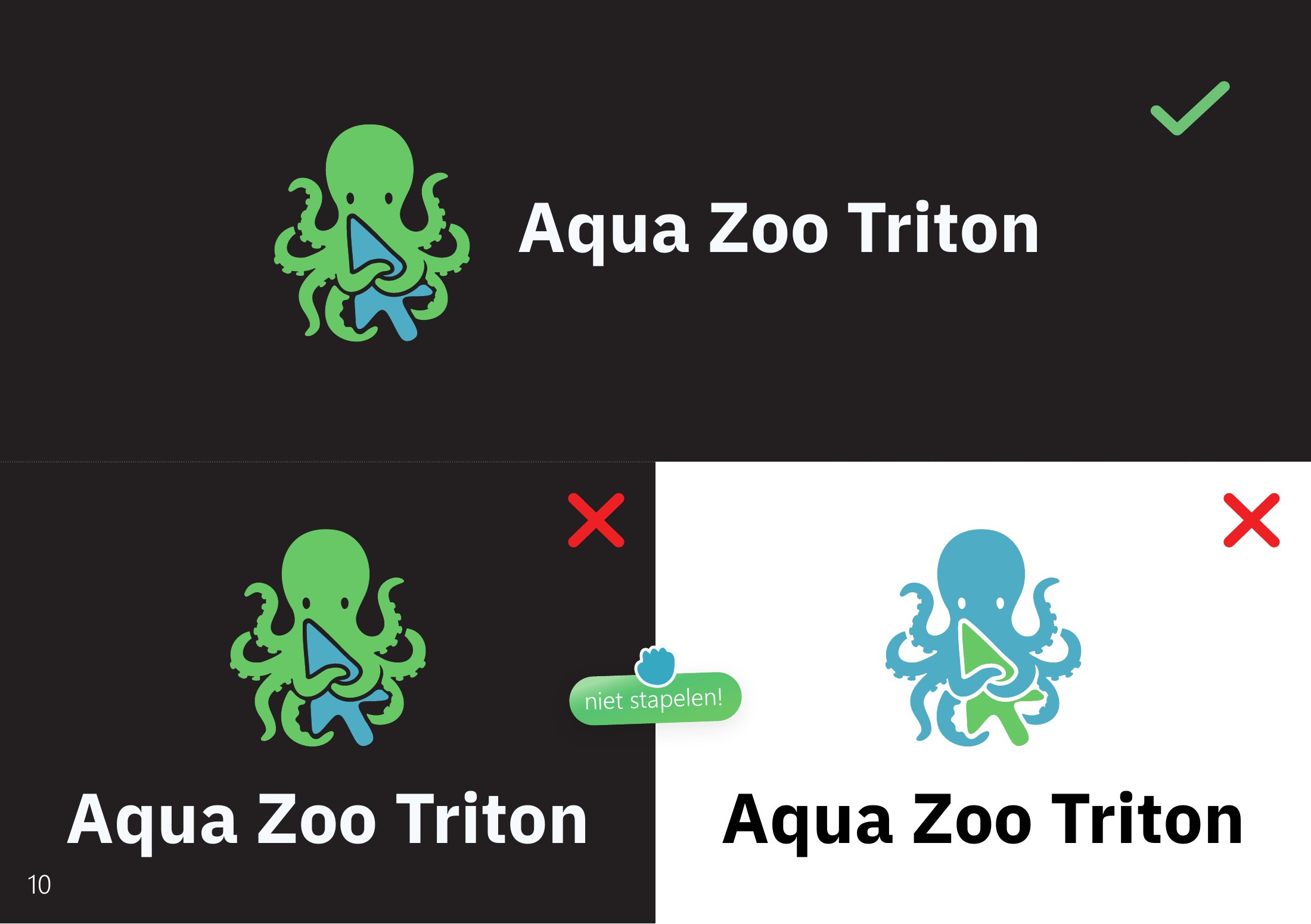
The logo comes in a full colour sticker version with a glossy white outline, plus a one-colour blue, green, white and black version for when the glossy one can't be used. The octopus is never used without the pointer, and the pointer is never used on its own. Next to the name the logo always sits side by side, never stacked.


- Step 1 of 1
Colour, type and elements
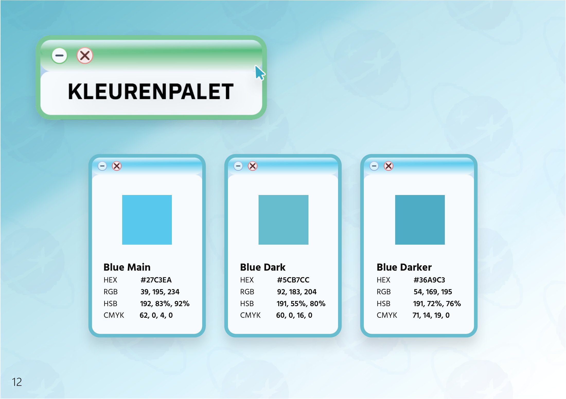
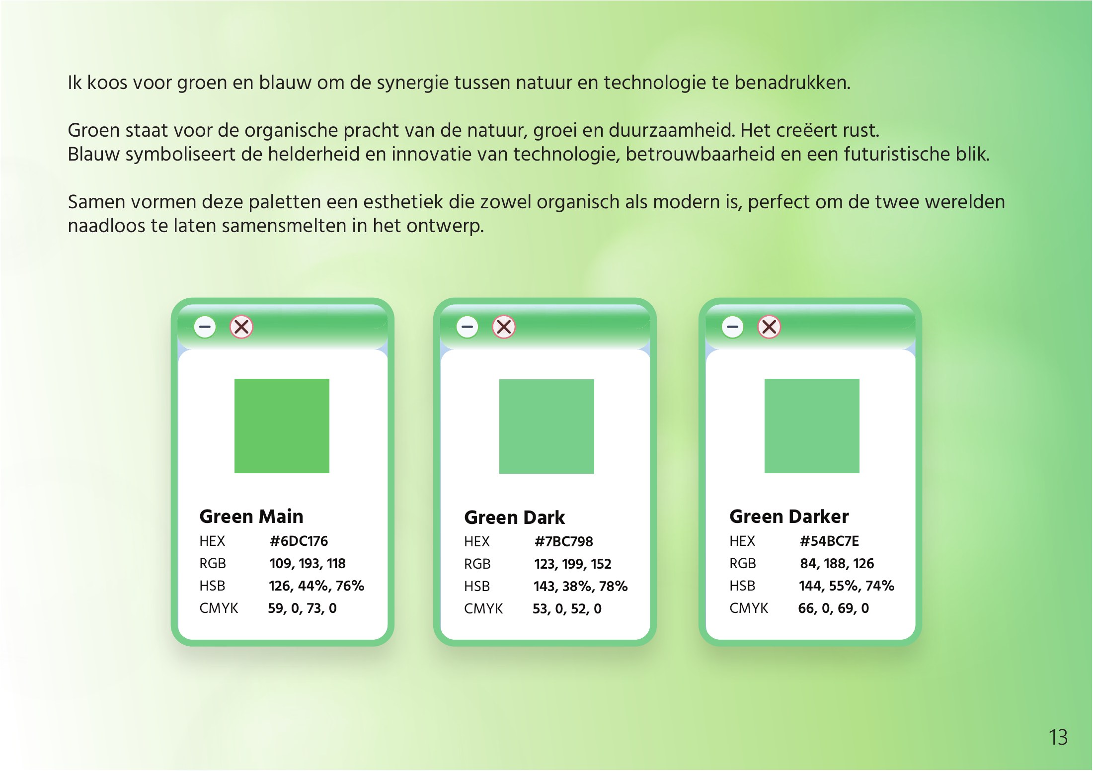
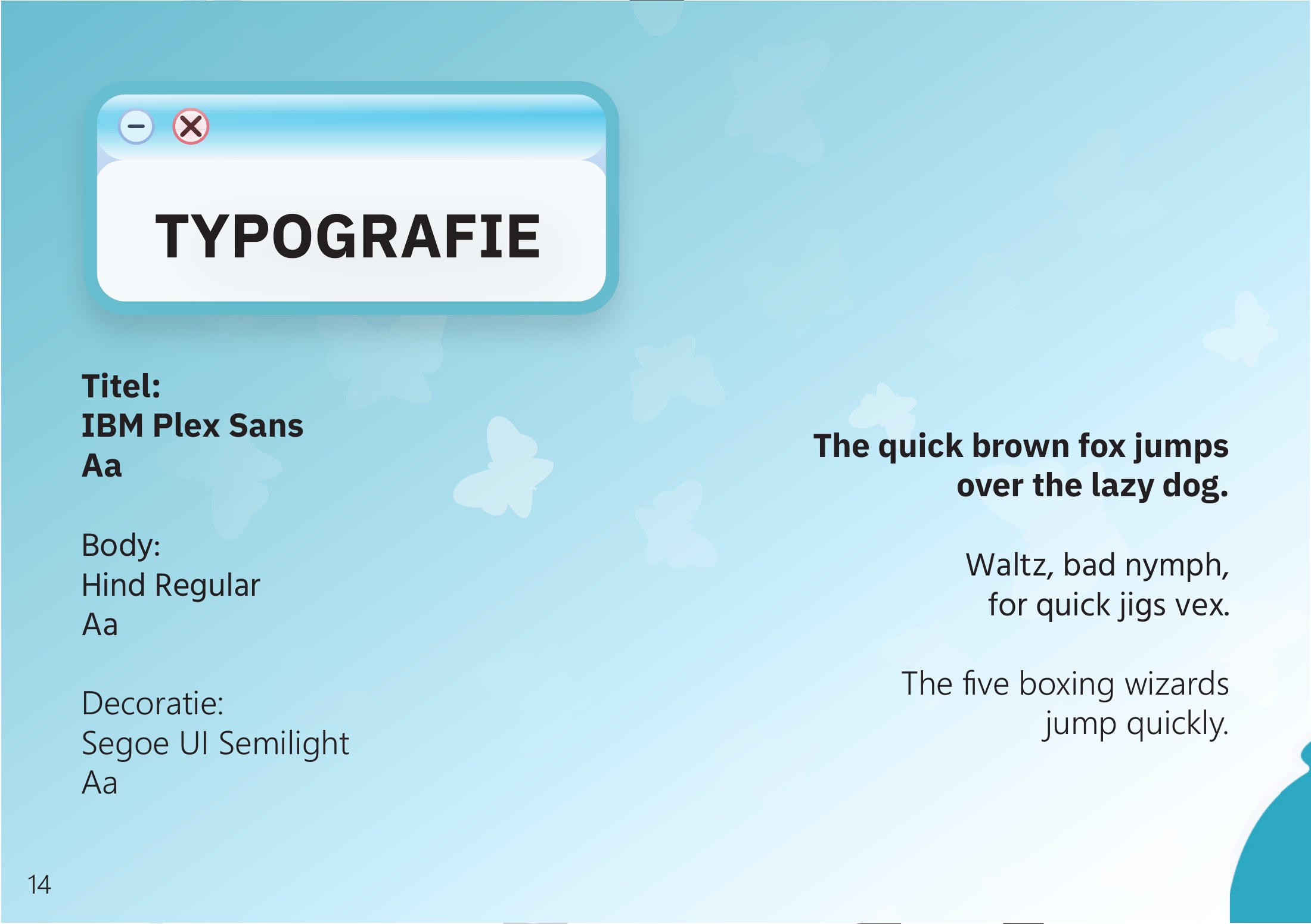
Green for the organic beauty of nature, growth and sustainability, blue for clarity, innovation and a futuristic look. Blue Main is #27C3EA and Green Main is #6DC176, each with a Dark and a Darker step for depth. IBM Plex Sans Bold for titles, Hind Regular for body text and a bit of Segoe UI Semilight for decoration. Besides the logo there are a few more pieces: a tentacle that holds objects and title cards, a hand pointer as well as the arrow, butterflies, bubbles and an octopus pattern. The windows with a glossy title bar and the minimise and close buttons are on every page.
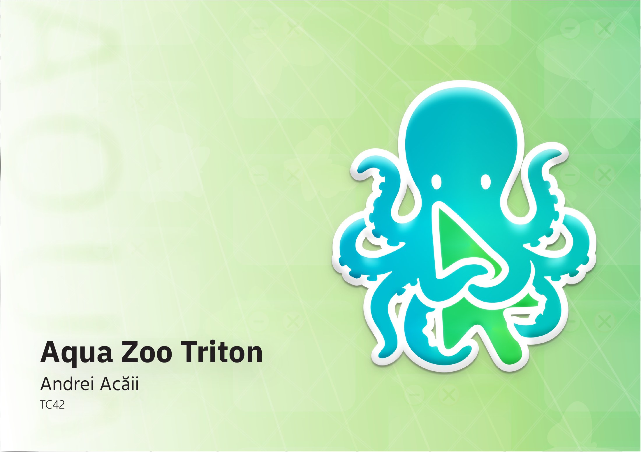
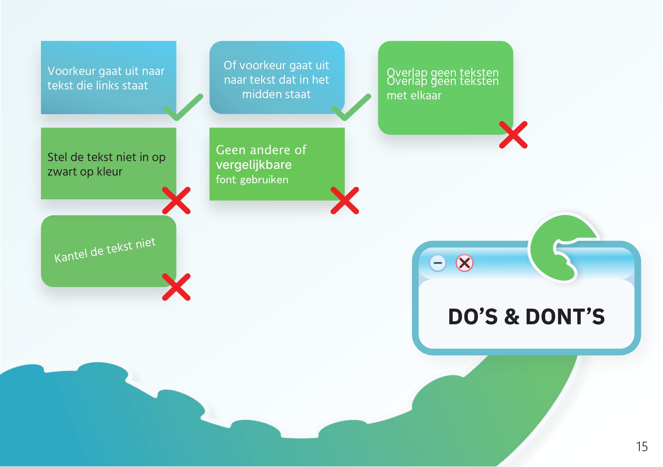
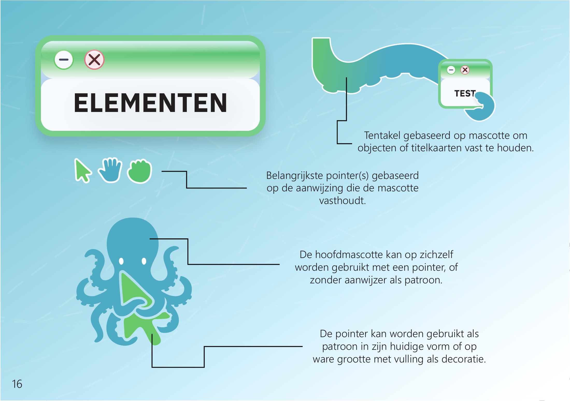
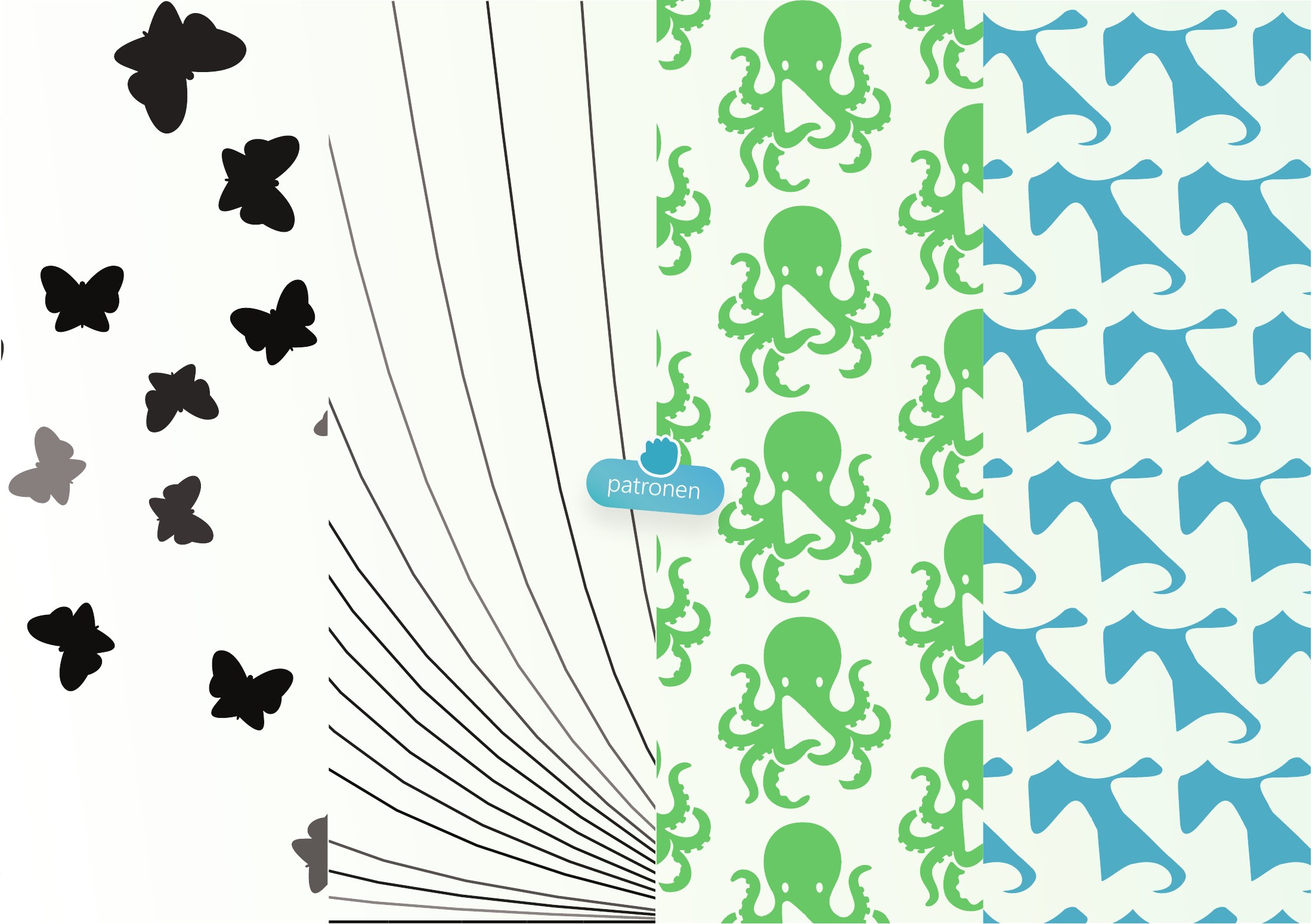
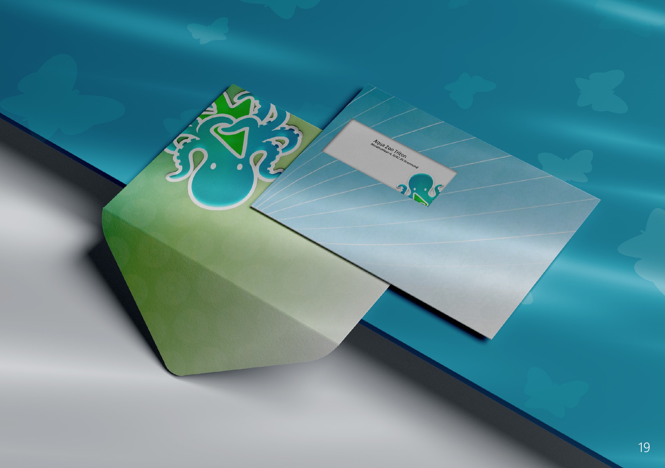
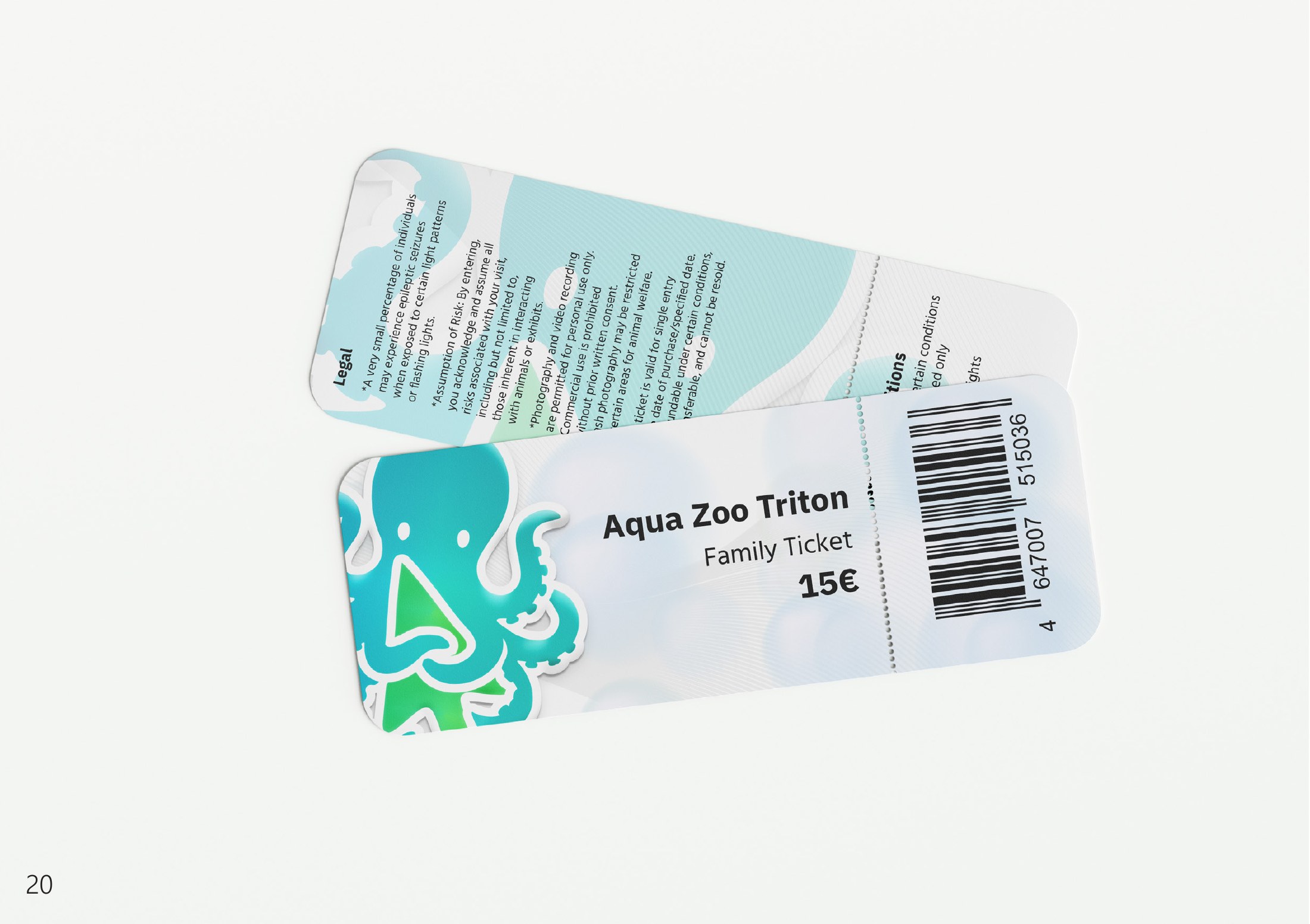
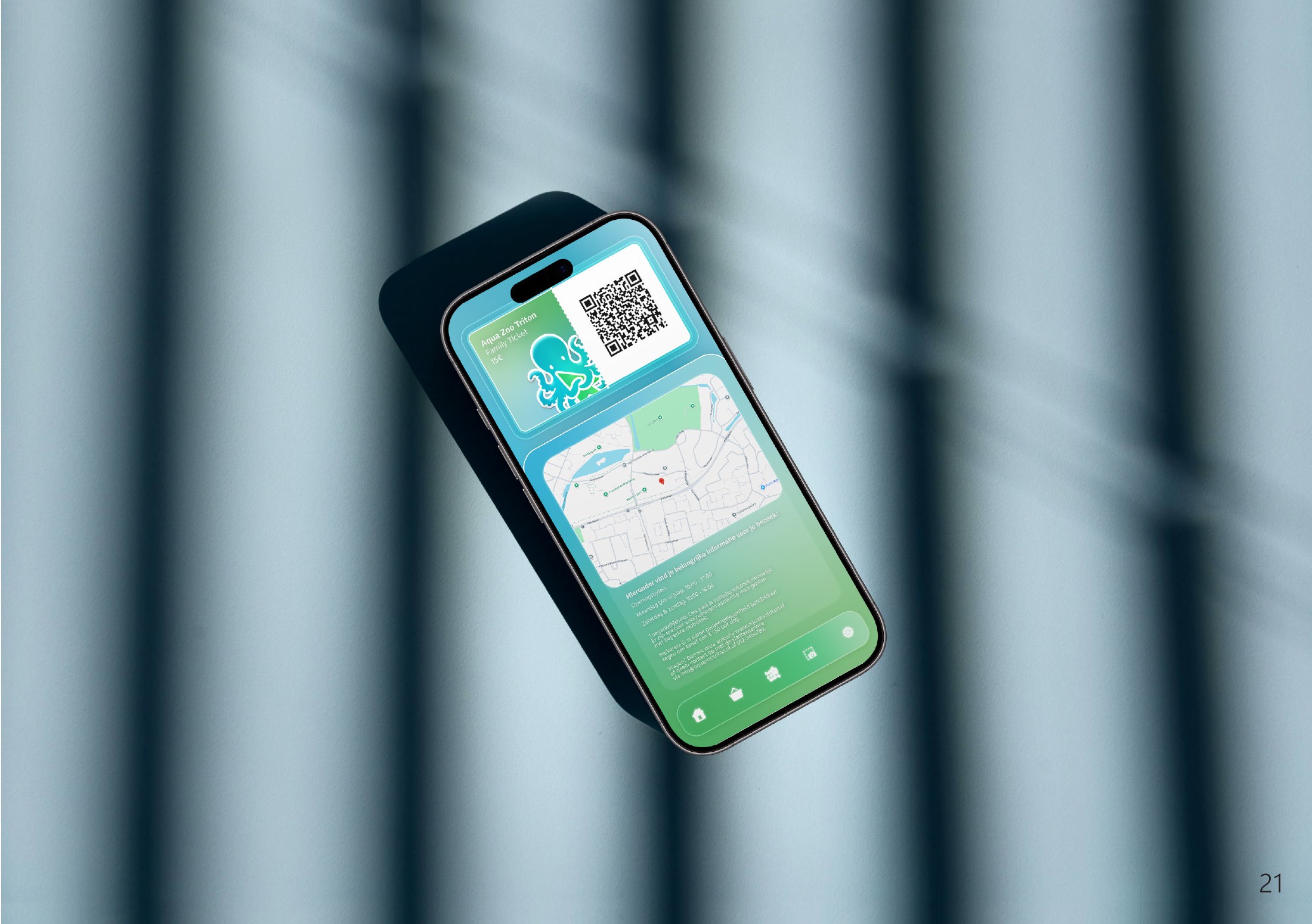
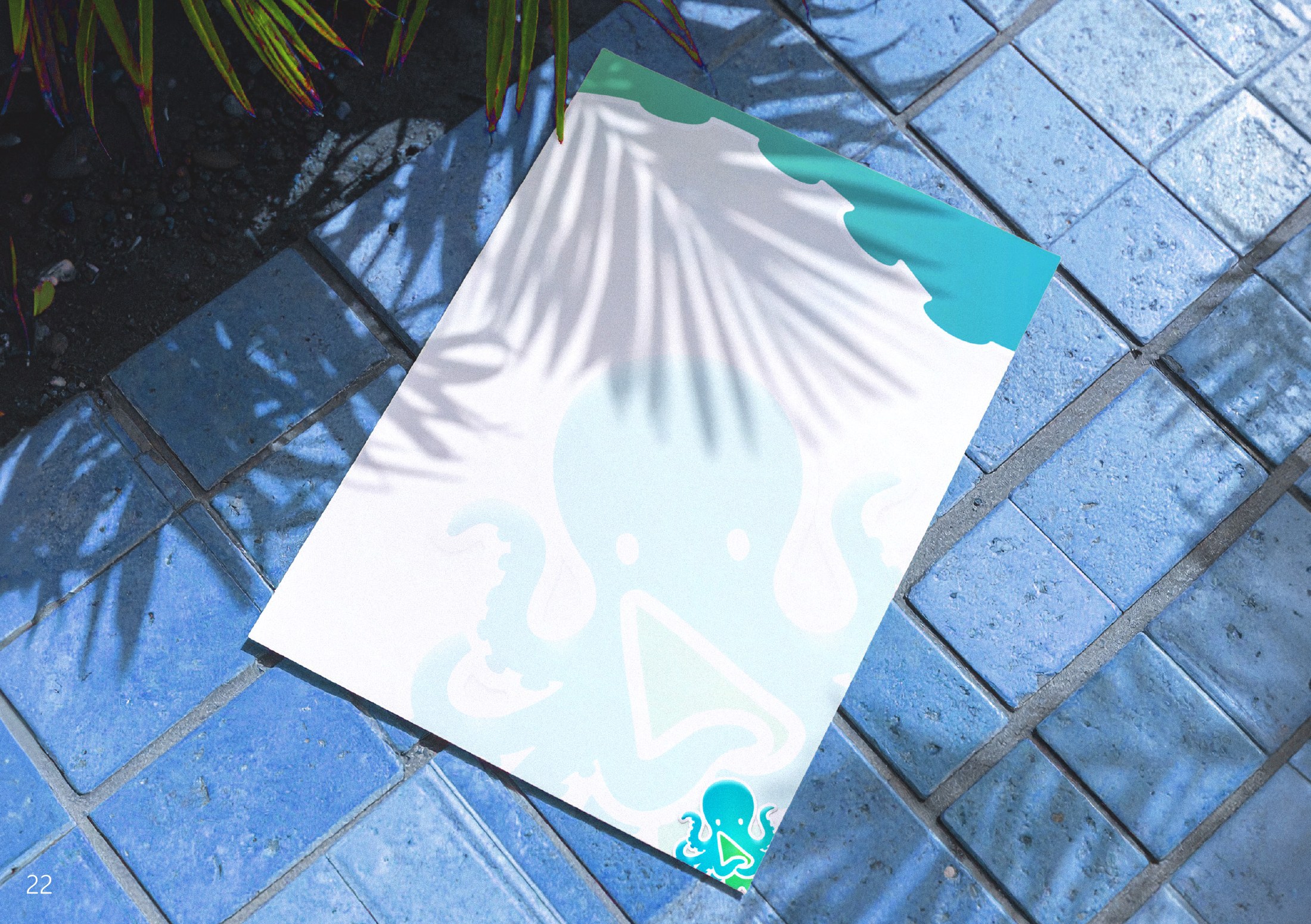
The complete house style handbook (in Dutch, 24 pages, A5 landscape). Drag a corner or use the arrows to turn the pages.
- Step 1 of 1
Out in the world
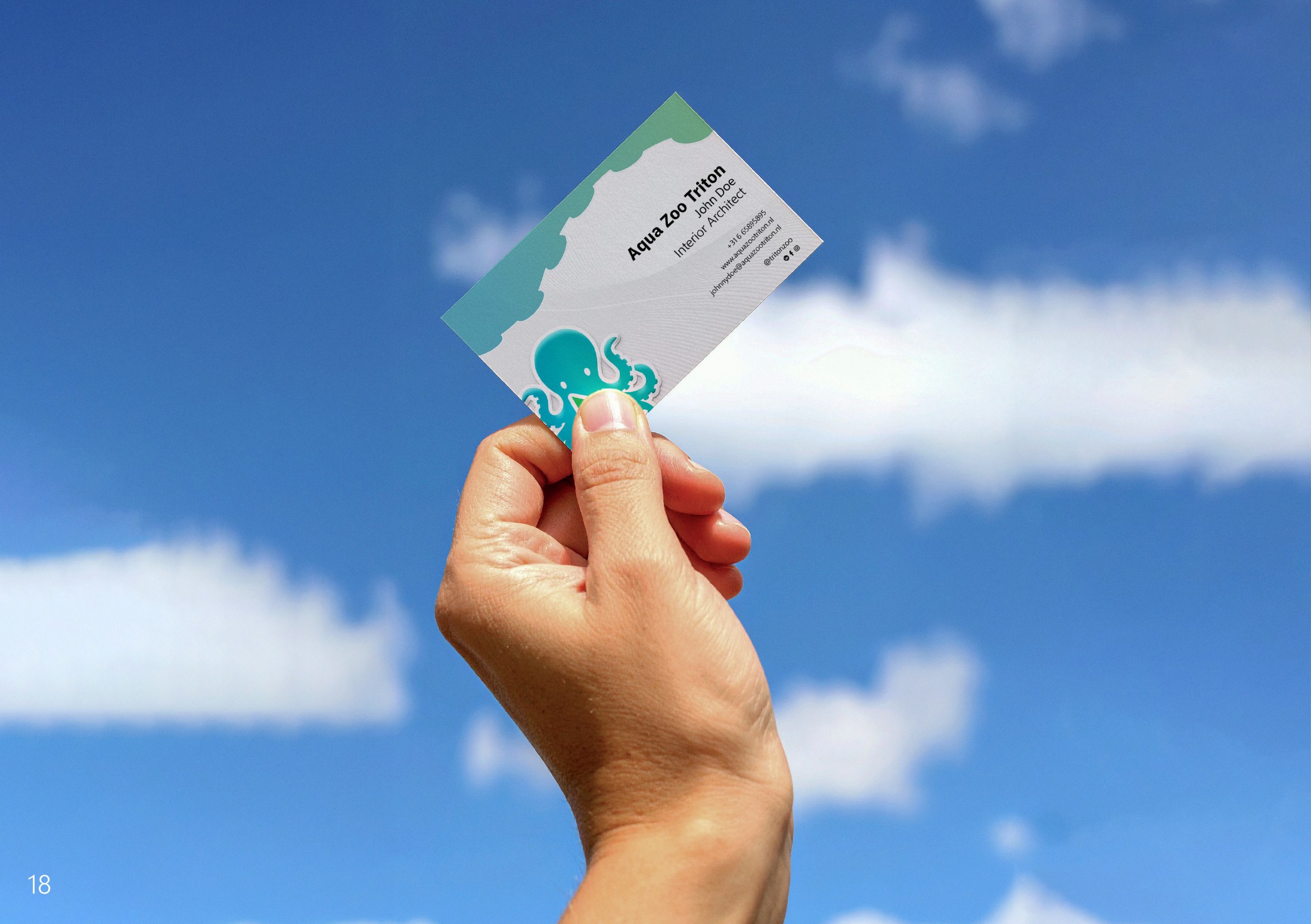
The last chapter of the handbook shows the identity on real things: the business card, the envelope, the letterhead, the family entrance ticket with its back side full of legal text, and the ticket in the phone wallet. They are all in the same blue and green and carry the octopus, only the amount of glass changes.


